
I would love some input on this logo i've been working on for our organization... I can't seem to get anything more than "It's great" or "I like it" out of my co-workers (none of them are designers).
Here is the scenario:
We are America's largest high school assembly program and we speak to millions of people every year. They have not had a designer until they brought me on in july of 2007. You can see the design mess I inherited here: Rachel's Challenge. I am currently working on changing things, most of the work I've done is marketing collateral, and I am trying to convince them of the need for them to have a unified brand, to update the logo and website. The problem is that they aren't buying it. Any talking points that would be helpful to convince them would be greatly appreciated.
This is the logo for a new program they are launching:
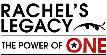
I wanted it to be very simple and appealing... It needs to be kind of trendy while still appealing to educators :) It comes in two parts. the actual name, and then the "Power of One" graphic. These are actually normally not together as they are here, the "power of one" is probably going to be used more frequently.
The type is Avant Garde.
Thoughts?
Thank You all in advance!


