
in all of your professional opinions, what font has the best (THE BEST) digits?
in all of your professional opinions, what font has the best (THE BEST) digits?

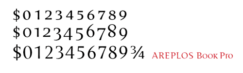
There are far too many fonts with great figures. But, I have to say Dolly because they have designed figures that line with the small caps and in my book that is giving the designer a full-set of figures.

Which font has "the best" digits in some general sense is really impossible to say - it's really situational. (Says the guy who started the "best hyphen" thread...)
That said, I've always liked Clarendon.
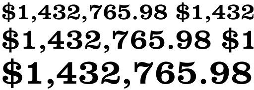
Verlag's solution for lining figures works well, I think.
Ya can't top "Numbers" for numbers.
http://www.typography.com/fonts/font_overview.php?productLineID=100018

You'll never guess this anachronism:

Trajan Bold, what's the anachronism?

“You’ll never guess this anachronism:”
Good one!
But I do favour roman numerals with Trajan…
/KTKM
I dig the curvaceous digits from the fat didones like Annlie, Falstaff, Poster Bodoni, and Bodoni Ultra Bold.
pattyfab - i always loved the numbers on the american dollar
stephen - bodoni numbers are some of my favs too .. something about the contrast in the stroke weight always makes for great digits
so, let me also pose another question - can you guys think of any more "experimental" fonts with interesting numberforms?
A few from Hughes: Miserichordia, Dazzle, Stadia
More experimental ...
A couple from Schiavi: MonicaDue, Virna
A couple from Schamal: ARS Product, ARS Zero Rate
A couple from Identikal: Sharp, Phlex
A couple from Kóthay: Plexo, Zanzibar
Honestly? I'm in love with Mrs. Eaves' numerals.

I like the number 56, especially in oldstyle figures.
This week, my favourite numerals are these:
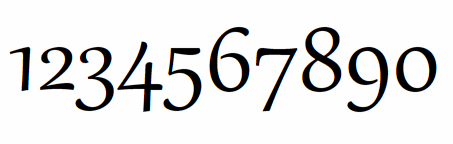

context is everything. There is no "best"...
(In my always humble opinion)
-=®=-

What are those John?

"Numerals" is the authentic moniker for these things. Strange people from another planet like me call them "Numberals, you moron! What's wrong with you?"
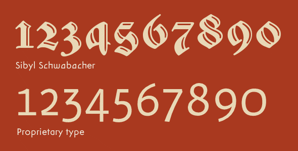
Some of my favorite numberals are the units I drew for Sibyl, and the other one I'm not allowed to talk about, but can show:
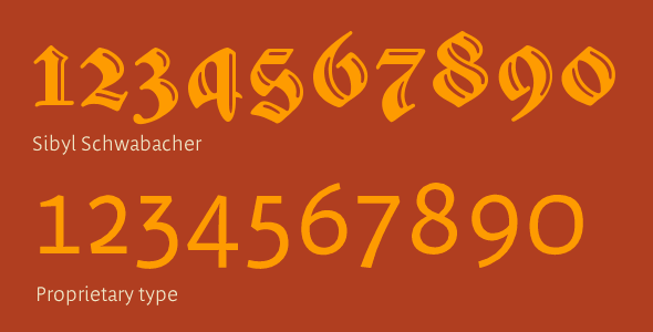
I have other favorite numberals in Other People's Fonts (OPFs). But really, as if I've got time to round them all up. My criterion for good numberals is, Do they look good enuff to eat? They look like candy or peaches? Right, I'll have 'em.
My favorite number is 425.
so, let me also pose another question - can you guys think of any more “experimental” fonts with interesting numberforms?
Sibyl's numberals are experimental (or interesting, depending on how you look at it), being old style and cursive, which is somewhat unusual for a blackletter font. Most blackletter fonts have lining figures that look like they belong in another font.
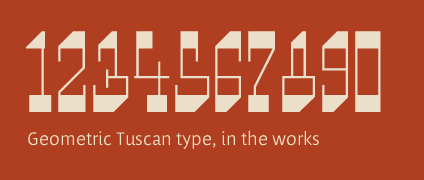
If you want something more experimental or unusual tho, try these:
Honestly? I’m in love with Mrs. Eaves’ numerals.
You're having an affair with them? Scandalous!
j a m e s
What are those John?
Like James said, I can show them but I can't talk about them.

I'm surprised no one's yet mentioned the gorgeous figures that accompany:
Herman Zapf's Aldus and Palatino
or old standbys like the Garamonds, Jannons and Baskervilles.
David Thometz

I like Carousel:

And Fette Fraktur, Stencil Bold & Le Corbusier
Fette Fraktur is fabulous. It's got great numerals too.
j a m e s


Hi George,
see also this recent thread: Suggestions for numbers/figures
At the moment, I cherish the figures in a current airline ad.
Then, these are not fonts but lettering, of course.
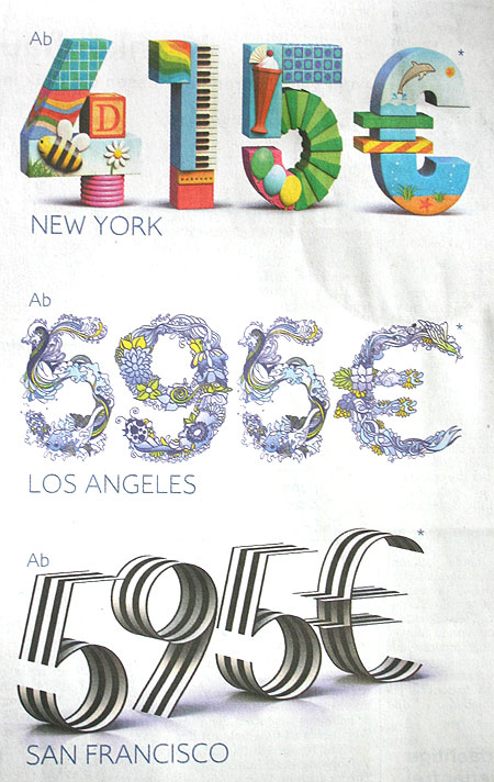
Florian---those airline ads are brilliant :^) Great advertising design and great. lettering design. Imaginative, fun and interesting. Jimmy Cat "most like!" the first one with the bright colors and music. They could concievably be eaten.
Are you at liberty to tell me what airline / country, and the name of the agency / creative who came up with that artwork?
That sample with Sibyl's numbers was colored in very poor taste. Why cheesburger? Why not use some nice cream like the tuscan?
Cream could be brighter.
j a m e s
By comparing the Sibyl 2 with the proprietary sans it's easy to see how angling the foot of the latter down like a calligrapher might do will solve the branching joint geometry a bit better.
A perfect sentence has no comma. No punctuation.
j a m e s

James, I believe those are from British Airways’ “Attractive Prices" campaigns by BBH (Bartle Bogle Hegarty as was)
http://www.natl.tv/projects/55
http://www.bbh.co.uk/Europe.aspx
Sorry for the slight diversion.
Tim
Thankyou sir! :^) You are most kind and knowledgable. The links too, they're great.
"Attractive Prices"? It's a very clever concept. I once did an "Attractive Figures" campagne for a large financial client in the mining business. The ad concept was inspired by the partition/drive on my PC labelled "Attractive Women".
j a m e s
Those proprietary numbers look super duper fab. They remind me of my other favorite numbers Luc(as) de Groot's. He can sure rock a numeral...
Super Dab Fab!
Meow-miaow!
Lucas de Groot's Thesis sets the bar for integration in a linear typeface design---for me. Thesis was arguably one of the first "high concept" progressive linear type system or series.
PLTS type.
j a m e s
"runnin' after that Stewf"

I once found these beautiful numbers
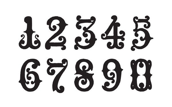

Mark has it right with Carousel (mho - and what I like :-)
I have found myself when wanting big numbers to make a point - using Bodoni Poster... just like the way it looks. (Thank you Tony Greco)
Sauna Mono is wonderful.

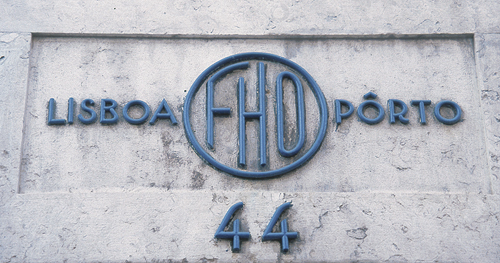
I wish you all a good and peaceful New Year 2008. Nora
And to you Nora!
It's not a font, but I like the numbers on my antique grandfather clock. I posted pics in this thread.
Those are beautiful numbers eliason. Especially the 7. Wow!
Captured from web.archive.org on 27 Mar 2015. view this capture


