
I finally made it into In Your Face, the monthly newsletter from Myfonts.com
Yay! Like it’s a big deal (I’m exaggerating). But seriously, it isn’t every day you produce a marvellous solution to the problem Herbert Bayer failed at with a mixed case uniheight design that makes a cute and useful headliner display type, like Amity for example. The Myfonts text gives a neat summation:
“James Arboghast’s Sentinel Type recently released a Bayer-inspired unicase – Amity is both modern (or perhaps Moderne) and Deco, with a truckload of alternates that owe just as much to Celtic alphabets as they do Herbert Bayer and Kurt Schwitters’ unicase and phonetic alphabets. It’s a bold, confident face that would be an ideal building block for logo designers and poster artists alike.”
Thanks Myfonts. Thanks Joshua Lurie-Terrell for the wonderful word smithing.
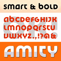
The good news about Amity is the imminent release of an inline version to expand the type’s stylistic range. I plan to add Amity Inline to the main font package with no increase in price, making Amity much better value for money. People who have already purchased the original package will receive the upgrade free of charge.
j a m e s