
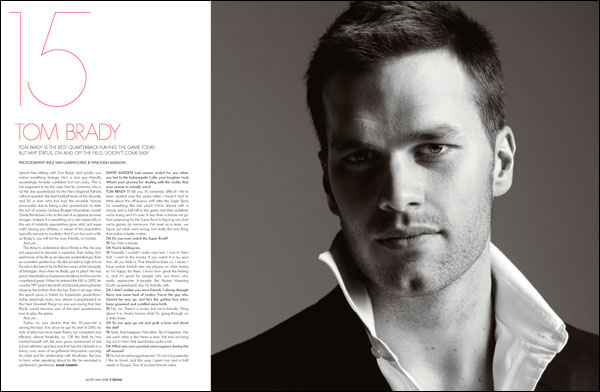
Hello to everybody.
This font looks like a extra light Futura but “C”, “G” and the numbers doesn’t match.
Does anybody knows what is this?
Thanks in advance.

I thought it might be Agenda Thin but no…

It looks like a thinner version of Graphicus DT. Added white stroke or custom?

Difficult to guess when all we have is TOM BRADY to go by. Can you provide a larger scan?
Sorry guys, I haven’t a hard copy of the magazine right now.
Here’s, some more spreads from the magazine...


maybe a custom extra light Graphicus?
or something like that cause the “G” is still different
This reminds me of one of those awkward Manfred Klein fonts, and it’s very close to Geo Sans, despite the weight difference. Note the ’R’.
Quite possibly custom, like a lot of magazine headline fonts.
Thanks a lot.
I think both Graphicus ang Geo Sans is very close to it despite the weight difference
Thanks, again
Stylish homo-erotic imagery galore BTW. What is that V Man magazine? ;^)

The R reminds me of Resine by Drew Flaherty (scroll down a bit), although the 5 says: »well, ahem, no«. Please note also the rounded weight.
V magazine is the little brother of the V magazine and both of them are the little brothers of Visionaire which is a multi-format album of fashion and art produced in exclusive
numbered limited editions.

They sure are pretty pictures. And the “homo-erotic imagery” was just an observation, it just struck me. :^)
I understood your observation...
I agree with you. Usually the fashion editorials of the magazine have that feeling.


See us debating about half naked men while Florian picks up the art references. :^P
Yeah, I saw that. I’m a big fan. The tribute piece is actually very well done. I really like the embroidered Champion Gothic/Knockout type.

...while Florian picks up the art references.
Don’t forget Guns ’N Roses references.
... and some more ways of using the same type in different style...


Haha! ฿-)
The tribute piece is actually very well done.
Yes, I have to agree … still, its title isn’t really in line with that kind of ‘quoting’, is it? ;°p
Don’t forget Guns ’N Roses references.
Hell, yes! Was one (no, two, of course) of my first music cassettes.
♫ So never mind the darkness, we still can find a way … ♫
Okay, now I’ve outed myself …
By the way, and in order to stick to the ‘hand job theme’: Have you seen this guy, playing Sweet Child o’ Mine with nothing but his hands?!
Captured from web.archive.org on 20 Dec 2007. view this capture