
This is my latest font. The idea is to work on the posibilities of pointed pen but trying not to be very close of Bodoni-Didot.
Any opinion is welcome.

This is my latest font. The idea is to work on the posibilities of pointed pen but trying not to be very close of Bodoni-Didot.
Any opinion is welcome.

Hi Ramiro,
This is lovely. Would be very nice in display. It definitely is a
bodoni/didone (no getting around it), but you do have some
unique things working here: the a bowl, the u tail, the g ear, the
swash terminals.
Here are some suggestions on the forms as you have them now.
h, m, n: are looking wide compared to the u. Consider narrowing
a, r, g, f: add some more weight into your terminals
a, u: the tail (is giving/will give) you spacing problems. Try it curling
up more to make room for a foot serif next to it.
b,o: look a little flat-sided.
generally: consider a little more weight in the transitions from thin to thick.
Here are some stylistic suggestions:
1. My first thought upon seeing the a form was Hmm... this is
kind of like a Pill Gothic Bodoni (from the sans serif
critique). Not a bad thing, but you may want to involve that hard
corner in a few other choice spots.
2. The tail on the u (a more italic form) got me wondering if it might
be interesting to introduce more italic forms to this roman
(maybe). For example a loop k, pothook/tail on the i and l, descending

Ramiro:
Simplemente me encanta el camino.
En las min
excellent. LC "a" could use a larger bowl.

Cool.
I'll add two comments:
- r: deepen the crotch;
- a: isn't it 'too much'? I'd try to make the straight line not so 'horizontal'.
I'm thinking about something like Galliard's "a", for example.
Nice, Ramiro. I agree with most of Randy's comments.
You might want to check G. Noordzij's Ruse, a Didone
much closer in style to yours than any Didot/Bodoni (but
your Lavigne is totally original).
Thanks for the comments and corrections.
This is the prototype for the text version of "Lavigne".

Yes!!!!!!!!!!!
Nice work Ramiro!
This is a bodoni/didone with x-factor. Like (forgive the comparison) Mrs. Eaves is a baskerville with x-factor. Unusual beauty.
Ok, on to things to consider:
Overall: Keep and eye on your overshoots. Your xheight seems to wobble. I think there is not enough. See the burgef sequence. Bottom of the u a etc. Bottom of the b is very high.
r: The terminal on the r looks off. maybe give it just a little more hook. Also, the arm should overshoot the stem.
f: The hook may be a little too sharp. Consider a curve more like the top of the a. It will require a fi ligature, but even now you have spacing issues with the fi combo.
s: I like it. Have you tried it without the straight segments in the spine?
Show us more!
Randy
Espectacular, Ramiro! La [a] es mi favorita. Me pregunto si la barra horizontal de la [f] no es demasiado light.
Me encant
I certainly agree with Randy... your overshoots are not cutting the baseline and meanline enough, causing characters such as your: a, b, u, e, o, and s to feel small in comparison to the x-height of your other characters. Also, the tail of your g seems a bit heavy, as your counter forms are quite tight. Your s seems to be compressed compaired to the rest of your letterforms. Perhaps allow the bottom half of the character to extend in width?
Otherwise it seems that you have a really strong start, and a very querky but usable face. Very nice... your vertical proportions from ascender to baseline/meanline relationship is quite refined and classic.
I agree with Andrew. :-)
You will get a server 500 error, but it will still post.
Click post only once. Open a new window and continue browsing. Then close the error one.
Randy

Ramiro, this is shaping up to be a great face. The refinements already suggested (and corrected for) are working nicely. I think your G and E are a bit below the midline and S and E are still a hair high above baseline. Keep it up.
I like the first version of "a", it has character.
s: looks to me a kinda squarish 
Good Work!
Hola Ramiro
Felicitaciones por este maravilloso trabajo. Tu produccion es excelente. Tal vez puedas contar algo mas de la cocina de este plato.
Creo que es una fuente con bastante potencial, pero que todav

hola ramiro. Creo que esta fuente es hermosa de veras, y muy detallista, por lo mismo entiendo la preocupaci
Es importante el punto que trata Joaco Contreras en el trabajo de detalles en un tipo de texto. Que se pierden cuando se achican.
Existe cierto temor en el pensamiento colectivo de usar tipos display en cuerpos de texto porque se pierden los detalles.
Eso no es tan as
Gracias a todos por los aportes.
Sin referirme a mi tipografia en particular, creo que en ocasiones sucede que debido a lo monotona de las elecciones tipograficas en la mayoria de los libros en Latinoamerica (Garamonds, Times, etc.) tendemos a creer que solo un reducido numero de formas pueden funcionar en fuentes de texto.
Sin embargo en los ultimos tiempos he tenido la oportunidad de leer numerosos textos compuestos en muy diversas tipografias, algunas incluso muy ricas en detalles para nada "funcionales" (como DTL Fleischmann o la Jannon de F. Sorm). Las mismas funcionan perfectamente en cuerpos pequenios y sus particularidades le otorgan identidad y caracter, aspectos que tambien cuentan en fuentes de texto.
En mi opinion sostener en nuestro tiempo que la buena tipografia es "invisible" es un tonteria .
Una buena tipograf
La "invisibilidad" se llama naturalizaci
La "invisibilidad" se llama naturalizaci

> es producto de una construcci

Looking good bro. The second one is Brill-o!
kris.
mmm. Gran detalle JP. quizas mi falta de
New corrections... I'm showing the latest text and display versions.
Thanks again for the comments.

Ramiro:
Evidentemente este laburo apunta bien alto, el inter
Your adjustments between display and text are right on. The only I might change is make the display tighter.
hhp
bueno, ha mejorado bastante todo, pero sigo con mis aprensiones de dibujo.
te adjunto algo que te puede servir.... en realidad, le puede servir a todos.
Son mis conclusiones geom
Bueno, la manera de aplicar
Right on, JP. The arches of 'hmn' and the bowl of
'b' also suffer from the same problem regarding
the curves. Just notice, however, that there is still
a missing point on the beak of the 'a'.
The 's', I think it's not working. An 's' usually
has serifs, unlike 'c' and 'f', which usually have
teardrop terminals. See, for example, Acanthus.
You're trying to give a similar finish to both 's'
and 'f' terminals, and I think it doesn't work.
Just MHO.
Ramiro,
This is not purely a technical issue. Be aware that some of what is going on is aesthetic
Juan Pablo: sin animo de ofender, tus indicaciones en cuanto a como resolver las lineas bezier son harto obvias. Por otro lado es un TERRIBLE ERROR hacer depender la estetica de una tipografia del ajuste tecnico -supuestamente ideal- de las curvas bezier.
Una fuente puede ser dibujada con diversos algoritmos que se comportan de manenra completamente diferente a las curvas Bezier (por ejemplo Lavigne estoy usando bastante IkarusMaster...).
Ya que te gusta tanto DTL Fleischmann te cuento que fue dibujada en IkarusMaster y por lo tanto muchas de sus curvas cuando son trasladadas a postcript no son 100 % "correctas" (existen puntos intermedios entre los extremos, por ejemplo).
No por tener una matematica mas ajustada en los splines una fuente tiene mas calidad. No hay nada mas facil que hacerlo. Lo importante es alcanzar la forma que uno desea y para eso se pueden violar algunas reglas (de segunda jerarquia) en el posicionamiento de puntos en las curvas Bezier.
Te recomiendo leer algunos articulos o libros de Peter Karow: ni siquiera una autoridad como el se muestra tan extricto y pontificador a la hora de trabajar con los outlines.
Saludos a todos y gracias por los aportes.

Hola, Ramiro
Como ya te dije en privado, el trabajo est

Hola Ramiro,
Felicitaciones por tu propuesta, me recuerda mucho a una tipografia llamada Rus
Te recomiendo leer algunos articulos o libros de Peter
Karow: ni siquiera una autoridad como el se muestra tan
extricto y pontificador a la hora de trabajar con los
outlines.
But Karow being the man who said that
Rodolfo:
P.Karow was right. In digitalization by hand Ikarus splines are technically far better than Bezier curves.
The problem is that most of the new type designer don't have experience in the other ways of digitalization. Bezier off-line points can not follow with real accuracy a real art work.
Miguel:
No creo que JP este dando catedra de dibujo postcript. Creo que su error reside en creer que el correcto ajuste matematico de las Bezier (no de la geometria basica) deriva en buenas formas tipograficas. No hay nada mas erroneo: Los algoritmos fueron hechos para lograr aquello que queremos dibujar y nunca debemos adaptar nuestras ideas a la logica de los mismos (y menos que menos de uno solo en particular).
Ademas, la vectorizacion que hace de la "a" de Lavigne es incorrecta y esta basada en la ampliacion de mi ejemplo en el foro, lo cual deriva en un original de baja calidad.
Cambiando de tema, Jose, no se lo que es el "pincel vernacular"... Lavigne se deriva del ejercicios con la pluma flexible (pointed pen) al igual que la tipografia de "Ruse" GN. http://www.teff.nl/fonts/ruse/ruse.html
Ese tipo de ejercicios son comunes en la KABK.
Saludos y nuevamente gracias a todos.
P.Karow was right. In digitalization by hand Ikarus splines
are technically far better than Bezier curves.
OK, tell me how.
What happens, I think, is that Karow, at the time, could only
conceive of making digital type as being the precise
Rodolfo: Off course Karow always defended his tools but in spite of the modern and most popular way of deal with type design I still think there are some advantages in the Ikarus splines.
Sadly that is something that I can't transfer to your brain. If you want to try, download the FontMaster Light and try to do some things with Ikarus Master. Once you are a little accustom to this new enviroment (not so easy... I do not like the FontMaster interface) you realice is possible to correct the outlines in a more easy way than in bezie curves. You can try also the sketch mode in FontLab, the splines are very very similar.
Hrant: Por naturalizaci
Prototipo de Lavigne TXT Italic.

I don't think this has enough character.
hhp
i'd like to see more charactures?

Bueno, i found for first time a conversation about typophile, i was looking for something totally diferent but i see this is really nice and i am interested about knowing more about this topic, may u guys recommend me something to read for a beginner in this area, And don't worry about the sense of art, i have it, i'm almost an architect. So, please, if u don't mind, tell me how to get it to that nice part of the art's world and by the way tell me what program do u use to create it.
"Lavigne" has been changing so much I would like to leave here one sample of the last display version. Comments are welcome.
Ramiro.
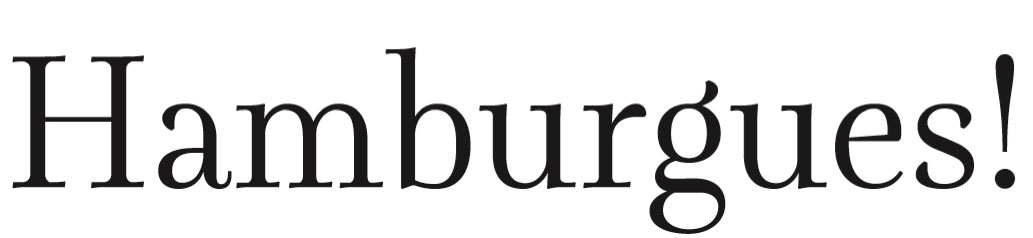
Classy.
1) Still too loose for a display cut.
2) The join of the "r" should be thinner.
3) "g": not elegant enough; optically too small; superb ear.
4) The "a" is a nice hybrid of Dutch and South American styles.
hhp

I hope this is not too frustrating ... I prefer the original.
It went froma font I would use, to a font I would not use.
The one from 29 April, 2004 - 8:09am is my choice.
The serifs are much stronger in that version.
I think this one is too fussy.
That one was much more fresh.
The italic was good too (n was wide) it could be more expressive as hrant suggested. Maybe with chancery assender forms?
Don't overthink this.
My opinion.
Randy
Just to record its evolution. Thanks to all for the corrections and advice.

Nice, Ramiro, to see this become a product after such a while. I miss some of the quirks, but hey, congrats and... make a bunch. :)
(As an aside, it's annoying how in these old threads posts are truncated at the first appearance of a non-ascii character (and this on a site that calls itself "Typophile", of all things). Couldn't the administrators do something about it?)
Wow, did you wait exactly three years since
the last comment in this thread on purpose? :-)
Congrats, and good luck.
hhp
IMVHO, it is good to see this one out but you could work on the original project again to do something different: there is place on the market for more didones, I think - especially with a 'different' flavour to the American/Italian we currently see. On the other hand, with a transitional, you are competing with many many fonts. Congratulations & Good Luck.
Hi,
Thanks for the comments and recommendations.
I think I will add some alternative characters in futures releases in order to include some original features. But for the moment I have to take care of not extending production times endlessly.
Greetings.
R.

A beautiful typeface its as if Mrs Eaves spent her summers in Parma
Captured from web.archive.org on 18 Apr 2015. view this capture