
This is Punto, one of the my first fonts. I would like to know your opinion about it, what is good, what i should change.
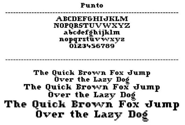
This is Punto, one of the my first fonts. I would like to know your opinion about it, what is good, what i should change.

Hi José,
With this image, it's not clear whether the jagged edges are part of your design or just becasue of a low-res jpeg!
You may want to post a different sample image where one can view the details better. It may also be an idea to use a PDF.
Sorry my ignorance, but how can i insert a pdf? On insert image only let me insert jpg. gif. & png.....
If it's a PDF, I think you'd need to upload it on to your server and post a link.
Jpeg, gif etc. could also do the job provided the samples are slightly larger.
Good luck!
I update the image. I think now is better.
It's quite interesting :)
Can you give some background on how you came upon this design, and also perhaps the applications that you designed it for?
Btw have you seen this?
A, V, v, w, y are really too wide.
The b is aesthetically strange, but it probably helps legibility.
You might want to try to find a way to make the descender of the g not so big.
The rest of the design is nice and solid, though I think one pixel is missing from the diagonal of the M, and the serif on the bottom of the h may be closing it too much.
The numerals are my favorite. I like that they have their own height.
Thanks for the feedback.
I came up with this design, when i see the work of Zuzana Licko with Lo-Res, and some manual works that with the point we construct the letter. From this i came up with Punto.

Is it Hinted??
what means hinted?
Hinting is a kind of programing to make a typeface look good on the screen.
A well hinted typeface should look something like this,
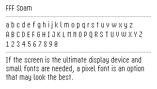

No, it isn't hinted.
Thanks for the tip
This is the most recent version of Punto. I change b,v,w and i have hinted it.

Can you upload an image containing some running text?
Here it is with some running text...
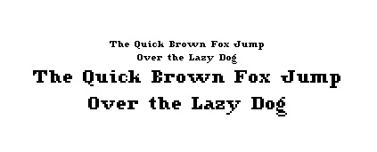
I liked it but your lc 'h' look like 'b' to me. Also one might get confused between the 'c' and 'o'. Also B look like E ( eg. Bar and Ear)
Captured from commoncrawl.org on 18 Apr 2015. original URL