
Sometimes it's hard to decide which slot to file a design under, but since this is derived from an old display type of mine, I figure it ought to stay with the display category.
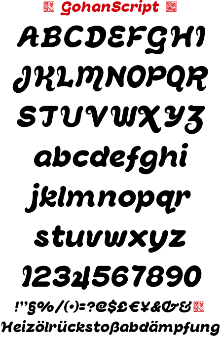
This is based pretty loosely on my old Gohan font, available for free if you'd like to compare.
| Attachment | Size |
|---|---|
| gohancript-testsheet-001.pdf | 21.01 KB |

