Hi Simon. Everything looks neatly finished but the spacing is fairly wide. In the PDF are we looking at default sidebearings, or has everything been tracked out? It's hard to say much about how it perfoms without seeing text settings.
Proportions look good. Notes:
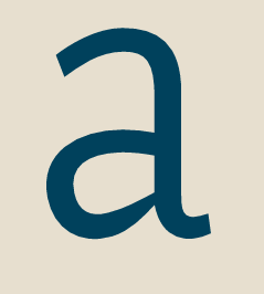
a -- bowl shape lacks definition and rigor.
e -- could be a tad wider. That's a personal taste thing. Some people prefer the e narrowish in a roman set like this.
g -- could be wider. Top bowl by 15%, bottom bowl by 20 - 30%
i & j -- dots can be that big if you want and will give good performance at 8pts or smaller. At larger sizes some people may be alarmed by them. Left side bearing on j too wide.
G -- align crossbar with E, F, H midline?
H, N, U -- in both even width caps and proportional caps, H often turns out to be the measure of all things. I base the width of N and U on H. *Base* them on H, as making them the same won't neccessarily work. If you make H about 10% wider, N could then be narrowed by approximately the same amount, then widen U to suit.
R -- consider moving top of leg back to harmonize with angles on K, N, X
r -- arm lacks definition.
S -- curves letting the team down a bit. Adjust spine angle and reshape curves to match P, B etc. If you change S you might change s to match, since that kind of thing is such a contemporary preoccupation.
V -- a bit narrow by prevailing standards.
Overall it's sweet but undistinguished. There are dozens of competitors out there just like it. Were it to be released as is (with spec corrections) most font buyers will fail to see the point.
But keep going.
j a m e s