Typophile

Alternative to Papyrus

Dear Typohiles,

This is my first post -- I've been learning from watching you smart folks for months, and now I'm in a situation where I could use a little of your expertise...

I am doing the titling for a documentary about a trip to a childrens orphanage in Africa and the director is in love with Papyrus. I can't stand the font (and from doing a papyrus thread search, I've gathered that most of you feel the same way).

Can anyone suggest some Papyrus alternatives? The font will be used for names of people and places, as well as short & long quotes.

I've been scouring my library and myfonts.com for something that I might be able sell to the director as a better alternative -- perhaps something elegant, friendly, and with a slightly "african" feel -- but I thought I would put the question to you, the ultimate type experts.

Thanks in advance for your time, and any input is very much appreciated.

Regards,
Julia

Kigali perhaps?

Wow, was that ever fast!

Chase - Thanks for the suggestion, but I think it's a little too... um... "clean"? not sure of the right descriptor here :/

Kent - Kigali might be close, maybe something with less extreme thicks & thins? I'm looking at some of Arthur Baker's other fonts right now, and leaning towards Pelican or Oakgraphic Thanks for turning me to Arthur Baker... not quite my taste in type, but I need to satisfy the director's desires while not succumbing to the ubiquitous Papyrus.

Still searching... any other suggestions are welcome.

Thanks again,
Julia

http://www.veer.com/products/typedetail.aspx?image=PTT0000181#specimen

morris golden is distressed but it has serifs... I don't know I don't think anything can take the place of papyrus(not in a good way hah)

maybe this too?

http://www.veer.com/products/typedetail.aspx?image=RRT0011416

What i was going for with Canterbury sans was the small x-heights.

just trying to help.

Chase Langdon

A quick search in Identifont brought up Plato and G&G as possible similar ones. I bet you could probably get away with using Plato without the director ever noticing. :-p

Plato looks like a great alternative. Me likee (note to self: use ASAP!)

elegant, friendly, and with a slightly “african” feel

I think that Palatino Sans certainly meets the first to qualifications, i'm not sure if you can ever really "feel" Africa in a typeface, but i don't think Palatino Sans would be too far off this mark either. I linked to the "informal" variant, but there is another, more regularized version as well.

Randy Jones's hand-lettered serif face Olduvai might be worth checking out. It's certainly got an African name. I must say though that I share Paul's doubt as to whether one can ever really "feel" Africa in a typeface. What aspects of Africa (an entire continent, by the way) do you (or perhaps more importantly your client) want to evoke?

Julia - If you like Baker, you might also like Bouwsma.
And a bit cleaner, but similarly structured: The Florentine Set

Maybe it would be better to address why the director thinks a typeface in the vein of Papyrus is appropriate for a documentary about an African orphanage. To me it seems like using Papyrus is just perpetuating negative stereotypes of poor Africans who can be coddled by rich foreigners but not actually treated with dignity.

I can't thank you all enough for the many excellent suggestions here.

Paul - thank you for the gentle correction, I realized after posting that using the word "African" as an adjective was inaccurate and a little on the ignorant side. I should have come back to correct myself, but got carried away with work. Thanks for not flaming me :)

James - I am in complete agreement with you, and am trying to steer the director and editor down a different road by giving some other options. But showing them an alternative to Papyrus that is close will at least demonstrate that I am listening to them as well.

Plato does look like a great alternative, and I am loving the hand-lettered Olduvai as well -- especially because it is a film about a travelling performing arts camp, with emphasis on hands-on artistic expression and experience. Palatino would be great for smaller/longer bits of text, perhaps to pair with another more overtly stylized display font?

...I'm interested in every font suggested here -- I've got some work to do!

Thank you all again, your feedback has helped immensely.

Something else to consider is that if you really want to reflect Africa, look at color. The generic green, red, white and yellow colors that are often used to represent Africa have been used in some parts of the continent for so long that nobody even remembers what they originally stood for; using colors appropriate for these particular people could be more evocative than type could ever be alone.

This U&lc article might give you some clues to approach tis project with. It also has a few nice examples of contemporary African lettering design.

I keep thinking of Amira. It has a calligraphic feel like Papyrus, and the caps have a rugged wooden feel. Only imagination can relate it to Africa though I'm afraid.

Brioso Pro Poster: Lighter than Papyrus, but has the same rough edge. This typeface is pure elegance and looks great at 300pt. They do have other cuts for smaller sizes. EDIT:Not african feeling though (to me).

EDIT: Olduvai is not intended to feel African in any way. The archeology angle is a big burial mound of schtick that my *ahem* marketing team came up with.

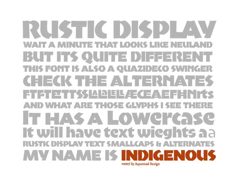
Side note: I did draft up a font a couple of years ago in the flavor Neuland (but more calligraphic). I was chuckling because if you want it to be "ethnic" choose Neuland. Hawaiian? Check. African? Check. Amazon? Check. I'm not saying, mind you that this makes any sense, or has any cultural sensitivity, but Neuland is pretty unique in it's ability to resonate with so many people on this level. It's called Indigenous, and it is growing cobwebs. Somehow, whenever I set out to draw a display face, it evolves into some crazy long project with text companion and blah blah blah.

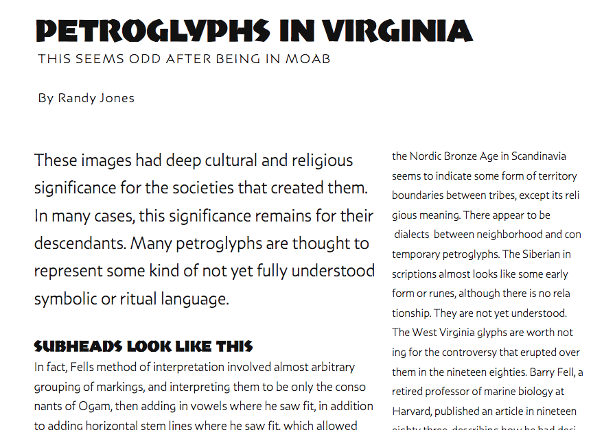
And i did manage a stab at a *text* (using the term lightly) version:

Randy, I think that is a lot of fun!! What is the text font?

Randy, you need to get that new site up already! I want to have a look through your whole library. >^p

MissT: Indigenous Text?
Paul: Aaaaaaaaaaaaaaaaaaaahhh. I know.

The discussion about type parody vs cultural sensitivity is an interesting one, that I don't want to side track. Type parody might be damaging in a butterfly flaps its wings in Montana and a typhoon strikes Mauritius kind of way. Some will argue that type parody is directly offensive and damaging. I just don't have a good answer, you have to pick a typeface. Chances are you're awareness of the design history and use of a font will be lost subtleties on most audiences. Still, not sure that means you need to go find a font that Joe Starbucks will overtly say is Tiki lettering. But then Tiki lettering has it's place. Like I said, I don't have a good answer. Just go with Olduvai. Muuuuuuhahahahahahahaha. Or not.

or Randy's Hand-drawn Sans, email him and bug him abt it.

I like Stewf's Florentine suggestion. I was thinking along the same lines. I was thinking of Carlton myself. Look at the similarity of the Fs. The long cross stroke of the upper case, and the descending lc f are very reminiscent of Papyrus.

Or, if you want to go classic "Afica", Thomas Phinney once told me that Koch's Nueland was always used to represent "ethnic" way back in the cold/hot-metal days.

Koch’s Nueland was always used to represent “ethnic”
Check out the article ‘New Black Face’ by Rob Giampietro.

If the Neuland suggestions hit anywhere near the mark, then don't forget to look at Font Bureau's Aardvark also.

Florian: thanks for posting that article. It caused quite a bit of introspection. I do think that Indigineous panders to caracature, but it was not intended to be hurtful, but playful. It was helpful to learn more about the climate that Neuland was introduced into, and who adopted it. Also to read more about the deco connection, which I wasn't aware of, but which shows up in my design more overtly. Probably not a bad thing that it stays on my hard drive. I wonder what others think about that. I honestly don't care. As far as it depends on me, I want to be about peace.

Captured from commoncrawl.org on 19 Apr 2015. original URL