
Just posted is Paul Hunt's 20 page specimen promo PDF for the P22 Underground Pro font set.
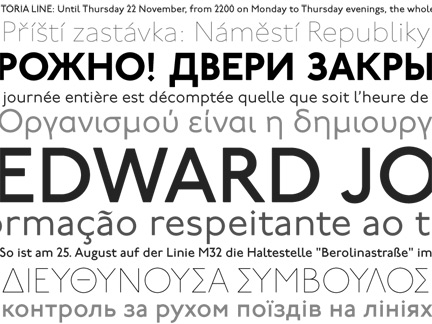
Just posted is Paul Hunt's 20 page specimen promo PDF for the P22 Underground Pro font set.

Way to go Paul and Rich!
A fine piece of work!
ChrisL

Lovely!

Chris, Eben i hope the small credits on the last page count a fraction to what i owe back to you, as well as to the others mentioned there.
Hey! I had not even seen that. How cool! The PDF is really nicely designed, and strikes a great balance between historical awareness and a future oriented sensibility.
Thanks Paul!
ChrisL

Looks fantastic Paul.
One thing that used to really bug me while sitting on the tube every day was the 'UNDERGROUND' sign - no overshoot on the O making it look noticeably smaller than all other characters. I don't suppose the other passengers were that bothered :^)
I see it has been adjusted in your digital family. Excellent!
Nick Cooke

Nice pdf Paul!!!

Wow, now that's a typeface! Great pdf too. How many years in the making?
92 years...
>^D
You can go back to the 1860's if you want to include the "Underground Railroad" in the U.S. :-)
ChrisL

That's deep, Chris, but I suspected you'd keep this discussion on track. I'd spur you on, since I'd like to see you tie it all together.
At least you didn't get steamed about it and just tried to rail me in.
ChrisL
I knew you'd respond with a couple of good puns, because you're well trained.
I wonder why you choo-choose to do that all the time anyway...
'cause my caboose is loose.
ChrisL
I wonder why you choo-choose to do that all the time anyway...
To gauge interest, but I suspect Chris might have an ulterior motive, or at least a loco-motive!
who knew a thread could get so much mileage even after it has been derailed!
Glad you came back to keep us on track, Paul.
ChrisL
You guys sure love to let off steam.
Eluard, It is either let off steam or drink another Boilermaker.
ChrisL
Captured from web.archive.org on 15 Oct 2013. view this capture