
For another take on type as art, you must look at the pictures created on a typewriter by Paul Smith. They’re fairly astonishing.
http://www.paulsmithfoundation.org/
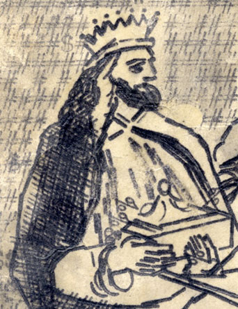
For another take on type as art, you must look at the pictures created on a typewriter by Paul Smith. They’re fairly astonishing.
http://www.paulsmithfoundation.org/
That makes me happy. Thank you, Andrew.

That is amazing. Simple and brilliant.

That is incredible
This reminds me, on a much less sophisticated level, of how some grad students used type in the early days of computers (mid-1970s). This was in the geography department at the university I was attending. They wanted to make a map with light and dark shading to show the distribution of something (population density, maybe). The only thing the computer could print was ASCII characters, so they made the thing print using different glyphs for each zone. A “light” zone would use periods; a dark zone m’s (m of course is quite dark in a monospaced font, which was all the computer had then); a mid-zone i’s. With a bit of experimentation they had about five levels easily distinguished.
The consistently brilliant folks over at Veer had several elaborate illustrations constructed out of type in recent catalogs, as I recall, but these works by Paul Smith are really humbling, I think. And uplifting at the same time. Ah, I love type.

Wow, this is beautiful work. Thanks for the link.
Sharon

Somewhat (un)related... http://www.engadget.com/2007/11/23/jeremy-mayer-turns-inoperative-typewr...
Captured from web.archive.org on 28 Nov 2007. view this capture