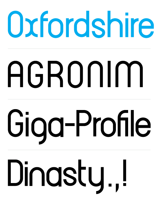
Gentle forum-goers, presented here is the first rendition of a future typeface.
I have never designed a font before, so these humble trials are unlikely to receive anything but righteous scorns from seasoned and experienced typographers. Still, I feel that this task might be a good learning experience.
To make things easier, I decided to settle on an orderly geometric san-serif display face, largely composed of simple repeating elements, and a slight nostalgic quirkiness. I'll try posting the scans of the original sketches when I get home.
What is the intended purpose of this face? Aside from practice, I was thinking about a unique display font to be used in the title of a hypothetical magazine dealing with computer history and retro-gaming. But that was just to give myself some kind of a direction, as I don't think this font would ever see the light of day.
I am treading in uncharted (for me) waters, so I'll greatly appreciate any critiques and suggestions.