
im doing a typography project, and i wanted to know what are the worst typefaces the earth has ever seen, if you can give me a list of the worst typefaces you have ever seen, that would be great.
This thread ran to 3 pages of replies and only one was recovered, so replies are missing.
im doing a typography project, and i wanted to know what are the worst typefaces the earth has ever seen, if you can give me a list of the worst typefaces you have ever seen, that would be great.

Caslon
Helvetica
Univers

The one I'm working on (Codename: Furtive) is pretty horrid. I'm sure once it's released, it'll make the top-5, no prob. Also, you might want to use the Wayback Machine and search for free TTF fonts circa 1996. They're pretty nasty, too.
Or do you mean common faces which are technically decent but ugly?

There are some really bad typefaces out there by folks who didn't know what they were doing, but they aren't available from reputable foundries and generally shunned by graphic designers. There are some spectacular examples of typefaces used badly, or wrongly chosen for the application at hand. Assuming a typeface meets the criteria its designer set out to achieve, both technically and aesthetically, I don't think one can say any particular face can be called "bad" or "good".

Tiresias.
R
HaleyFiege,
Which face do you like best, even if you like neither. Or better, which is worst, Helvetica, or Universe?
Giampa
I was pointing out how silly the question was.

In his book “While You’re Reading”, Gerard Unger points out that he never thought there was such a thing as a bad font before Emigre came along. Just food for thought.
The worst font ever created, in concept and execution, is Linotype Mailbox.
Take a moment to get over the execrable premise, hypothetically accept the assumption that it could be a good idea in the first place, and from this basis you can then begin to see how poorly it was carried out.

James
Well, that's an easy shot these days, but in Emigre's heyday, few would step up to the plate in a public forum to protest. Did I say few? I meant two.
Digitally speaking, it's quite easy to distinguish a technically bad typeface; convert it to letterpress. Emigre's fonts are dismal failures. Even Journal is quite goofy, and it is the one Emigre face I like a lot. Apparently, if you can't draw or punchcut a typeface, letterpress technology will just show you for what you are. This has nothing to do with "worst" (which is apparently an aesthetic decision), just "bad."
Gerald

Cerulean, Linotype Mailbox is a new one to me. It's pretty awful, but look at the year... 1997 was when everybody was adding @ symbols to logos. This is bandwagonism gone bad.
Foundries need to expire the lame typefaces instead of letting them decay in their catalogues. No other industry leaves crap in their catalogues forever! Come on people!

convert it to letterpress.
Why would you expect faces designed for one medium to work in another without adaptation?
You know how much difficulty there has always been in adapting the foundry classics to new technology, whether hot metal, photo, or digital, offset or monitor.
Would you attempt to print a finely-detailed 19th century face designed for coated paper on a laid rag stock, in the manner of 17th century printing?
expire the lame typefaces
I once retired a typeface, but people still kept wanting to buy it.

No disrespect intended to the Cherokee Nation, or their language or culture, but this is a very poorly crafted example to offer as their official script specimen.

This question is, as is, almost impossible to answer. 99% of the free fonts on the web are pieces of s***. now if the question was something like "the worst typeface, according to you, within the well established and renowned foundries", it would still be hard to answer - and extremely subjective - but, even though I know I'm far from being original, I'd personally say Comic Sans, ironically created by this guy vincent Connarre, whose last name means "moron" in french (it's actually even worse than that but we are on a civilized forum).
dr

Rotis
Zapf Chancery
Papyrus
Serpentine
Critter
Comic Sans
Lithos
And many more...
One more hater of Rotis...
This type is used by major graphic designers, it composes the entire type encyclopedia "Typo" by Ott, Friedl and stein...
Weird.
dr

Phew, I'm glad someone notched the Comic Sans mark. While there are many horrid typefaces out there, none has done such a masterful job of polluting corporate documents, birthday cards, sympathy cards, birth certificates, death certificates, company signs...oh you get the picture. It's been beaten to death more times than not. I'd prefer any number of bad typefaces over Comic Sans. What a terrible terrible society polluting creation.

Comic Sans.
Hobo.
Bank Gothic.
For all Comic Sans haters, please check this one out. Scary reading! http://bancomicsans.com/home.html
... Not to mention Souvenir. http://www.linotype.com/802/itcsouvenir-family.html Ah... the list is long!

Do you know the book Types Best Remembered, Types Best Forgotten?
There are some interesting texts by well-known typographers about their personal "worst typeface ever".
There does come a point where something is so bad, it becomes good again.
I would honestly use Comic Sans, if the right opportunity turned up .
Must disagree about ITC Souvenir as its currently quite a 'hot' font, at least in London at the moment.
Hobo - if memory serves was used on a Dylan cover?
One more hater of Rotis...
Add me to that list too. Can't stand it.
But I'm tired of threads like this.

Small Caps beat me to it with Souvenir. In fact, many of the ITC faces with their oversized x-heights annoy me.
Comic Sans, and crapola faces designed by amateurs are givens.

Sand, anyone?

As a typographer - I'd say any typeface misued - such as the menu I had to try to read yesterday. Alba in 8 point for descriptions of named foods... - yikes!
If James R. Harris would be alive to respond - he'd tell you ITC Eras. Why? Because it doesn't lean enough to be an oblique/italic and it isn't straight up -- it's just there, in limbo - leaning....
Personally, I hold a grudge towards HOBO. I can't stand that face. A quickie job came up for a window washer - and his font was HOBO... why - because he made his logo himself and HOBO was on the darn computer.... LOL
P.S. In defense of Emigre - when the faces first hit the publishing industry - they were quickly embraced -- but for front cover type. How many time did Tony Greco use Matrix -- oh, and it worked? Not all their faces are winners, but they did add a nice amount of a "new" style to help folks create new looks for front covers....
Triplex got its time in there -- and who could forget Mason - it was ahead of it's time... okay so 3 fonts in heavy use for a year or two is still quite a typographical accomplishment.
In defense of Sand, it’s not the worst handwriting font out there, and it actually passes really well for Toulouse-Lautrec’s handwriting, so it can be nice for period pieces. But why Apple made it a system font I will never understand.

Poor Comic Sans takes a beating again. It is what it is and has been badly used by many but the real reason is just that it was bundled with MS apps and "free" to everyone with no understanding of typography. No need to jump all over Vince or to ridicule his last name.
ChrisL

What are the worst assignments.......?

Maybe this will add some bashing to the list of the worst typefaces ever. Personally I cannot stand Courier and Arial (not Helvetica, but exactly Arial!), but that's personal.

I think that Mailbox font just might win in this category. It's just too much.
Try @a@c@0@o in the font preview and challenge your friends to read it!
And I thought i/I/l/L / rn / m could be bad

Small Caps beat me to it with Souvenir. In fact, many of the ITC faces with their oversized x-heights annoy me.
Saying that a lot of ITC fonts are quite popular again, Avant garde, serif gothic, even souvenir. I was lucky enough once to do a classs with Ed Benguiat, what a great bloke, anyway he was showing his work and up came ITC Tiffany, a hush came across the room. He looked at it a few seconds then said, biggest piece of crap I ever did, but one of my biggest sellers...go figure. And then the truest words I have ever heard....it's not whether you do crap, we all do crap....as long as you know it's crap.
By the way I hate Caxton.....I know that's crap!
Cheers
And then the truest words I have ever heard....it’s not whether you do crap, we all do crap....as long as you know it’s crap.
If only we had the option of just not releasing the crap.
mistral

How do you say a font is bad, let alone worst? Doesn't it depend too much on personal preferences??
:P
shreyas
How do you say a font is bad, let alone worst? Doesn’t it depend too much on personal preferences?
It’s usually a personal thing, but in some cases fonts are just bad from practical or functional standpoints. Arial is a bad font because it tries to be a Helvetica knockoff, but inconsistently blends features of Helvetica and MT Grot to create something truly ugly. Comic sans fails because it doesn’t actually look like comic book lettering.
Of course, this sort of reasoning can break down pretty quickly. For example, many of the Emigre fonts often fail at being useful outside the context of Emigre, or even being legible at all. But they did succeed at creating a dialog about type and type design that had a huge impact on design and has survived the magazine itself, so they succeeded conceptually as a catalyst for furthering creativity.
Ah yes, true.
I guess what I was trying to say was theres a thin line between trying to name "the worst font" and "my least favourite font(which automatically must make it the worst font)"
Ps- i dont think comic sans failed. Like Chris mentioned, its just been abused.
shreyas
Arial is a bad font because it tries to be a Helvetica knockoff, but inconsistently blends features of Helvetica and MT Grot...
Do you really think "blending features" was Robin Nicholas' modus operandi?
Look at the other faces he has designed, such as Nimrod and Clarion.
He is a more accomplished designer than Max Miedinger.
As you note with reference to MT Grotesque, Robin went back to the 19th century grotesque. In so doing he was ahead of the trend that has recently seen several foundries release grots in that quirkier, older genre.
Arial would get more respect if it had been hyped like Helvetica, but the foundry BS is lacking--generally the best they do is apologize for it, saying it's a good screen font!
It could be argued that Arial is a deconstruction of Helvetica, putting some fibre back into the white bread.
Hehe.. Vag rounded is just like a straightened out comic sans. Realised that during our college fest, when we used vag to match the identity designed by satya(above). :D
Then again, if a typeface is used in the wrong place(perhaps at the wrong time) it doesnt qualify it to be "the worst typeface". The fault lies with the user and not the typeface itself.
@hanabot--> What IS your project anyway?
shreyas

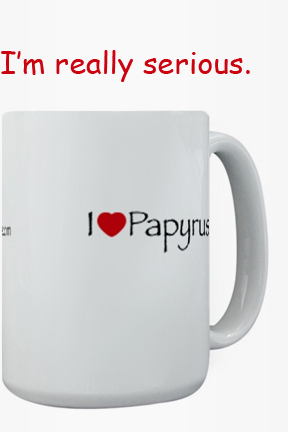
I actually like Papyrus :(
Do you really think “blending features” was Robin Nicholas’ modus operandi?
Given what I have read about the history of Arial and the motivation behind its creation, yes.
He is a more accomplished designer than Max Miedinger.
That doesn’t make Arial any better—nobody’s perfect. Ed Benguiat is more accomplished than either of the two, and he knocked out a few bad types, too.
As you note with reference to MT Grotesque, Robin went back to the 19th century grotesque. In so doing he was ahead of the trend that has recently seen several foundries release grots in that quirkier, older genre.
Can you tell me where I can read more about those details? The best I’ve read on the matter is Mark Simonson’s The Scourge of Arial which points to MT grot as the source, and I have seen that article cited by other sources I consider reputable. As for Arial being a trailblazing design, that may be so, but Arial is still pretty hard on the eyes, at least IMHO.
Vag rounded is just like a straightened out comic sans.
Its not at all a straightened comic sans but a rounded grotesque, you can say. It was actually designed for Volkswagen AG in 1979 by Adrian Williams. And I think its a great typeface.

Peignot, Souvenir, and Arial.

I actually like Papyrus :(
Me too. But I wasn’t happy when it showed up on my sister’s wedding invites.
Given what I have read about the history of Arial and the motivation behind its creation, yes.
Don't believe everything you read.
Why not open the fonts up and compare them?
nobody’s perfect.
I thought you were talking about the process ("blending features") not the end result.
Can you tell me where I can read more about those details?
As I said, open up the fonts.
Also, take a look at some printed samples of grots from c.1900 (not revivals, even a little nuance loses the flavour of the original, as can be seen with G.G. Lange's Akzidenz Grotesk).
"There are only two kinds of typefaces: those you know how to use, and those you don't."
Attributed to Alvin Lustig
I cannot track down a source for this quote, which I read somewhere, with its attribution, about 1991. Whether it is from Lustig or not, I do haul it out whenever this hoary subject gets raised.
That said, it may well take an extremely talented or sensitive typographer to design something excellent with some of the faces mentioned above.
**********
Unfortunately, too many people [including myself] over too many years have tried to do things such as printing "a finely-detailed 19th century face designed for coated paper on a laid rag stock, in the manner of 17th century printing." Blame the perpetrator, not the typeface. It might be that there's no good reason to print Emigre's Journal, or many other types, by letterpress.
powers
I think Papyrus is a true testament to the ingenuity and modern ways of thinking of the ancient Egyptians who designed it.
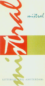
This list of bad typefaces is getting long! And once upon a time I used to be the first to sniff haughtily whenever the word Mistral was mentioned. That is, until I stumbled across some quite nice stuff back from the 1950's. Take a look at this picture. I think Mistral works quite well with these colours.This thread shows how easy it is to make a list with all the bad typefaces. Maybe we should start another with the best ones instead? Clarendon is my all time favorite.
Captured from web.archive.org on 23 Jan 2015. view this capture
