
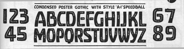
This is a quick and dirty trace job I did from an old Speedball Textbook (16th ed.). It took me about a week.
The original:
and my output:
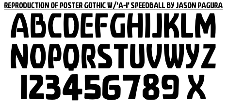
The spacing isn't perfect, and I had to create a couple letters to fill out the alphabet, plus all the extras for a complete MacRoman font. See the attached PDF for all that, and to peer into the fleshy curves.
I made it in FontForge mostly using Spiro curves. They get a bit difficult to deal with though, since you have to convert them to Bezier curves to make a usable font and the procedure isn't fully optimized in the current version, requiring much manual tweaking, lest one get 5 or more Bezier points for each Spiro point on a curve.
| Attachment | Size |
|---|---|
| PosteronyThree_test_2.pdf | 35.99 KB |


