Hi there:
Unfortunately, I'm not as fluent as much as I'd like to be in the anatomy of letters. Here are a few lowercase a's that have interesting characteristics that I'm not sure how to describe using the proper jargon. This post is spurred on by recent release of Droid from Ascender. It has a peculiar terminal affectation that I have seen many times before, but now is the time to learn all about it. Esprit is probably the first instance I can think of. There are also other design features I'm interested in. Here are the subjects:
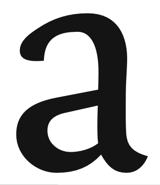
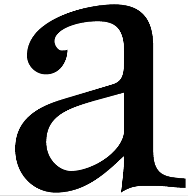
1. DTL Unico
There is not a sharp point in this entire letter (except in the inkwell). Its smooth like it's from letterpress. What would a type designer call this global treatment of smooth curves?
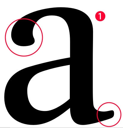
2. DTL Dorian
The circled area is the first example in which the terminal looks like a brush stroke and comes to a sharp point in the inside of the counter. What are these terminals called? The arrow points to an area that has been purposely made bulbous. What is that feature called?
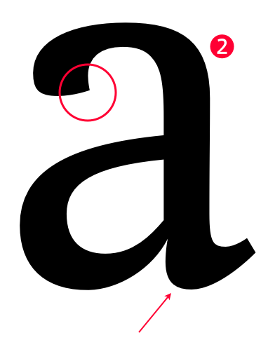
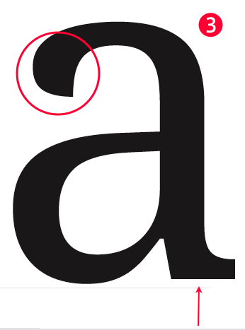
3. Ascender Corp. Droid Serif
The second example of that terminal treatment. The arrow points a slab spur which definitely enhances readability and sturdiness for low-res display and printing. Is slab spur the correct term?
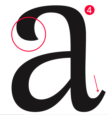
4. Type Culture Latienne
The third example. The arrow points to an area (spur, tail?) that is pointed upwards. What do we call that?
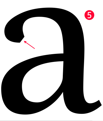
5. Linotype Really
This one looks like it would have been like the others but the terminal has been chopped. Just interesting thats all, no question. :-)
Thank you all for responses,
Mike Diaz :-)