
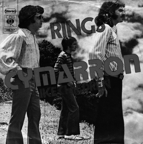

‘RINGS’ is Prisma and ‘CYMARRON’ is Stop.
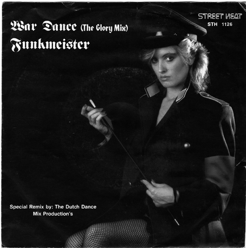
Fraktur typeface on the top is Fette Fraktur.
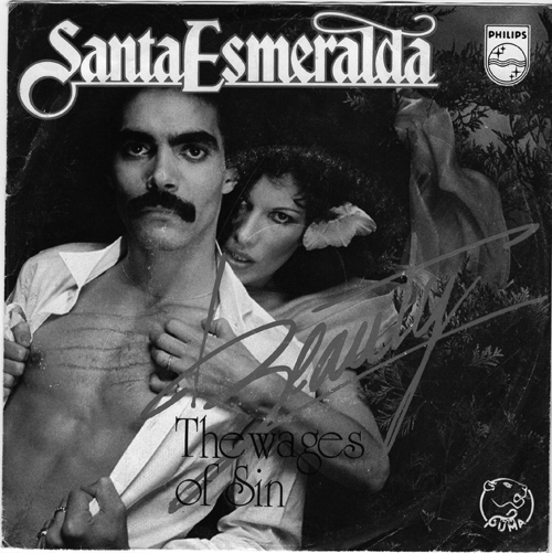
‘The wages of sin’ on the second one is University Roman.

The Glory Mix in the first one is ITC Honda.
(3)
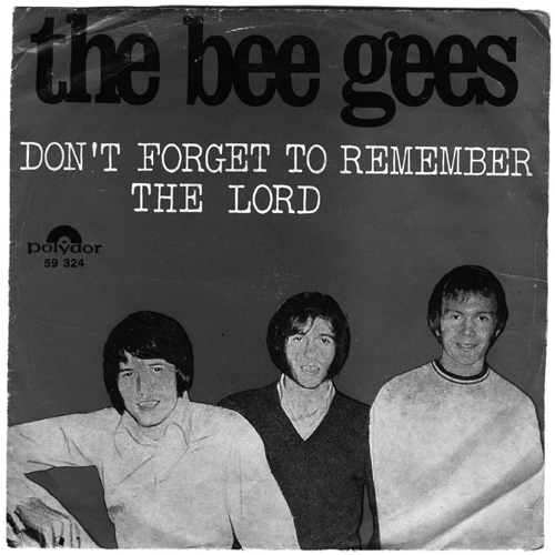
‘DON’T FORGET TO REMEMBER THE LORD’ is similar to Typewriter and LTC Remington Typewriter.
‘the bee gees’ is Clarendon?
Santa Esmeralda in the second is Bradley.
The fifth one is ITC Garamond.

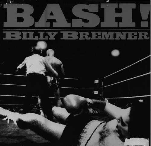
Nr. 8: Bash! Billy Bremner - I think this one is pre-digital, but you’ll get somewhat close with Ategiziano, FTN Farao or maybe Antique Six...

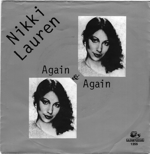
Nikki Lauren’s is Letter Gothic with an ITC Zapf Chancery ampersand
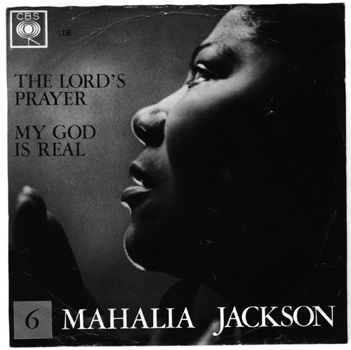
I think MAHILIA JACKSON is ITC Garamond
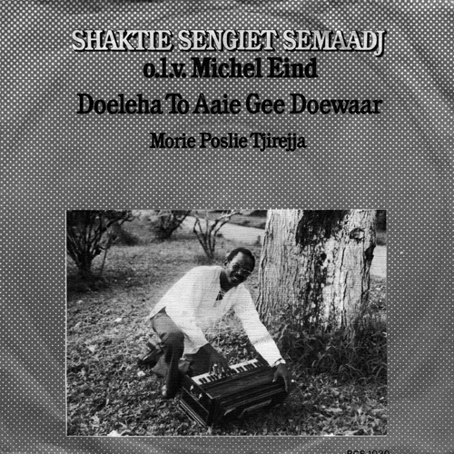
Tha last one (SHAKTIE ...) looks like a condensed version of ITC Bookman.
> Wow, what a Type ID battlefield …
Yeah, and Akira beat us all – like so often.
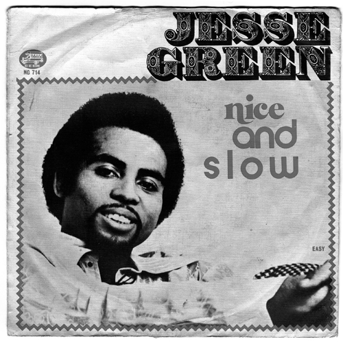
BTW, “nice and slow” is the worst use of type I’ve seen in a looooong time.

Some classy stuff there! especially the first 2.
Nick Cooke

and Akira beat us all
Yeah, he’s the power mower on this type lawn!
“nice and slow” is the worst use of type I’ve seen in a looooong time.
Well, but it’s quite illustrative, isn’t it? ;°p
“nice” is something like Cabernet Swash.

“Funkmeister” is a great band name.
As this hasn’t been adressed, some suggestions for “JESSE GREEN”:
Bodoni Black is a good base, if you want to fill in the fruit yourself.
Archive Garfield has similar proportions.
Last but not least, Lettres ombrées ornées and Romantiques both are nice decorate slab freebies digitized by Dieter Steffmann.
Captured from web.archive.org on 13 Nov 2007. view this capture