Typophile

Belshaw Donut Robot

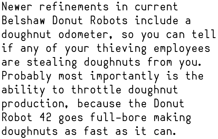
So this is a new typeface I'm working on based on the supposed font choice of the Belshaw Donut Robot 42. It's the first monospace I've ever done and I'd really love some feedback as it's hard to find specific design information on the web.

AttachmentSize
belshawtest2.pdf214.91 KB

The O (oh) and 0 (zero) look virtually the same. Depending on what you're intending it for this might be immaterial, but if you want people to be able to code with it, one of the glyphs needs something to distinguish it (like a center dot or a slash). Maybe as an OpenType alternate, as slashed zeros often are?

Good advice! I put a dot in the middle.

Captured from commoncrawl.org on 27 Apr 2015. original URL