hi folks. this is a request for informal thoughts on a collection i released about 3 or 4 years ago.
i really like the collection myself, and can use it in a pile of different scenarios, but nobody has ever bought the thing. what do folks here think of it?
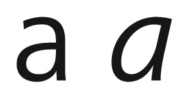
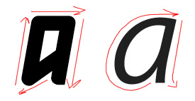
the basic notion of the collection is minimalist, constructed shapes in the roman, and more of the same for an italic—but using forms from handwritten & calligraphic italics. Nobody and i mean NOBODY has ever bought a single weight. am i completely off my game here or something?
not really looking for tactical tips, such as "i would do this," just wondring what folks' general feeling might be.
thanks!