
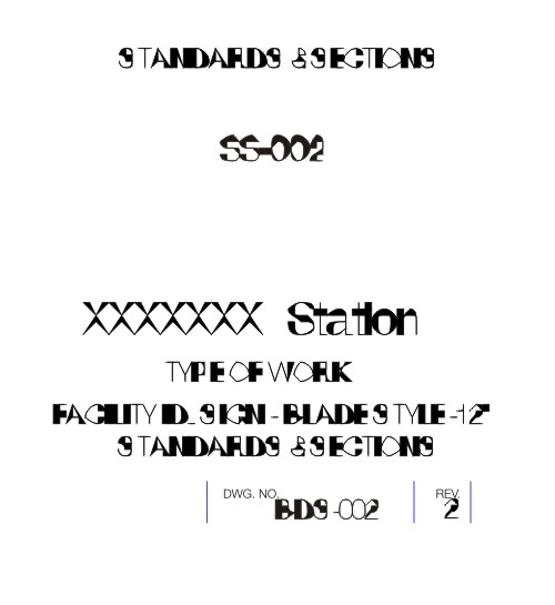
This is what happens to Helvetica when you import an AutoCAD drawing into CorelDraw X3. Other fonts do the same thing, only in their own special way. The text is still text and can be edited and it’s wonkiness changes as size changes, getting less distorted as it gets larger and on the “Clear Transformations” command it shrinks down to an undistorted 1/10000 of an inch or so.
this isn’t an issue for me, since any time I import an AutoCAD drawing to work on in Corel, I blow all the text away anyhow. I just thought it’s kind of intriguing - Perhaps as an automatic grunge font generator. AutoGRUNGE?
R
