Typophile

(x) Geometric bold sans 'Ongoing Series' - Neuzeit (custom by Laurenz Brunner) {Yves (Angel)}

james langdon

This is some publicity from Museum de Paviljoen in Almere, Holland. In the list of credits it mentions Laurenz Brunner so there’s a chance it’s custom, but I think there might be something close. My searches haven’t turned up much so any help gratefully received...
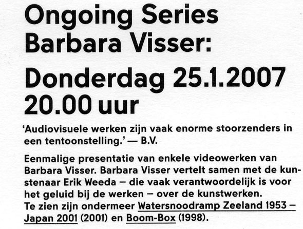
This looks like a Neuzeit. One mo.

As you say, it’s custom by Laurenz Brunner: Neuzeit Bold thirteen heavy.

http://www.ianswork.net/translated/translatedinfo.html

Hm… I’d expected it to be a bold DIN Neuzeit Grotesk, but there’s no such weight in digital.

So I was right. Good one, Angel!

Thanks for the knowledge, I hate it when it’s custom! Nice type though.

Captured from web.archive.org on 6 Nov 2007. view this capture