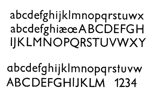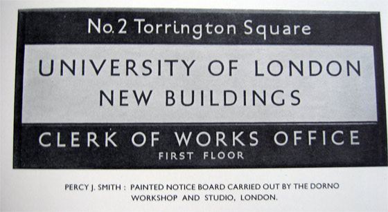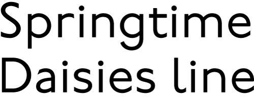
i was wondering if certain types of letter forms are "inappropriate" for certain type styles. of course, the school book (or single-story) forms of a and g look funny in Bembo, but are they so bad in something like a revival of Johnston's Underground type?
second question, is it irresponsible of a designer to make these types of alternates available?
third question, there is a strong correlation between some forms (a & g) and a weaker one with other forms (t & l). i'm sure the answer is "it depends," but does anyone have examples of some of these conventions being successfully broken?
for the sake of transparency the original post is below, the original title of this thread was "Is this sick and wrong?" I prefer the ammended post above, but if you want to respond to the post below, feel free.
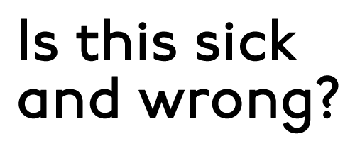
well maybe that’s a bit more emotive than i’d like to be, but i wanted to show a few certain things and this text worked. what i’d really like to ask is is the type above in the image above “inapropriate” in any way? this is all i want to ask at this point. i’ll give more context after a few initial reactions.
(post ammended 10 Nov 2007)