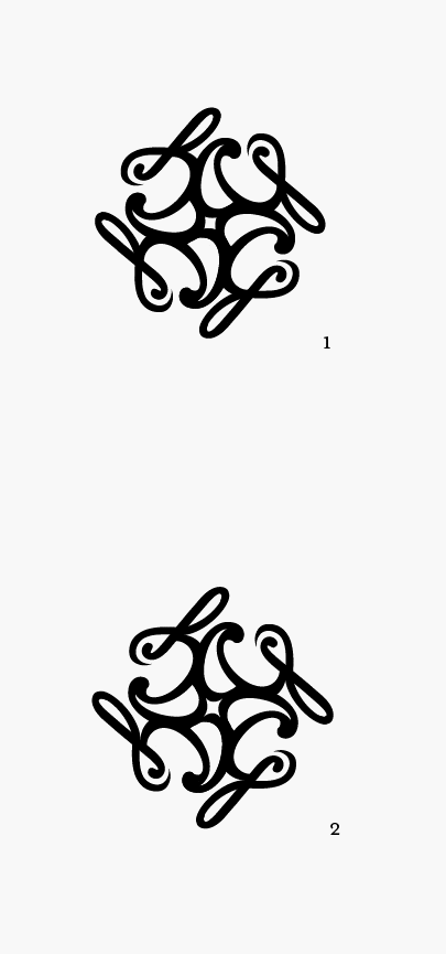
Hello everyone,
My first Typophile crit: So I'm finally at the point to be designing a personal logo, stationery, etc. I'll be graduating in May (finally!), and am ready to go out into the "real world." I've been working on this mark for a while now, and I feel it's at a point I'm happy with, so I'm ready for your insightful critiques to improve it further! I'm going to start soon on my name placement, typography, etc., but I wanted to nail this mark first.
My design style tends to be, in a few words, complex, clean and somewhat delicate/elegant, but not really feminine (unless the job calls for femininity). I also have a slightly unhealthy obsession with typography (as opposed to other design elements). I hope that makes sense; let me know if it doesn't...
Thanks in advance for the help!