Typophile

(x) Magazine text faces - ITC Berkeley, Adobe Caslon, Eldorado {Marc O}

gravityfrog

Greetings friends,
I’m in the beginning stages of a magazine re-design for Montana Outdoors, a small circulation (about 45,000, mostly U.S. and Canada) bimonthly magazine that focuses on Montana conservation and wildlife issues: http://fwp.mt.gov/mtoutdoors

We’re a small outfit, just an editor and myself, and I’d like to launch a new look next year, with better grids and a more effective and readable typeface for our body copy. We currently use Adobe Garamond 10/13, which I think is a little light, and perhaps a bit challenging for our older readers to read comfortably.

I’ve only been in the magazine design business for five years, so I have much to learn. I’d like to transition to a more square typeface with a taller x-height. Utopia is pretty high on my list right now... I’ll be pairing the body font with ITC Franklin Gothic condensed for our sans-serif / subhead choice.

My editor has asked me to survey the body text typestyles used by some of our peer magazines, who we view as the “gold standard” for us to strive for. Specifically, does anyone know at-a-glance what typefaces the following magazines use for body text:

Arizona Highways
Field and Stream
Audubon
(see attached samples)

Thanks in advance for any help. If I can’t find the answers, I’ll do it the old-fashioned way and call their art departments!
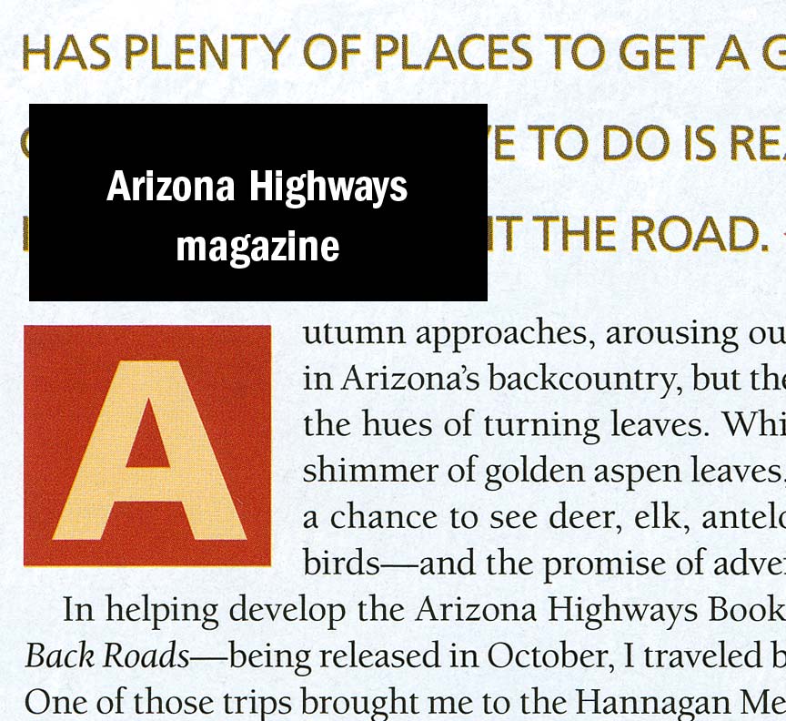
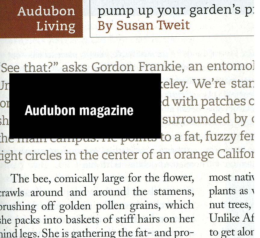
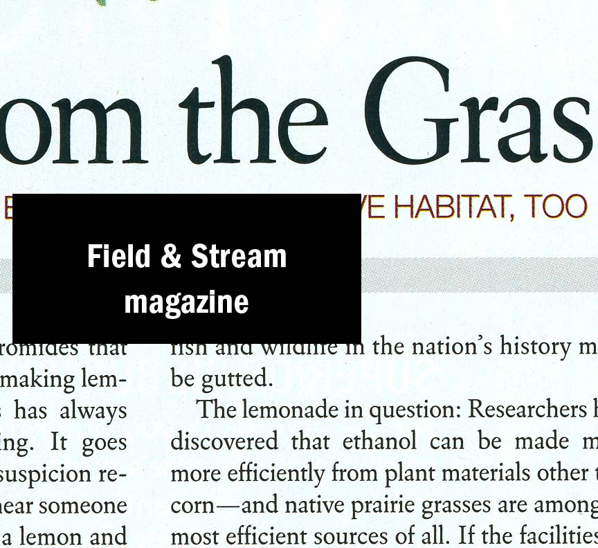
Arizona Highways: ITC Berkeley

Audobon: Adobe Caslon
Field & Stream: Eldorado

Wow. Amazingly fast response!
Thanks so much for your help. And now I’m going over the merch page to support Typophile.
Peace,
Luke

The slab in Audubon, by the way, is PMN Caecilia.

Thank you both.
If you have any favorites you recommend for consideration, I’m open. I like the density and x-height of Utopia, which I see more in newspaper body, but it might look nice in a magazine spread...

That’s nice, a new free newspaper (like Metro) just launched here
which – I believe – also uses ITC Berkeley. I don’t know if I find it appropriate for newspaper use or not (I think not, actually), but I just wanted to mention it. ;)

If you’d like the large body but with more elegance, consider Classica or Alinea Serif.

Can’t go wrong with Utopia. It is one of the most readable fonts out there. Plus, I think its more casual tone would work perfectly with a publication targeted towards seniors.

For your accompanying sans, Franklin Gothic works well with Utopia, I’ve used that exact combination before. Not surprisingly, Helvetica Neue is also a safe choice with Utopia.

In my opinion both Franklin Gothic as well as Helvetica are pretty dull typefaces for magazines. They have been used to death for it. :)

Personally I wouldn’t go for the safe choice, but maybe that’s just me. ;^)

I agree. Franklin is pretty common in magazines, and is certainly a safe choice, but I’m trying to keep at least ONE typeface consistent for a little familiarity to our readers.

The Alinea Serif that was recommended is just beautiful. I love the lower case g! It’s just a little too pretty for our audience. I have to strike a fine line between readers who subscribe to Audubon and Nature Conservancey versus our sportsmen readers that pick up Field & Stream and Outdoor Life.

I’ll have to pick up Alinea for some freelance projects. It’s just too nice to overlook...

You could also pick a typeface that has the same feel as Franklin, but is just a tad different in the details.

Captured from web.archive.org on 1 Dec 2007. view this capture