Typophile

Web Design Business Logo

Tintin81

Hello,

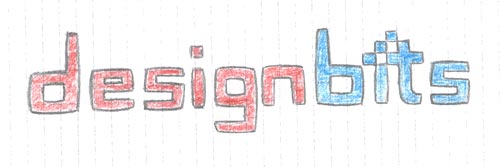
I had a flash of inspiration last night and quickly sketched a new logo for my web design company “DesignBits”. I am relatively new to logo and type design though, so I am not entirely sure how to take this design to the next step. I used to work in Photoshop a lot, but people keep telling me that Illustrator is actually better for designing logos and type. What would you suggest?

The most important thing is the actual typeface though. I need a font that resembles the one I sketched on paper. Has anybody ever seen such a font anywhere?

Any help is much appreciated...
Web Design Hamburg

You have to create your logo in any vector based program and not in Photoshop. You do need size versatility.

But for your scratch I would suggest you draw your own logo without any font, because you’ll have to tweak it’s vectors anyway and I can see the subtleties of these letters that give it a special character.

And it shouldn’t be too complicated. Based on your sketch. Quite squarish style with a bit “fat” strokes that look a bit pumped up.

If you know how to use Photoshop I suggest you try learning Illustrator for its similar UI. But before that read about the differences between bitmap and vector graphics to justify why you need to make it in vector based program.

I agree with litera that it’s probably best to design your logo from scratch, by drawing with a vector program.

but if you would like a typeface use as a springboard, check out ITC Tetra

“but if you would like a typeface use ...”

Or probably one of Neville Brody’s FF Gothics.

By the way, you might see if you’d like to push the idea a little further. This example may open up a possibility or two:

By the way, that example was a crop of a piece of early work by Michael Beirut published recently in Design Observer.

Hey,

Thanks for all your input. I think I’m going to design this logo in Illustrator, although I still haven’t found a suitable font. ITC Tetra comes pretty close, but I’m sure there’s an even better one out there. Can anybody help?

Web & Logo Designer Hamburg

Hey, Nice idea. I found a font that was pretty close to what you want. It’s called “new Detroit”
Here’s the link http://www.1001freefonts.com/ hope that helps.
I always use Adobe illustrator for logo’s . It’s a vector program different from Photoshops rastor format. This way you can use it at any size and it will always remain the same.
Have a great day.

bart69: I wouldn’t click that link for all the free fonts in the world.

wow, such a nice idea, but you have the luxury of having a very simple base font, and simple but elegant detail around the second i, so surely you can afford to go a little wilder with your colours. personally i’d like to see the text in a rich blue with a subtle gradient effect in it to give depth, and then giving way to some really wacky fluoro pink/orange/lime around the i detail. if you choose your colours well it’ll still have a strong masculine feeling, but really smart and modern too. please post your illustrator efforts, this one is exciting

Captured from web.archive.org on 7 Oct 2008. view this capture