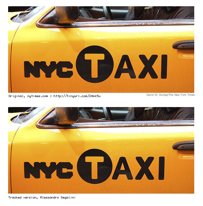
You can the Times article here.

From top: current, new, and three other proposals. There’s a larger image with the story.
You can the Times article here.
From top: current, new, and three other proposals. There’s a larger image with the story.

I’m partial to images 3 (by Oscar Bjarnason) and 5 (by Mark Sanders)...
But come on, was this “branding” even necessary? People already know they’re cabs... Duh!
I think that what they’ve done is overkill: a pictogram of a man hailing a taxi, on top of the already bold “NYC” and the T in a black circle? Harumph, harumph.
Plus, they took Smart Design’s proposal and kept changing it... No wonder the result is awful.

They could have tried harder to make the letters the same weight, too.

Thanx Ricardo ;)
—-
Oscar Bjarna
http://analog.sys.is
Today’s New York Times blog has a Design Your Own Taxi Logo feature.

I liked the Painted-with-a-can-of-black-spray-paint-and-a-stencil livery better.
R
Right on, Russell.
I just saw one of the new cabs, the NYC is so bad!
Captured from web.archive.org on 30 Apr 2008. view this capture