Hi all!
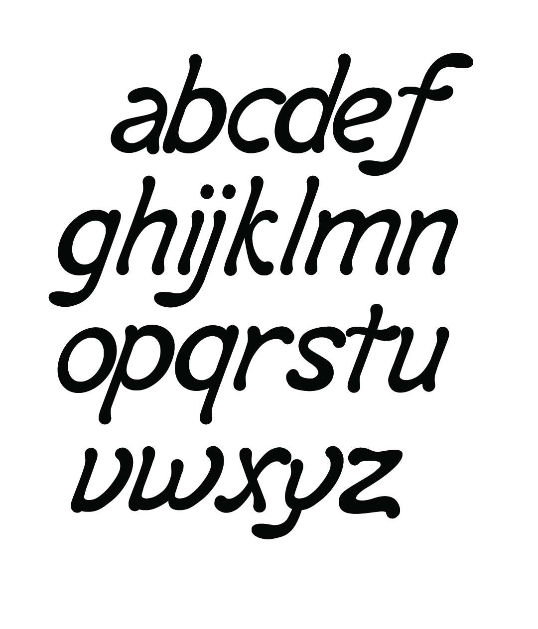
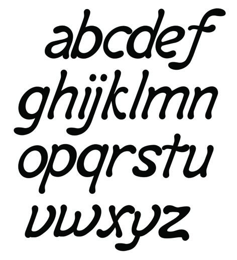
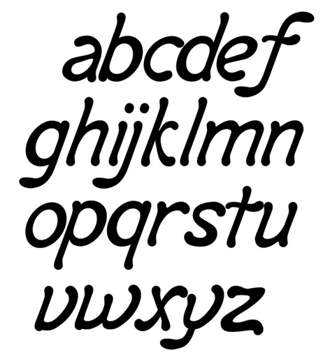
In my leisure-time I am working on a Typeface inspired by an old lettering from a Portuguese Pharma company.
After some search (posts here in Typophile) I found some similarities with Hubert Jocham’s Milk. But even so I decided to go on.
I would be thankful if you could take a look at it.
There are certainly some problems with some glyphs at the moment (for example I dont like the S, T, Y) The V, W, X, Y and Z also need more work...
Just need some feedback before I can go further with it...
Thanks a lot for your help
António