
Hi, this is the first thing Im working on...and Im sure you all have sugetiosn and opions, I have no school on this dark art and i basicly let my self go. I really want to learn but i have no guidance.
Thank you all!
::ROM::
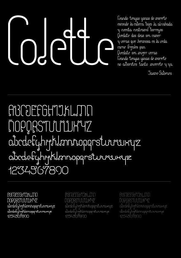
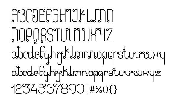
Hi, this is the first thing Im working on...and Im sure you all have sugetiosn and opions, I have no school on this dark art and i basicly let my self go. I really want to learn but i have no guidance.
Thank you all!
::ROM::

Hmmm, no response yet. My 2 cents:
I think the biggest issue I have with this typeface is the overuse of your embellishment. It seems forced and unnecessary in most places, especially the lowercase. I'd try removing it from all but a few lc letters and consider reworking some of the uppercase for a more consistent placement.

The word "Colette" looks great in this face. I've heard before thats what was said about
Avant Garde at one point. stay in there!
Chase Langdon

I think this is a beautiful display face in the right setting - I'm sure there's a great logotype waiting to happen in here!
I would really like to see how it works with some other short pieces of copy - this face is obviously more suited to a couple of words at a time, rather than the block of text above...
Great work, love it!
Thanks for your comments.... they keep me on working!!! i've all ready made a logo with it... check my website at the "personal" section... first image is the logo... www.romstudio.com.mx

Yeah it would be really nice to have a plain version too. So you could mix and match the embellishments for longer pieces of copy.
Captured from web.archive.org on 17 Apr 2015. view this capture