
Typophile
Looking for freeware fonts similar to these

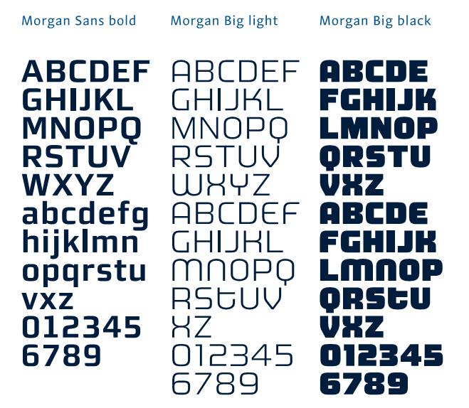


You might wanna read The value of type by Erik van Blokland (Hey, 10th anniversary!) and the FAQ on Free Fonts.
In the latter you’ll strike a bonanza or two (e.g. you’ll probably like Kontrapunkt).

> I have to be able to identify similar fonts to those in the picture because the real fonts aren’t free.
Have you ever stopped and wondered why these fonts aren't for free?
Bald Condensed:
I know why they aren't free because they where designed by a Portuguese Designer specifically to a project. But my design teacher decided to obligate us to do a new presentation of that project and use the most similiar font possible. The font that we going to use is one of evaluated topics.

I think that what Yves was after, Jonny B, was more like ... the reason that those - and most high quality fonts aren't free is because they require many, many hours of work to do correctly.
That said, your situation seems to present a very legitimate need of free fonts as close as possible to the originals. You aren't going to find anything precisely like the Morgan and Stella series for free - or nearly as well made - but you might check DaFont's Sans Serif section for something as close as possible.
I should have elaborated indeed. It is very unlikely you will find fonts similar to these for free because a whole lot of talent, skill and effort went into creating these specific fonts. I don't see anyone else doing the same quality job and then give away his/her work for free. It's just doesn't make sense.
> they where designed by a Portuguese Designer specifically to a project.
No they were absolutely not -- they were designed by Mario Feliciano not "specifically to a project" but for retail, to sell for profit. So anybody who wants to can purchase a license. That's the mechanics of economy. Somebody produces something, and then sells the fruit of his labour to be able to buy something somebody else produced (like food, lodging, goods, …)

at the risk of going against the grain, search for the Kontrapunkt typeface, it's similar to Morgan Avec, and free for non-commercial use
… and had been mentioned in the very first reply.
;°)
No, please do -- I was merely providing a context. Kontrapunkt is an exceptionally good freeware font, and indeed bears a certain resemblance to Morgan Avec.
Indeed. :^D
Thanks to all the replies. After some research it seams that the Kontrapunkt would be the best options. Once again, thanks to all :)

This brings up an interesting topic but I'm not sure if it is enough so for a new thread. Why would a teacher tell their students to use something as close as possible (or the same)? Maybe I'm assuming a lot here, but doesn't that force the students (obviously) to go online and perhaps end up on sites that only promote piracy?
> Why would a teacher tell their students to use something as close as possible (or the same)?
I thought exactly the same thing. The part which goes "(…) and use the most similiar font possible. The font that we going to use is one of evaluated topics." set of my alarms.

Tiff, I had an assignment back in David's 110 class to reproduce exactly an article I had found in a magazine. The aim of the exercise was to get us to observe someone else's work very closely and to familiarize ourselves with the type control aspects of Quark (those were the days, not). It was not a creative project, but more about the tools. In that case I had to find matching (or as close as possible) typefaces from the school's type library.
JonnyB2's description sounds similar, no?

"Why would a teacher tell their students to use something as close as possible (or the same)? "
Mee too!? I mean a skilled teacher could compose something of parts known to be free and accomplish the same goals, no?
Cheers!
I can actually see the value in this. Assuming that the students really stick to "free fonts," it's forcing them to choose fonts from a much more limited set to try to get the closest matches to some specific fonts. The exercise could help them learn a lot about letterforms, I'd think, and perhaps a bit about differences in quality.
Regards,
T
Hmm. Maybe I've been reading too many EULAs and I've forgotten what it is like to be a teacher and a student (having been both).
I think one can study another's work and have a great discussion about it without having to actually create something similar. Articulating why it is good or what makes it work would make a great essay. I guess, in a way, I can see how it would be helpful though. I just think it puts the student in a dangerous position of having to make a choice (find the exact and pirate it or find something close that is genuine freeware, hmmm?) that they otherwise might not. Yes, yes, students have millions of other reasons to find themselves making that decision, but from an educator's perspective I don't think it is wise.
Captured from web.archive.org on 28 Dec 2011. view this capture