
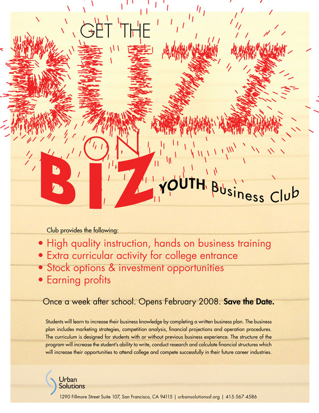
These are going to print. does the background look better lighter or harder? How can the type be a little more exciting?
comp 1:
comp 2:
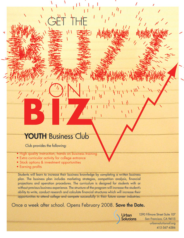
These are going to print. does the background look better lighter or harder? How can the type be a little more exciting?
comp 1:
comp 2:

Light background.
Type exciting? You've got your excitement with BUZZ. I don't think you need to attract readers into two different things. You'r BUZZ is already doing the job. The only thing I find distracting is the lines on B. the joins.
Captured from web.archive.org on 8 Nov 2013. view this capture