
Hello, I thought amusing to share with you what happened to my belt once I trow it on the bed of an hotel.
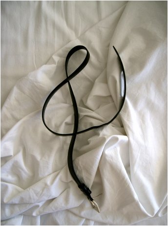
Hello, I thought amusing to share with you what happened to my belt once I trow it on the bed of an hotel.

Haha, what a peppy ampersand! Très élégant! Next time, you might try throwing your user icon?

normally, the thick and thin strokes of a typeface make sense because they relate back to calligraphy and the act of holding and writing with a pen. here, the thick and thin strokes make a whole different kind of sense and it is quite pleasant to look at.
R
a whole different kind of sense
Is it really that different? Broad-nipped pen oder broad belt—who cares? ;°)
Yeah, well, I’m going out to Good Will to buy a bunch of belts right away - Let’ see that’s 26 X 2, 10 numerals, punctuation, diacriticals... Hmmm.
R

Russell. You may not be able to do all the characters with a belt ... want to borrow my suspenders for the Y?
they aren’t too bold are they?
R

The cover for Argentine rock band G.I.T.’s second album (1985) featured belts (actually, two of them look like wristwatches!) spelling the initials of the band members’ last names (Guyot, Iturri, Toth)... The results are not as pretty as Alessandro’s image, though. :-)

Captured from web.archive.org on 10 Oct 2007. view this capture