Typophile

Havok - Homebrew Label Critique

sublevelbus

Just new to the site,

I will be brewing up a batch of homebrew in the back yard this weekend. I started tinkering with a label recently. Any feedback, positive & negative welcome:

Thanks!

Andy

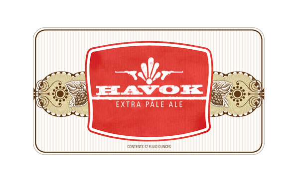
Clean version:
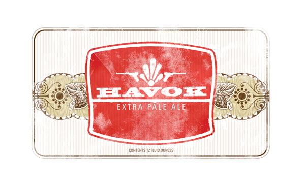
And the ever so cliché distressed look:
So please Jump in!

Andy - I would probably drink bottle number one. I like what you are doing so far. My only suggestion would be to fill the surrounding white space with some chunks of khaki and maybe bring up the 12 fl oz to the red area. Have you thought about giving the rectangular box a subtle curve on the top and bottom to mimick the shape of the red badge? The inside elements will make a great bottle neck label. I like the distressed outline in version 2. Bullet holes?

Great suggestions. I will contine working the label with these aspects in mind...i really enjoy the subtle curve you gave to the label shape. thanks a ton for the feedback!
Andy

I think a white star under the extra pale ale would be cool. And or something - a rosette? - in the four corners of the red box. I think the lines in the background might be bent into a waist centered on the word havok. This is very cool already. But I want to encourage you to keep going.

great start. I myself am in favor of the white + pinstriped background, but I’d like to see it brought in vertically to make the red badge more dominant. Possibly to the point where the red badge runs to its outer edge. As for the distress: let the condensation from the bottle have its toll on your design.

Label 1 here too.

R

How did it turn out?

The beer itself has started to ferment. another week and we can bottle it. another two weeks in the bottle to condition, and we shall find out if it was worth the toil. As for the label, i will be posting some changes shortly-Thanks again for everyone’s input!
Cheers!

Nice overall. The lugers are cool, but I’m not sure how they relate? Is this a retro German thing? Somehow the scale of all the elements doesn’t mesh all that well... you’ve got jumbo accoutrements above the type, small lugers flanking it, and then off to the sides you’ve got dainty foliage.

I’m all for keeping those fine details as it adds to the overall complexity to provide character. I just think right now it’s going in a couple too many directions.

Also, your condensed gothic sans (Trade? News?) is not my favorite. It feels like you left a default font there (but had the sense to not to use Helvetica). Consider something wide and heavy at a very small scale, and still in caps. I think that would blend well with the red slab serif and yet not leave it so generic.

I think, agreeing mostly with Joe, that if you took the “Extra Pale Ale” out, I would have no idea what this was labeling.

Cheers!

I think the red “shield” area and the background ornaments seem disconnected. They seem like two unrelated elements to me. I would beef up the “Extra Pale Ale” type, and as Joe said, maybe look at a different typeface for that. Overall, I like the feel. And the ornament above “Havok” seems a little arbitrary.

It seems like a beer named HAVOK, should not be contained in nice little square labels with aligned type. One thought was to look at a bandana and carve out an irregular shape from the paisly and really give the type treatment the energy it deserves. Kindof a grunge paisley explosion.

If you didn’t want the western look, maybe go urban havok with it and make a stencil (or stencils) and spray the bottles.

Anyhow, some fine looking homebrew. Hopefully it will taste better than some of the homebrew I’ve tried :-)

R

Captured from web.archive.org on 8 Dec 2007. view this capture