Typophile

HELP Comic Sans Crisis

Koppa

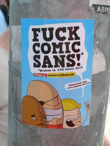
My supervisor just showed me the slide show she created for a presentation she is giving today. It is not very funny, but she thinks it is, and to add insult to injury, the entire thing is set in Comic Sans. I had to bite my lip, as the proliferation of Comic Sans in our company emails has become a running joke among a few of my peers here at the plant, and this is the icing on the cake.

Is it my responsibity to enlighten my supervisor? I consider it an embarrassment to the art department as a whole, but I am not the art director, so should I just let it go and shake me poor head in despair?

What would Tschichold do?

What’s the business impact of the presentation - are customers or suppliers the audience, or is it internal to your company?

Tschichold would use some sabon to wash the socks.

There are various ways to deal with difficult or visually challenged clients, customers, co-workers and designers – a search of typophile may reveal some useful ideas.

> What’s the business impact of the presentation

Internal...it’s over already. I mostly posted this for the amusement of other folks like me...

The real question is: If you have a supervisor who is artistically, graphically, and intellectually your inferior, how in the hell do YOU cope with it? It’s one thing if you’re in a larger market, where you could consider finding a different employer...but suppose you have no other legitimate options for employment?

I guess this is a business ethics question and may not be appropriate for this forum.

So...have fun with the your replies, please! I could use a good dose of humor.

The real question is: If you have a supervisor who is artistically, graphically, and intellectually your inferior, how in the hell do YOU cope with it?

Get out before they get to you. Seriously.

Your job is to sneak into his/her office and uninstall comic sans. Or, even better, open up a better typeface, change the name to ’comic sans’, resave it and distribute it throughout your corporate environment.

Get out before they get to you. Seriously.

This is the best advice I can give, too.

“So...have fun with the your replies, please! I could use a good dose of humor.”
Okay, tell your supervisor it’s fine to use C. Sans, s/he just has to laugh through the whole presentation, even if it’s not funny? just a little Comic Sans relief.

Cheers!

This sounds like an episode out of The Office

David

>Get out before they get to you. Seriously.

>This is the best advice I can give, too.

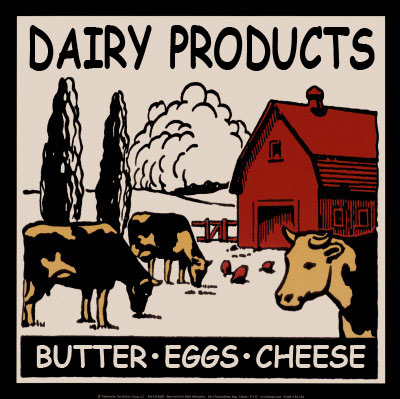
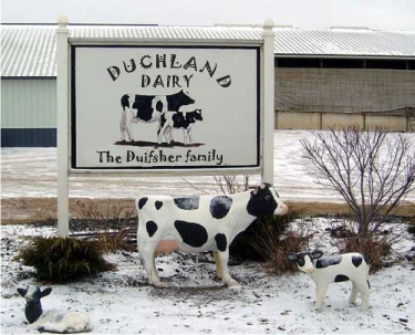
Come on, he works for an organic dairy, for cry’n’out’loud! If this were a design company, then maybe look for another job, but a dairy?

>What would Tschichold do?
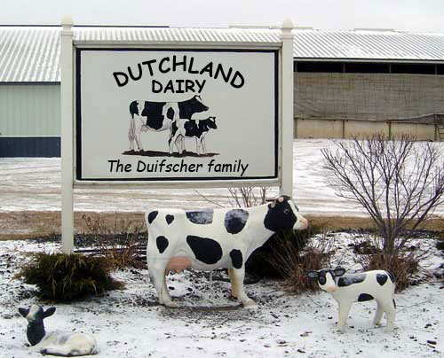
He would quit the dairy and go freelance. :-)

Adjust the weight downward in FontLab Studio. Slim the guy out. Technically it’s a very good font, a diet is all that called for.

Hey, most of you folks hated Helvetica as well, up until the rolling hype came through. Type folks are really a herd species.

Gerald

punch her in the face... works every time :-)

Tell her a slide is missing, and that you’ll send it to her. The text on the slide you send her should say “I apologize in advance for being a worthless idiot who thinks it’s cute to inflict stupid humor on coworkers. I apologize in advance for being ignorant of the field I have chosen for my career. But please be nice to me, I can’t help being a worthless idiot, you see, my father was a sheepshagger, my mother a sheep, and I’m just lucky to not be half as stupid as they are.”

Or something to that effect.

I certainly am enjoying this. Thank you all.

> Come on, he works for an organic dairy, for cry’n’out’loud...

Not just any organic dairy. THE organic dairy. Mostly I love it here, and I do my best to smile and laugh through the frustrations. In many ways this is my dream employer (if I have to work as a graphic designer in the obnoxious world of marketing).

Frankly, I’d rather be a junior high English teacher.

You should redesign ALL of their packaging using Comic Sans as the sole typeface... Then redesign all of their forms, letterheads, signage, legal contracts, etc., ALSO all in Comic Sans.

:-)

ricardo gives away the fact that he HAS a copy of comic sans on his computer... DIE HERETIC, DIE!!!

I agree that a thinner weight would be in order if everyone wasn’t already sick of its overuse.

ricardo gives away the fact that he HAS a copy of comic sans on his computer

ROTFL, Brett!!! But I am at work right now, heh-heh. It’s not really “my” computer. :-D

I would have thought all you haters out there would have the font installed so you can feel smug and superior when you get email or view websites set in the font.

Cheers, Si

I remember when we were setting up TypeCon a few years ago and one of the guys at the conference centre was thrilled to discover we were type people, as Cosmic Sans was his favorite font.

The one good thing I suppose is that font people have become more sick of the Comic Sans discussion than they are of the font itself.

Cosmic Sans, Nick? Sounds like a transcendental typeface, hee-hee. ;-)

[EDIT] Funny story, by the way.

> The one good thing I suppose is that font people have become more sick of the Comic Sans discussion than they are of the font itself

I suppose that might be true for some of the font people. I, on the other hand, still giggle every time I fart.

I, on the other hand, still giggle every time I fart.

I saw a take-off on candid camera where where the camera was on some people who were pedaling the fake bicycles at the gym, while someone with a fart button lifting weights in front of them “farted” with each exersion.

The faces they made were real funny, and the whole thing had me cracking up.

Another time a band I was in went on a camping trip, and we had stopped earlier in the day to pick cherries at a place that said any you eat while picking were free. You only paid for what you carried out.

Well, you wouldn’t have wanted to be in that van on the way home. We all were contributing to “the tune”, but the sax player ’cut’ one that we estimate went on for about 90 seconds. and the SMELL! We were hanging out of the windows, but still cracking up so hard our stomachs hurt.

Farts are funny. Even the word is funny.

why stop at Comic Sans?

R

The martyrdom of Comic Sans.

R

Mister Koppa, if it makes you feel better I cringe at the display boxes of your company’s milk cartons every time I go to the grocery store! Stonyfield’s boxes look a lot more professional. Maybe pointing out a competitor’s boxes will help? :)

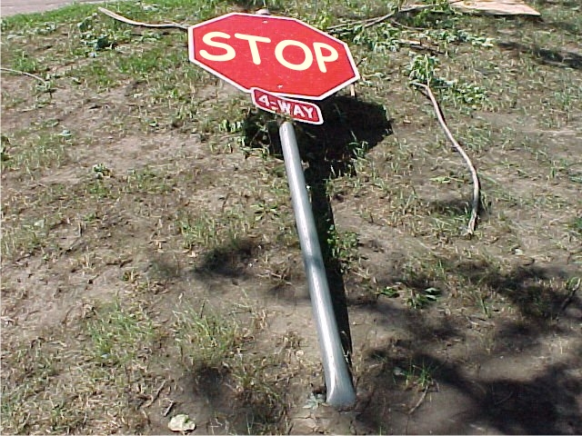
You must’ve missed the stop sign.

I’m not exactly sure what you’re referring to when you say “display boxes of...milk cartons.” The only milk that has a display box is the new shelf-stable aseptic single serves. If that’s what you’re referring to, I am in full agreement. Not too great. Had noting to do with it. The refrigerated milk comes in boxes that are never meant to be displayed, as the milk normally goes from the box to the retail cooler. I hope you will agree that our half gallon is the most classic of the bunch. I think it is.

Now if you’ll all please heed the stop sign and do everything you can to stop this from coming back to haunt me, I’d really appreciate it. We can talk milk in a separate thread.

Thanks.

I picked up a weekly paper called Now and at the back are all the call girl and escort ads and there were a bunch in comic sans. Very wrong.

Now if you’ll all please heed the stop sign...

I think he wants us to stop adding comments to this thread. :-)

>I picked up a weekly paper called Now

Tell people you only pick it up for the movie times. That tends to work for me.

I think he wants us to stop adding comments to this thread. :-)

On the internet, I have found some of the longest threads are the ones you wish you had never started. Especially if you hit ’send’ with a horrendous spelling error in the subject line that can’t be changed. I once had one of those go on for months in a newsgroup.

With these kind of things the best strategy is to not care. Murphy and his minions will tire of it when they see they can’t get to you.

>Tell people you only pick it up for the movie times. That tends to work for me.

I actually picked it up because there was a really nice script font on the cover.

Actually I’m not sure if thats better or worse than saying I picked it up for the porn.

;-D

Captured from web.archive.org on 14 Dec 2007. view this capture