
what is this insane thing? and is the L actually part of the face? it doesn't even really match.
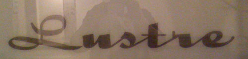
what is this insane thing? and is the L actually part of the face? it doesn't even really match.

Holly Script is very similar with a cap 'L' that matches only slightly better.
Ahh, it looks like they gave the 'L' a bit of a squash and a squoosh.
huh. crazy. i actually like it better squashed. more, um, refrigerator-y.

is this type? or is it a piece of lettering?
i have some samples of upright script with capitals quite different from the lower case. i think this was something of a trend in its day. perhaps the L could match somewhat more with the lowercase, but i always like this kind of effect.
Captured from web.archive.org on 25 Apr 2015. view this capture