
Any ideas what fonts are used in this (esp. the title)?
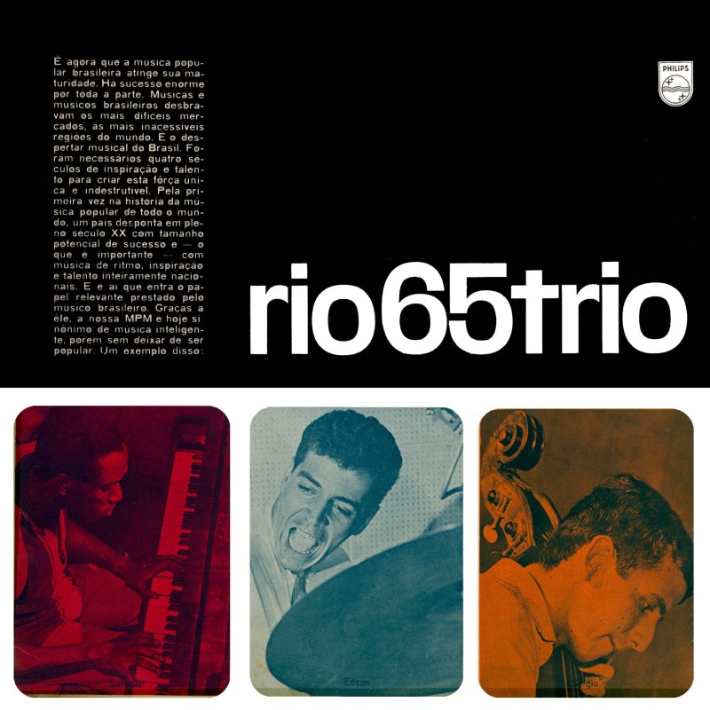
Thanks, as always,
--Michael.
Any ideas what fonts are used in this (esp. the title)?
Thanks, as always,
--Michael.

looks like a right old mixture to me... the numbers are bureau grotesque, the r has an antique olive flavour...
Yes, but I can't seem to get past thinking all of the glyphs belong (came?) together...
--Michael.
------------------------------------------------------
// love what you do or do something else. //
Michael Ebert -- graphic designer, jazz saxophonist, horror movie devotee
------------------------------------------------------
you're right, there is a nice balance to everything, although the 't' jars somewhat
I probably would have expected a curled tail on the "t," given its AG roots... you too?
--Michael.
------------------------------------------------------
// love what you do or do something else. //
Michael Ebert -- graphic designer, jazz saxophonist, horror movie devotee
------------------------------------------------------
No thoughts on this?
--Michael.
------------------------------------------------------
// love what you do or do something else. //
Michael Ebert -- graphic designer, jazz saxophonist, horror movie devotee
------------------------------------------------------

I was looking at some old Photo-Lettering Catalogs, where I think they call this style 'obround'(notice the oblong counter of the 'o'). Many of those types had a tailed 't', but some had tail-less alternate characters, so that suggests that this is consistent with a 60's - 70's advertising look. It was the 'r' that seemed harder to match, and I don't think I saw anything identical to this sample -- not too surprising, considering that the samples in these books are just a few words, and not alphabet showings in most cases.
- Mike Yanega

The skeleton reminds me of Westerveldt, but I can't find any more iterations beyond this one.
Captured from web.archive.org on 18 Aug 2013. view this capture