
Please see my last post for current thoughts...thank you :)
| Attachment | Size |
|---|---|
| eternal regular oct08.pdf | 26.81 KB |
Please see my last post for current thoughts...thank you :)
| Attachment | Size |
|---|---|
| eternal regular oct08.pdf | 26.81 KB |

It's pretty obvious that you've assembled these letters from components. They are very good looking components, and this is a great way to start, but now the letters need some individual personality.
The un-connected horizontal in the A is great. a, c, e could be mistaken for glyphs in a sans-serif font. The tops of the D and R (and q) look really weird to me. I'd straighten out the part where the bowl meets the counter. The curves in the f and j are too straight, bend them more. The g is great, keep it, it fits, and maybe add some serif-ness. The tops of the verticals in the H should match the uppercase I, not the lowercase l. The r has some outline problem -- very faint white space between the vertical and the ear. The S and s are falling over to the right (a common problem). The shaved-off bit on the t is just the kind of personality I think you should add elsewhere. The flair at the end of the z is good, keep it. The & is too wide or bulging -- make the backwards moving part of the curve less horizontal.
Thank you for this. Components: yes. That was the only way I could imagine. I have much to learn. I was concerned the letters looked slightly disparate, as though from different fonts. Perhaps that's because they were made from bits. Yes they definitely need more work.
The a,c, and e wanted to stay nice and open and I couldn't see how to fit serifs into them. I quite like the straightish ends.
Yes, the D and R and q looked funny to me...didn't know I was allowed to straighten that part! I don't like the & at all.
Well I'll play with it some more. Thanks for the tips.

I like that 'A' as well, although I think the left stroke is probably a bit too thin. Some of your other caps have the same problem.
As for the sans-serifness of the 'a' and 'c', try incorporating subtle vertical spurs on the top terminals (and maybe on the 'r' as well), look at your question mark! That is what I mean, basically.
The 'b' looks fine. As Matt already pointed out, the tops of the 'D', 'R' and 'q' aren't working. I think the 'q' should resemble the 'b' more. Somehow I think the crossbar of the 'f' should be flipped on a horizontal axis, as in that the shaved off slope is going downwards, instead of upwards. The serif on the 'G' looks a bit attached. The top serifs on the 'H' don't look right, I think they should be more like the bottom serifs.
I like where you are going with the 'k', though it could use a bit of character. The 'o' has very bumpy curves, as does the bottom of the bowl of the 'q'. Apart from the 's' leaning to the right, I think it is too light, the spine can use some more weight. I like the 'v' and the 'w'. Last, look at the stress of your contrast, I don't think it is completely vertical. If not, the counter of your 'o' is vertical, it should probably be rotated a bit, to echo the stress of the rest.
I think all in all it could become a very nice typeface. :)

I think your overshoot at the baseline is too big. Take "n" for instance. The right stroke goes too low.
Letters have different weight. "a" is heavier than "c" for instance.
Your S, s and & are falling right.
I like what you did with "z" on the bottom, but you'll have to balance it. It looks like the bottom is going too far to the right.
"g" looks smaller than other letters (compared perhaps to p and q) because you tried to box it to the descender. Bowls are normally smaller with this style but this one definitely looks smaller than other letters.
Is this font supposed to be a mixture between serif and sans serif? If not, you're going to have to do something about completely sans serif letters (e and c).
It is very nice to have honest and constructive advice where to take this! Thank you. I will iron out the bumps and see where other letters want to go. Await next instalment! Cheers,

There are a few colour issues as well. Look how heavy the 't' appears compared to how light the 'E' is, for example. I think this has a lot of potential, and I love the 'k'.
- Lex
This is all very encouraging. The stems on the capitals want to be thicker than on the lowercase. Is that normal? And the curves want to be thicker than the straights? As I said, no technical knowledge, just experimenting and finding what looks right. This is quite possibly far too ambitious. But I guess I won't find out unless I play. Thanks so much!
Yeah, it's quite normal for capitals to look thicker then lowercase. And curves/diagonals to look thicker then straights. You have to optically correct these illusions.
But usually it only takes a couple of units thinner to fix it.
Yes, that seems to do it. Busy on the ampersand, colour, wobbly curves and those letters which didn't work yet. Still have most of the uppercase to try too. It gets quite addictive, no? ;)
Just to clarify; there's absolutely nothing wrong with starting a font from component parts. Don't feel bad about that. I just meant that it should be a first step. :)
-matt
Thanks :) It was very definitely just a first step!

It's noyce! (very nice)
There are loads and loads of successful seriffed fonts with a g of these "small" proportions. It's not so abnormal.
t only looks heavy compared to E when they're next to each other, mainly because E contains a lot of white space. t looks fine in other combinations. The point: typeface design involves compromise. Certain combinations are always going to look awkward. Some type designs manage to minimize awkward combinations, but this one has design parameters that do not allow that degree of optimization. Awkward combinations are something you'll have to live with.
c and a need serifs. e rarely, if ever, has a serif in seriffed fonts. Look at Charter for example.
r could benefit from more weight at the end of the stroke---a serif might do the trick.
The established convention for stroke width is that capitals have a slightly heavier stroke than lowercase letters, because they are larger and appear more natural this way. I don't make this stuff up. Other type designers do.
j a m e s
thanks. i can still fatten the E and slim down the t as long as they fit with the other characters, right?
Yes, i am beginning to think the a and c need serifs. i wonder if it will begin to look like the Guardian typeface. i hope not.
the thing with the g was that i didn't actually like it very much and thought it looked out of character somehow. I'm still playing with ideas at this stage. :)
...i can still fatten the E and slim down the t as long as they fit with the other characters, right?
If you really weant to do it that way. I wouldn't. Leave t and E as they are and test them with other characters to see how they look. t only looks heavy compared to E when they’re next to each other. Certain combinations will look awkward. Test t with other characters, test E with other characters. If t looks okay with other characters there's no reason to change it. Same goes for E.
j a m e s
See the Draft 2 version. Comments/tips/criticism needed please! :)

Just looking at Eternal Draft 2. The "e" somehow bothers me---seems top heavy. The "s" and "S" I think need to be stronger at the lower terminal. Overall I like where this typeface is going.
i think i'm going ahead with the semiserif idea, for now...perhaps a full serif sibling later. (maybe a sans if i really get into this!)
Now putting a spur on the U and wondering about that e. it was the starting point for the whole font and i liked it but perhaps the tail can be longer or something.
i can't seem to get the numbers right.
:(
Hi Ben. The spacing works for display sizes, but the paragraphs of text look a bit tight.
e looks okay to me. Take a holiday from your concern with it and deal with it later if it's still bothering you then.
New binocular g looks fine.
Lower case s is more problematic. Make a replacement s with serif on bottom arm and post a revised PDF for feedback.
The thick strokes on lower case w, v and y need to go on a weight loss program ;^)
j a m e s
thanks james for that. i tried using the font in word and suddenly realised the M, N, W, w and v both uc and lc are really too narrow. metrics still difficult and i'm trying thicker bottom of s perhaps will add serif there too... can't get my 2,3, and 4 to look right...will post new version when have a moment soon hopefully. i rather like the e. what about the ear of the g? maybe needs to be straight? Italic is looking nice i think so i'll add that in the next pdf. thanks :) for all the ideas.
do you think this generally works better as a display font than a text one? i know that's not what you said with reference to the spacing but perhaps that is what it should be. but then perhaps the contrast should be higher?
Yes v could be wider. w and y look okay---they're functional in the text run.
Ear of g -- make it larger at the free end tip, and bring it up further above x-line for collision avoidance.
do you think this generally works better as a display font than a text one?
The design and detailing make it shine the most in display applications, altho it's surprising how capable it is at text. Before you go widening sidebearings try the text setting with some positive tracking. If it works reasonably well then you may be able to leave the sidebearings alone for a while. Hope I'm not too late on that.
j a m e s
i'm also fixing some of the serifs as they were all the same size and so slightly unbalanced on some shapes. I'm suddenly not too sure about the capital M. Here anyway is the latest version to have a look at.
Thank you for your very nice encouragement James :)
The latest iteration looks great. I'll get to it in the next few days and try to post something...it's a pretty full stove this weekend.
j a m e s
i need to spend time on it as well, so no rush for feedback :)
I appreciate your help so far. This is the first font i'm seriously trying to make so it means a lot to hear positive opinions. Thanks,
Well I couldn't look any longer at those particular shapes so had a twiddle and came up with the start of the black weight...if I ever manage to finish the Regular. Or should that be Medium?
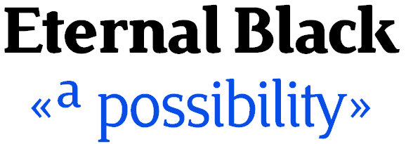
The black looks very good, and importantly it's got spunk now! Jimmy Cat like very much.
I would keep developing it as the black weight and make an additional font with a big increase in stroke width (but not so much horizontally) and counterspaces almost as large as these.
Bug Blatter Megagrotesk has a very fat stroke in all directions and very small counters. Very small counters would ruin your tasteful spunky design.
The k can be remedied by bringing the arm & leg in so it touches the stem.
Adding the serif to s helps balance it. Extent the bottom arm to the left a bit.
j a m e s
Eternal 3
a -- add a small amount more rigor to the bowl
d -- south eastern corner looks undecided
e -- this is very good. neat detailing. thin the bar a bit, just a bit.
f -- neat chiselled detailing like the e
g -- test tail gap performance at small sizes in print. This may work better with a wider gap and rounded-off stroke end.
h -- excellent. a nice simple h
k -- gap visible from low earth orbit. your serif design and detailing are very good.
m -- asymmetric serifs and body. asymmetry is good.
n - ain't broke don't fix it
o -- reduce horizontals a small amount to match line contrast to stick-and-ball letters.
p -- could be drawn narrower, or left as is.
q -- aha...mhm...yep...I see.
r -- detailing and visual interest here is fullsome.
s -- this is being redesigned.
t -- standard t structures have the curl project level with the bar.
u -- narrow it for more "u-ness".
v and w -- missing soft detail at baseline vertices.
x -- wonderful x. don't change a thing.
Numberals:
1 -- would be more legible if it was wider. see example
2 -- see example.
3 -- try it with the lower bowl stress reversed---like b. see example.
5 -- if you change the curve body on 3 you'll want to do the 5 as well
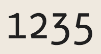
Can we have a PDF with letterspaced text set in columns please. 10pt on generous leading, at least 14pt -- 16pt lead. Ten words per line, play with the tracking until it reads properly.
j a m e s
I think the ear of the r needs to have some more weight. It has to fit with the other characters. The s leans to the left. Try extending the lower left stroke. The 1, 3 and 4 are too light. The 8 leans to the left. Have you tried to make the hook of the f a tad longer? (a bit like you have in the fi-lig). I think it might define the shape better. The same goes for the t.
I think the waist of the k should be lowered a little bit. It seems to me the lower leg is too long, and the top one too short. Somehow, the o doesn't look right. Compare it to your capital O. The same goes for your c, e and the top of the g. I think it is the contrast (weight) that needs some work on those characters. The same problem exists in the italic.
How about oldstyle figures? You can make more creative shapes with those, so to decide what kind of numerals you want (and then extend that to the lining figures). I like your questionmark, but the one in the italics seems to be too small?
Overall I think it is definitely coming together pretty nicely. If you loosen up the spacing a bit, you can probably judge longer text settings better. Keep it up. :)
Thanks guys :) That's very useful. I'm playing with some of those ideas. The o is looking better i think. The s looks better with the bottom taken left more. In fact all of those comments have helped with the shapes. However, i don't understand some of the phrases...
an additional font with a big increase in stroke width | Do you mean like an extended version? Or just as fat as possible?
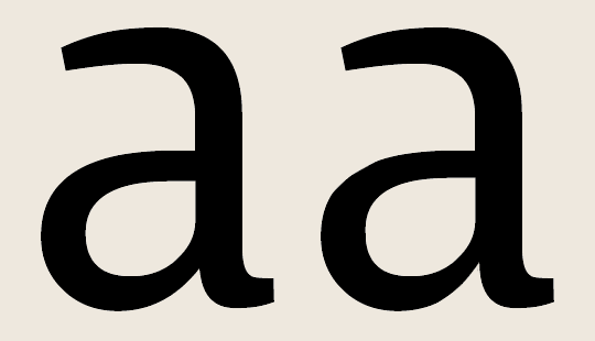
a — add a small amount more rigor to the bowl | Do you mean to take the curve higher on the left side and make the shape rounder on the middle branch?
k — gap visible from low earth orbit. | Is that a good thing or a bad thing?
q | not so great??
t — standard t structures have the curl project level with the bar. | the 'foot' part? Longer? Not like the other curly feet?
v and w — missing soft detail at baseline vertices. | Should I round off the flat bits or try slicing angles in there somewhere?
x — wonderful x. don’t change a thing. | Oops. I think I changed it. Thinner arms and legs...weight loss programme?
Numberals...yes...tricky. Am playing with oldstyle but there need to be tall ones too.
Hi Jelmar; yes, my biggest difficulty is the contrast and getting the curves smooth and the angle of stress right, as you have noticed...it's very fiddly. I've amended the o and e and about to try the g. The italic so far is just a skeleton and i have not spent much time yet on it. That italic o is horrid. I changed that nice question mark too, i'm afraid.
Here's the changes,
I'll post a pdf soon. Then you can find more problems for me to fix ;)
Thanks for the tips guys, really appreciate it.

2 and s are much improved. Try growing the oldstyle 2 to caps-height lining size.
> an additional font with a big increase in stroke width | Do you mean like an extended version? Or just as fat as possible?
Yes. "Morbidly-obese".
> a — add a small amount more rigor to the bowl | Do you mean to take the curve higher on the left side and make the shape rounder on the middle branch?
See picture:
> k — gap visible from low earth orbit. | Is that a good thing or a bad thing?
Big gaps can and often do pose problems for reading text. If you halve the width of your isthmus (gap) everything should be fine---it should work at small sizes for text and at display sizes as well.
q is fine. Yep. Yeah buddaye!
> t — standard t structures have the curl project level with the bar. | the ’foot’ part? Longer? Not like the other curly feet?
Bring the curl out right as far out as the bar end.
> v and w — missing soft detail at baseline vertices. | Should I round off the flat bits or try slicing angles in there somewhere?
I'm hoping for one rounded corner versus one sharp, a dialog of soft and sharp.
x — wonderful x. don’t change a thing. | Oops. I think I changed it. Thinner arms and legs...weight loss programme?
No problem-o.
Ben, this is going very well. Pardon my attempts at satire.
j a m e s
Here's that pdf in columns. I have widened the sidebearings so the body text appears as it would with no extra tracking, only justified. Left column is 10/14pt and right is 9/12pt.
To my eye, the spacing is too wide...but perhaps that's because I've got used to narrow spacing.
Small caps are not finished; I still have T through to Y to fix.
The numbers are still fighting me. The 2 is too short and dumpy and the 3 is too heavy. Its bottom hangs out looking bulbous.
I got some nice results interpolating the black and the regular to make a bold. The extra fat idea is great...really fudgey, and will probably need a lot of restyling, so that'll wait for now.
I lengthened the curly toes of the t and f, pulled up that bowl on the a slightly as you suggested; also, the k has a thinner knee.
I shaved off some of the eyelid of the e and likewise on the c. There wasn't enough contrast. Perhaps the G needs to be a smidge wider. I squashed the p in slightly. And that ampersand needs a tweak.
I haven't done anything to the italic. But i'm glad you liked the black spunky one :) It's funny how the regular one somehow contained the recipe for the black weight. The e there needs its curves to be a bit tauter, I think.
It's very encouraging to hear positive opinions. I'm sure I would have lost interest without your feedback, so thank you all! And, please, any comments again :)
Cheers,
The spacing is definitely not too wide. (Dare I say it could even be a tad wider?) I would keep it like this for now.
Yep-yep-yep. The spacing is just right in the columns PDF. You have a good eye for these things Jelmar. It could easily go wider and still be functional, but it will be safer to keep the sidebearings as they are and leave it up to users to add extra tracking.
Looking good Ben :^)
j a m e s
Ben are you going to make alternates for this font? An x-height small capital Q would fit right into the lower case.
j a m e s
Hi James,
Thanks for your idea about the super fat weight...i am starting on that. I found some hints on your Bugblatter page about how to add on weight (bigger overshoots, larger x-height, superelliptical beziers) and it's going to look really super. Definitely obese. Perhaps even callipygian [adj. ="having beautifully proportioned buttocks"]
No sample now, sorry! Later...
Alternates, probably...with closed off counters on the B and g and R? Those gaps slightly annoy me. I'd like to add some nice twirly swashes too. I had noticed that the small caps were almost fitting into the lowercase...but there is much else to do first...gosh! the possibilities!
Does the lowercase o need to be wider/rounder? It now begins to look hexagonal :[
Happy holidays!
That Bug Blatter thing was a quickie done for the fun of it, but if there are things there you can use for your fatboy Eternal, by all means adopt, adapt. "Callipgyian" I didn't know that word.
Jelmar is right about the ear of r. It would benefit from more mass.
The lowercase o looks okay but will probably gain functionality with extra width.
For the moment concentrate on perfecting the regular.
j a m e s
Yah, the regular still needs smoothing and checking each letter in detail. I haven't measured anything yet; it's all done by eyes only, and i now notice i've trimmed too much off the thins (like on V and v). Will concentrate on the details i suppose. Let's hope my eyes do not pop out.
:)
Take a break. Give your loved one a big hug. Pat the cat (Put the cat out dear. "I didn't know he was on fire!")
It sounds like you may be a little too close to it after much intense effort. I would take a break and give the font to a colleague you trust, ask that person to play with it for a few days, to live with it by doing some comps with it. Then a few days or a week later when you look at the comps you'll have a fresh perspective on the type design---at that point I find my feelings and reaction to it are different.
Season's greetings.
j a m e s
Absoultely right. I'm stopping for a week! Have fun! :)
Well i came back to this :)
I've posted the latest alterations. I've made some of the serifs weightier on the regular, widened the M, looked at the stroke terminals, curly toes and reshaped them. I think the tail of the g and the o still need the contrast to be better. I've given the r a heavier ear.
I have still not finished the small caps. I want the tall caps to be right first. Oh, and the numbers are still giving me grief. :)
The italic caps are just sloped for now. All those serifs need reworking and some of the lc shapes, but the bones are there already. I read somewhere that italics are generally narrower than uprights, but mine aren't. Is that a mistake?
I like the way extrabold came out, though there were a few odd difficulties such as the northwest corner of the uc N and the shape of the lc w. The crossbars on the E F and H need to be thicker I think.
As for the ultrablack experiment...well!
c needs widening. d needs rounding. e was ok until i made it too wide. g is tricky. where to put the weight without the contours crashing into each other? Smaller head? Is it called the head? the circular part. The curly k is not really there yet, but it had to curve like that to stop that leg spreading out to the right and leaving a big white space at the knee. I haven't tried any uc yet.
Please have a look and tell me your ideas. Next i want to focus on getting all the regular shapes in line.
Thanks for your opinions!
I'm on it. Wat 'til I have my coffee. Mmm! This coffee tastes good. It's fullsome and able-bodied. I'm sure I could use the ultrablack and regular to advertise coffee.
Check back later Ben. Yes, get the main caps sorted before working on the smallcaps.
j a m e s
I'm looking at Eternal 2 Jan. Prepared animations show recommended changes for g and a. Do something similar to g to the counter of o. The change for the hood of a is optional. I'm looking for a way to reduce the horizontal thickness of that top part and still make it asymmetric. The modified drawing in the anim isn't successful as far as the shape goes (asymmetry disappearing!), but shows the change in thickness that would complete the a, matching the rigor of the hood to that of the bowl, which came up very nicely.
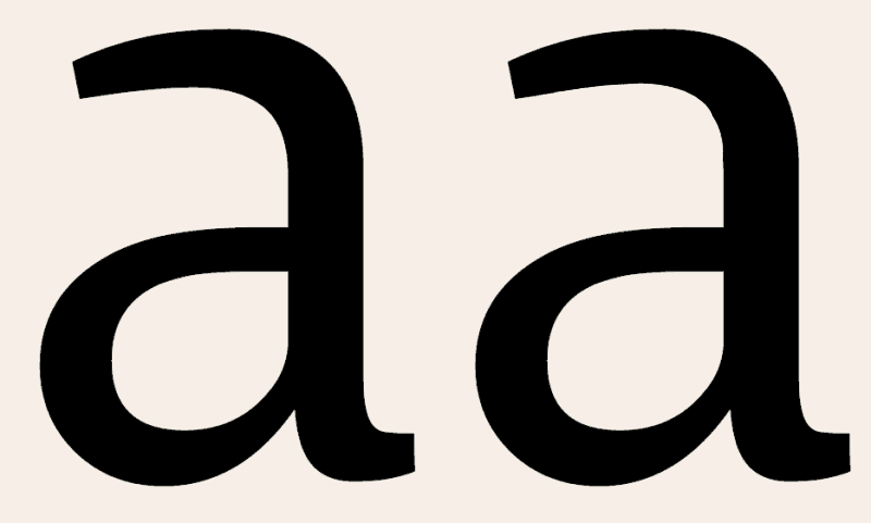
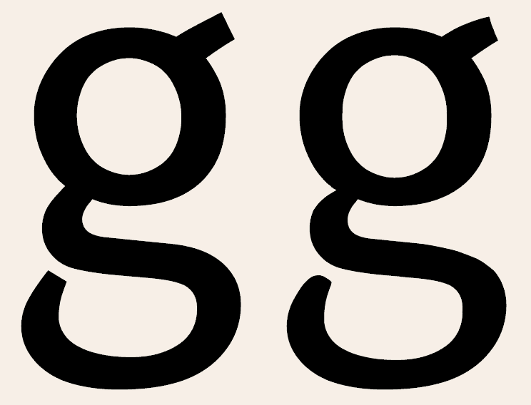
a much improved
r much improved.
What's up wth the numbers? Describe the problem(s) in detail.
For the Extra bold, the crossbars on the E F and H can go thicker, no problem.
From what I can see of the ultrablack, c looks okay (not too narrow). If you can post a pic of the ultrablack g at a decent size I will happily show how to solve its problems. Reducing the size of the upper bowl would be a good start. The upper portion of a binocular g is the body (proper), a.k.a upper occulus, but you can call it the head if you want. k is well solved, keep going with that. For the ultrablack generally, your overshoot appears excessive.
Italics are generally narrower than their regular cousins, yep. At this stage of development the regular still has some basic problems that need attention first. Put the italic aside for the time being. When the time comes to build it, yes, narrow those guys by character width and stroke width. Not narrowing your italics isn't so much a mistake as a defiance of convention. We can be philospohical about this; pretend nobody has ever seen the regular font, an italic version with forms not narrowed they would be none the wiser about. Depends who's looking at it. Some designers insist that italics have to be narrow or they're not true italics. Others will accept it on face value.
I need to see a PDF with full character sets (everything drawn so far) of each weight before advising any further.
j a m e s
Thanks very much James. i like what you've done with the curvy tip on the g, but that would be the only place such a shape appeared. As for that a, hummmm...I'll experiment.
I'm into the regular for now, but here is the g of the ultra bold if you want to see how it can be figured out...i wanted the upper slope of the tail to be nice and thick without squashing the bottom loop, so reducing the height of the body is probably the best way, though with the fatness required, it is in danger of ending up very flat looking, no?
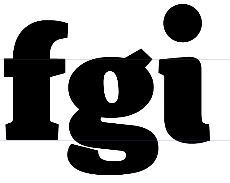
The overshoot is sizeable; is it better to reduce that or increase the x-height of the flat letters nearer the size of the round ones?
Your comments are very useful, thank you :)
I've been working on the regular weight. Smoothing and checking the colour and details. I think the uc and lc are looking good now. It's all unkerned so I can see the sidebearings and if anything needs to be adjusted. Does anything need to be adjusted?
Please check the letterforms in case i've missed anything though!
James, i didn't yet try the a and g you suggested but will look at that later.
Things i'm not happy with yet: b, o and p are not smooth and it's hard to get the stroke contrast right.
Numbers 3 6 and 9 are not quite there and i need to look at them all more closely. The 3 i find too dark on top. The 6 and 9 are just difficult shapes for me. That octothorp is not going to stay so ugly. What should i do with the % sign? Is my comma too odd? £ sign is too light bottom left.
With the non-English characters, I have not been familiar with some of the shapes and I know some of those diacritics are running wild. Are the accents at the right kind of angle? Is the ogonek nice? Should the breve be rounder? Which way does the µ want to go? I think the ð is too light on the stem.
I think my small caps are slightly too dark, but like them with big sidebearings.
I have not done anything with the italics and they are just there for comparison.
Hope you like it :)
Hey Ben,
* f -- You probably drew the bar shorter than the hood to avoid collisions on the x-line. It can stay that way if you want it to. A lot of fonts are designed that way. The alternative is to have the bar project as far right as the tip of the hood---like the t but upside down. The f-bar will then tend to crash into x-line serifs (or come very close), but will fit better with rounds.
* f-ligs: compare the whitespace inside those ligatures with the whitespace between their individual component letters when typed in the same combinations. Space the ligature stems for consistent color and encapsulated whitespace. The standard form for an f i ligature is to bring the finial (beak) out to the position the dot of the i would otherwise occupy. The finial on your f-i lig could be a bigger lump to emulate the presence of the i dot. f-l is okay. f-f -- try dropping the hood of the first f about half the distance between x-line and ascender line, then extending the hood it until it mates with the back of second f, and make the bar between them a bit thinner.
* h looks a bit wide in the body. Recommend narrowing it some to even up the color. Same could be done for n.
* m might integrate better and improve overall color if the arches were narrowed, but subtly. Try it and see how it looks.
* b o p A whop bop-a-loo-bop, a-whop bam-boo! It is entirely possible you are over-critical of these fellas. Only o is in serious need of adjustment. Make the counter taller then recenter it. Test, test, test. Put it all aside and go for a walk. While out walking think about your loved ones, or interest yourself in the street life and details of houses and cars. It's a woopy raggy world we live in. I always get a clearer perspective if I go for a walk when I'm too close to the thing I'm working on.
* Capital J is dropped design. Will work in some combos but look funny with others. Recommend making alternate lining J, to give users a choice. We live in a world partly driven by consumer choice.
* Gap on k is about right now. Try narrowing gap on K to match. Test it, see how you like it. If the wider gapped K makes more sense to you then keep it.
* Numerals: 6 and 9 take some effort to master. Study the 6 and 9 in other people's fonts (OPFs), look closely at the way the bowls join onto the stems. Learn the form. Try to emulate it. Have patience. 3 is basically okay. Angled left stroke of 4 can angle in to the right more (harmonize with 7), as you have plenty of gap next to the vertical stem. Biggest concern here is top bowl and diagonal stroke of 8. Top bowl is small, not a serious fault but a stylistic concern. Diagonal stroke needs to be thinner
* comma tail, make it shorter.
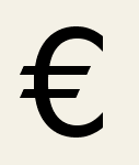
* Euro symbol incorrect form according to industry spec. The right tips of the bars should be staggered to form a diagonal alignment, like they've been cut by a slash. Bars will also benefit from more space between them. See example:
* angled bottom of exclamation stroke is a nice touch :^)
* mu symbol is fine, no need to adjust except maybe make the descender serif asymmetric or a curl if you want. Your choice.
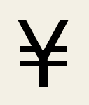
* Yen symbol -- give the bars more air, and extend them as far left and right as tips of upper v structure. See example:
* Bar and Brokenbar -- to distinguish Bar from similar characters like l and I, I draw Bar about fifty to a hundred units higher than the ascender line as well as the descender line. Amount of extension depends on the font. You've got the width right. Set the bearings nice and wide. Bar attains some of its functionality from the whitespace either side of it. Set up Brokenbar the same way as Bar.
* Asterisk is very cool by way of its impression of motion. Looks like it's spinning. Some designers insist it should appear static, but spectators seldom notice small details like that. Five prongs the way to go.
* Percent sign -- thin the connecting bar until it looks elegant (not pedestrian). Move the zeros away from the slash. Aw man they need air. Check it at small sizes to guage how much. Looks like you adapted the 7 for the slash. Hee-hee! Make the slash thinner too. Having a curved slash is another nice touch.
* Accents -- angles are all fine. Ogonek is noyce, oye loyke it. Breve curve is fine but make the whole breve narrower. Lower case thorn ð stem is fine, but thin the bar down and reposition for less eccentric symmetry.
Most of the sidebearings look okay except for a few:
* right sidebearing of b may be too short. Study combinations b-e, b-o. Compare the right side bearing of b with that of o, e. If they are the same then the bad combos I'm seeing in the PDF may be due to errors by InD CS2.
* right bearing of g looks too short. Adjust, check in combination with everything else in the lower case. Adjust until it works with the most probable combinations.
* l, right bearing and possibly left one. Set the bearings by measuring from the stem. Ignore the curl tip. The basic formula for a lower case is to set the sidebearings for the stem letters -- b, d, f, h, i, j, k, l, p, q, t -- all more or less the same. They don't have to be exactly the same, but that often works well. For the bowl pairs b-q d-p, this only applies to the stem side of them, not the bowl side.
* How short are the bearings on t? The right side looks a bit wide. A formula for designing lower case t is to set the sidebearings so they are the same distance from the stem as l and i. Then bring the tips of the bar on t out (or bring them in) until they are at zero with the sidebearings, or very close to zero. You can make them negative if need be.
* Set up f the same way as t.
* v V y Y --- usually the bearings on these are zero or close to zero. For a seriffed font it's not unusual to set the bearings negative.
Hope you like it :)
I love it :^)
j a m e s
The purple flag indicates harmony,
the best I could do copying and
pasting the tail of 5.
Try something like that.
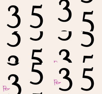
j a m e s
"bleeple bleeple"
Hi James
There's a lot of good stuff here. Thank you.
It's funny how sometimes what I expect to work actually looks wrong, and good-looking shapes just happen by lucky accident.
We did have a walk yesterday...a peace walk in central London to protest against the Burmese junta, with monks and nuns and gentle folk. It was quite meditative and a good break from work and beziers :) but I think I am addicted to type design, which may indicate I am in the wrong job (marketing coordinator!)...
Thanks for all your recommendations. I'll go carefully through them next time I open the font file.
It’s funny how sometimes what I expect to work actually looks wrong, and good-looking shapes just happen by lucky accident.
Yep. That's generally the way. Allow for some fudging to be part of the final forms. A certain percentage of what you're drawing has been predetermined by 500 years of type design history, and the 3000 years of letter history before that.
...I think I am addicted to type design, which may indicate I am in the wrong job...
You too! Type has done a job on me, I know that much.
j a m e s
Diddle di dee.
It's fiddly work. I'm repairing the 8, thinning the h, m, n, grappling with the 3, 5 and o, bending the % in all directions, getting the bearings of the t all up around my ears and redrawing the M and W like this...is there a way to describe those shapes...more modern?
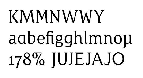
And I had a go at interpolating:
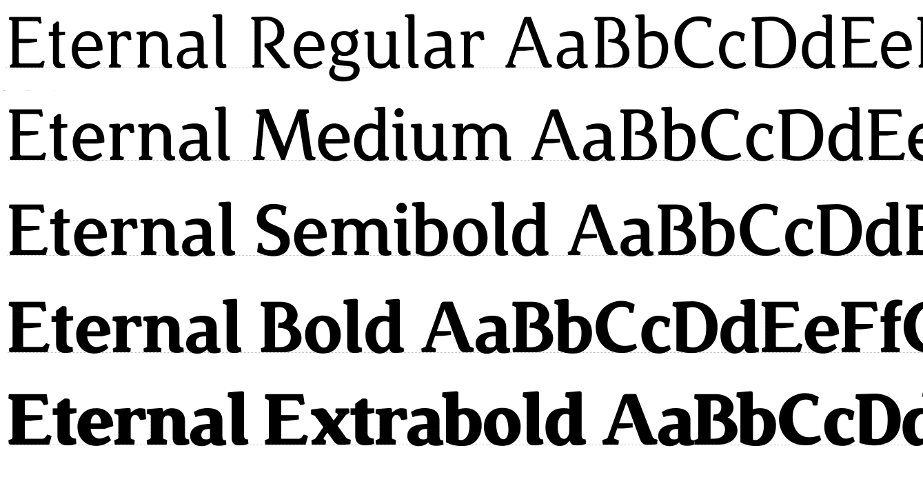
Slowly slowly...still fiddling :)
thanks,
Compare the 'e' in your Extra Bold weight with that of the Regular. The one in the Regular needs more contrast (thick/thin), just like you did in the Extra Bold. It probably doesn't only apply to the 'e', but possibly every character with a similar contrast in it (well, maybe not all, because I can't see all of them in the image). The contrast of the 'a' in the Regular is much better than that of the 'e', for example.
(By the way, it would be convenient if you could upload a new PDF every now and then for viewing it up close).
Yes, the contrast is a sticking point with this design. I liked the lower contrast originally with the e, but increased it some already. I'll try thinning the horizontal bits some more...b, c, d, m, n and u probably need reworking too. I'm undecided whether low or high contrast looks nicer, which is why some shapes don't match the others. Indecision probably not a good thing in this work!
The shapes have not changed since the 5 Jan pdf, except the glyphs in my previous post. But i'll add a new pdf later today. Paragraph text?
Thanks :)
Well, in my opinion some of the characters (like the 'e') can use higher contrast. About as much as you did on the 'a', that looks quite ok. But it can be very subtle, but I think it should be a little bit more apparent than the 'e' is now. But it's up to you what you like the most; but it should be the same on all glyphs.
And in the PDF you could show the new weights. I usually make a PDF with two pages; one with larger type, the other with paragraphs. This way you can see how the type performs as display and for text.
Ahh. Ok, here is the latest incarnation.
Don't take the interpolated weights too seriously. I have not done anything to them!
On the regular, I think i've taken too much off the top of the c, the p is suddenly fat again, the numbers 6, 8, and 9 have been redrawn, the 2, 3 and 5 are now deciding to mutiny. Which lining J do you like? Which W and M? I think i'm putting in a Thai alphabet for some reason too. I couldn't get the ff lig to look nice with the joined hood. I raised the contrast on h, m, n, u, and a tiny bit on b and d and p and q.
I like the extravagance and eccentricity of the Ultrabold. No caps or numbers yet.
Your comments are always interesting! Thank you :)
I like the extravagance and eccentricity of the Ultrabold.
Coffee! Coffee, coffee, coffee! It's got a warm and inviting girth like Aachen but avoids that font's bluntness with flavourful curves.
j a m e s
I hadn't thought to compare it to Aachen but I see what you mean. It was certainly meant to be warm and comfortable! Flavourful as well! That is grand! :)
M.bleep bleep.. . :. :: . ..:.
Eternal sample .PDF
For: Regular font shows verve and all-round crispness of form absent from early iterations. Surprisingly capable around town with competent text handling performance. Offers display typographers pedigree looks and genuine driving pleasure straight out of the ZIP.
Against: Lingering fit problems with r in the regular font. Angled ear of r creates fit problems in the heavier weights. Needs to be progressively flatened out towards vertical. r-a ligature makes a great hood ornament. Keep this and other mirthful angled end combos as ligatures.
Sum-up: Coffee, science books, hardware and lighting, manchester, biscuits, furniture, beer labels, cake, chocolate, real estate signage, optometrists will love it. Coffee, coffee, hot chocolate, teabags, coffee, coffee, coffee.
j a m e s
Nice one. That's exactly the kind of PDF specimen I mean. :)
I will have to take a better look at it in a couple of hours, and make a more constructive post. :)
Also try: cosmetics, plant & nursery, hobbies & crafts, home cooking manuals, kitchenware & kwokwi, fruit & vegetable, travel guides, house & garden, bathroom & laundry, pharmacy & health products, furniture & bedding (see manchester), wainscotting, pasta packaging, country kitchen buffet, hamburger franchise, s'more schnapps, root beer, stationary supplies, near earth asteroid warning sticker, museum & gallery collateral.
j a m e s
What seems somewhat strange to me is the stress in the p. The thickest part of the bowl is on the lower right, which I think (?) should be - considering the angle of stress on the o, e, c - on the upper right. The same goes for the b, where the thickest should be on the upper right, and the q, where it should be on the lower left. Compare them to your o, and you'll see what I mean (it becomes apparent in the word 'bold' as well). The image that words form, will look more balanced when the stress is consistent. :)
James, do you mean that the ear of the r should not slope at all? (I liked the effect next to the a as well; will keep as a lig.)
Jelmar, I think you are right about the b p and q. I'm not sure why it's got the stress reversed, so i'll switch and see if that looks better.
It's really encouraging to hear all these ideas. I hadn't started seeing the font as a product, only as an arcane hobby! Thanks :)
I mean that it may be wise to look at the letter fit resulting from all r-combinations to determine if the angled ear end is really the best way of finishing the r. It works beautifully with a, but by the time you get to the black weight the fit becomes awkward with some letters. For example r-s in the black weight is a bit quirky, and an ear facing closer vertical would make more sense to me there.
Another way of looking at it---an ear facing closer vertical poses less risk of fit problems.
But this isn't a huge fit issue. In the regular it isn't very noticable. Only in the heavier weights does it draw the eye's attention.
It’s really encouraging to hear all these ideas. I hadn’t started seeing the font as a product, only as an arcane hobby! Thanks :)
Don't let me impose too much commerciality on this font. It's your design, your baby. Ideally commercial considerations should not come last but neither should they occupy the front seat. If you decide to make Eternal commercially available then my key word lists may come in useful. Some of the ideas may turn out to be duds too. Sometimes when I look at an unproven type design (like this one) a torrent of applications (uses) and key words wells up in my head and it makes sense to write it all down somewhere. But I can be very commerically-minded at times and I recommend you get as many more impressions from other people as you can---people who aren't type designers or typophiles and people who don't work in design or advertising :^)
j a m e s
Aah. I'll experiment with that r. I like the idea of the shape changing as it gets heavier.
Some things I might change on regular: bottom loop of g wider, feet of w further apart, f and t crossbars wider, serifs heavier (perhaps), spine of s more horizontal, chop feet of v and w somehow to include a curve there, close counters on B and R (alternates?).
I don't know enough about font marketing to let it influence the direction it is taking. I think the concept was formed without a particular industry in mind, though it was conceived as a text and display font. I'll need to do more research about similar fonts/fonts that influenced this, to see how they are marketed, before I think about selling it. Your ideas are a good starting point. I'll do some mock-ups with some of those when I am happy the font is clean.
Is there somewhere a checklist of what needs to go into a font aside from glyph design/sidebearings/kerning, as I have no idea about testing/opentype/hinting and it all sounds a bit daunting the first time! One version threw up errors in Word when I tried to pdf it, and the intermediate weights have had to be different families as I couldn't figure out how to get them appearing in the same one with name and style variants...sorry to seem so amateur! :S
Thank you.
The naming conventions are quite elaborate. If you are using FontLab, Adam Twardoch posted a how-to on the fontlab msn group (but it's probaby similar for other apps as well). Can still be kind of complicated, but give it a couple of tries, and it will work (the same name but with styles thing).
That looks helpful, thanks! :)
Well two months after the last iteration, and it feels like this is going to take a LONG time :)
See new PDF at the top.
Anyhow, i've twiddled with the lowercase to improve the contrast as you suggested, made it lots smoother, you will see what I mean. I've reduced the general clonkiness and been quite detailed with double points in the apexes of pointy shapes, and am especially satisfied with the s and t. I can't get the shape of the o! Thinking about it hasn't helped; nor has just letting the points go where they intend...and the o really needs to have some influence on the shapes of the b, c, d, e, g, p, and q...possibly others. So I guess i'll just have to keep trying, look at other people's fonts, and see what i can come up with.
Do let me know what you think! :)
Ben this is in all-round great shape. The o "can be" improved, but it seems most satisfactory as it is. I am more concerned about your e. There's an easy way of making it more elegant and less eye-catching (it "dazzles" a bit much for me). If you narrow the e body a bit and raise the crossbar as shown in this animation.

The other glyph you could consider reducing the size of is w. This Venetian style of w has ruined most major text fonts for five hundred years, and right now it's doing a fair job of ruining Eternal's integration and sense of stylistic unity. The only thing you can do to these little twerps is narrow them to make them smaller, and by making w smaller it somehow seems less intrusive.
The only other thing I had time for is the curl tip on the right side of z. Can you make it taper like the curls on n, m, l etc?
m e w j a m e s
I'm glad you approve :)
I hadn't seen a possibility to make the w a different shape. I'll see how it looks to narrow it down, is that what you mean?
I liked the large happy counter of the e, but it does look slightly dippy. Let's see what else i can do with it. Yes, the z should fit more with the other curly toes.
i want the o to be more elliptical, it's a bit too round and doesn't quite match the shape of the other bowls.
Do you think the beak on the c is too pronounced?
James, are there any lowercase w shapes you recommend i can look at?
Condensing the w is what I mean. Rather than looking at other fonts for a particular w shape, it's better to adapt your own design first by adjusting it. Select each joint and shift the whole lot horizontally to the left. Try ten or twenty units of shift for each joint for starters (assuming this font is drawn at a scale of 1000 units per em) . It may need more or less.
This drawing shows how to do it as a series of steps.

After condensing it in this way you'll probably need to adjust the stroke widths to make them the same as what they were before.
The serif on c does speak a bit loud. I like it as one of those little eccentricities that can help make a typeface interesting. Consider keeping it as is because it adds flavour without drawing as much attention as the counter of e. This drawing shows how it would look if you paste the unit from s on as a replacement, making no other adjustments.

Alright, that works in being less pronounced, but it's a modular method I've used (only to get a quick idea of how it might look). Best if you adjust the existing beak on c instead of cutting and pasting, to keep it unique.
Your o can never truly match the shapes of the bowl pairs on account of the differences in structure between those letters and o, and you're better off not sweating over that discrepancy so much. The art of typeface design is in part the attempt to perfect what ultimately cannot be perfected. The effort to do that leads to creative work. By all means try condensing o to make it more elliptical, but keep in mind the need for even density and color. The current width is about right, making o a good match for the bowl pairs as well as h, n, m, u, producing a fairly even color in combination with them and other glyphs.
j a m e s

Try making two circles, each w/ a diameter of some set ratio (I did 1/2 here) of the height of the x-bar, then arrange them so that one is against the x-bar, and the other against the bottom boundary, at which point you can fuse the two w/ a line, shown at left, or an ellipse, right.

Nah, we're not doing that. Much easier to draw an ellipse of the required size and aspect with Fontlab's ellipse drawing tool.
The point I made above is that the o is just fine. Every typeface design is a collection of compromises. Ben has made Eternal into an artful collection of compromises, and that is what every good type designer does---creative work.
Perfection is boring. A technically 100% consistent typeface is usually reductive and not design at all, but rather soulless pedantry.
The "x-bar" is called the "x-line", and the "bottom boundary" is called the baseline.
j a m e s
I agree with James that the o is fine. Also the visual connection it has with other round shapes (b, d, e, etc.) is good enough.
Small details; I think the e might be a fraction too wide, although James suggestion of setting the crossbar higher might already help. The b (and q) seems a little narrow, compared to b/p, etc. I think it has the same width, but optically it looks less wide. Maybe you can try if you can optically balance this out, but we're talking a couple of units here. I like your s.
One thing that I see when looking at the pdf, is that the shapes are quite 'rigid', so to speak. They are very 'well-behaved'. You have put some playful aspect into them, like the curly endings and such, but maybe you can try to introduce some more small details that give it a more lively and human appearance. For example small changes/cuts in line-direction and things like that. I don't mean you should ditch this version, it is getting better and better, but you can always give it a try.
I am thinking little things, like in the following illustrations. Please excuse the rough auto-trace and quick edits.

Top of f edited. Very rough crossbar edit, but you get the idea. I let the top terminal flare a little bit.

Top of the p. A subtle but sudden change in line-direction I mentioned earlier. Gives the impression of a written or cut line.

Top of the t. Shortened and altered top, less rigid crossbar.
Just to give you an idea what I'm talking about. There are lots of places where you can introduce these kind of details, without making it annoying or anything like that.
I think you're right about trying to make it less rigid. It wasn't originally intended to look hand-drawn, but very clean and unfiddly. But I do think perhaps some more unique touches would help.
I'm not convinced about flaring the hood of the f; all the other terminals taper. But I like your angled arch on that p. Yes, I don't want an annoying font! I want to keep it smooth and clean, so tweaks will need to be subtle.
Anyway, I'm still tuning the shapes to each other, so i'll post another pdf soon. That o has grown on me but my gut feeling is still that it needs to be a different shape.
I'm thinking of changing the name of the font to Robusta. That suits the bolder weights. It's a variety of coffee bean. James' comments made me think of it. What do you think?
Of course, they were just a couple of examples that crossed my mind. The flaring and stuff. To make my post a bit more clear. I could see you intended it to be very clean and unfiddly, but I think some nice detailing might only make it stronger. If you do it consistently and subtle, it won't become annoying. And it will stay clean. You will probably not even see them, not consciously anyway. But it might give a page of text a nice texture, so to speak.
I noticed exactly what you mean when I increased the contrast from the previous iteration. It suddenly seemed more like writing than just shapes, and I think that's what I'm aiming for, (well naturally!) with the stress angle and slight deviations from horizontal/vertical strokes.
I've just found out how to do simple opentype scripting so the ear of the r can fit diagonally with round letters but a vertical ear when space is crunched.
Detailing, yes, and texture, yes. Hopefully I will be capable! :)
Thanks,
I'm quite confident you can do it Ben. Adding the kind of details Jelmar suggests will be noticable in different ways depending on the type size in print.
At large sizes, display sizes, everything will stand up to the prolonged scrutiny display typography invites, and at small sizes or text applications the extra detail will work as "micro detailing" and create a texture closer to letterpress, at the same time disguising the fact the outlines are digital.
Robusta. Name suits the bold and heavy weights, but Eternal is a better word image for the regular. I would try to find a name that covers the full range of weights. Maybe another kind of coffee bean, or something along those lines.
Jelmar---nice moves mister! This and your excellent work on Rough Cut indicate a strong natural ability at type design. A lightning-quick learner :^)
j a m e s
I think it will end up nice, Ben. It's already shaping up nicely, with some additional finetuning it'll be great.
James -- Thanks. Only doing my best! ;)
Jelmar, I mean it man. I think you're a natural for type design, like a duck to water, and it shows, and you have a bright future career in the bizness.
j a m e s
Do you like this direction? (work in progress)
It is looking more handwritten, unexpectedly.
Yes! Absolutely! I think this is definitely going in the right direction.
The single storey g and a are great. I see you have incorporated those little details in that g where the lower part of the bowl joins the stem. I like it! Those are the things I meant, and you should probably sneak them in other characters as well.
Also, I see a minor problem with the b which has to do with your concerns with the o. See the attached image. They are autotraces, so might be a bit bumpy. I changed the counter of the b. I 'rotated' it slightly, counter-clockwise. This way it is more in line with the counter of the o and the open insides of the c and e.
Sorry that the image is huge, but otherwise you can't see it properly. The filesize is small, though. Only 34 kB.
I'll go over your pdf again later, when I have more time.

Yes. I was happy with the outside of the bowl on that b and forgot that the inside bowl needed more rotation. I think the angle of stress has increased on most glyphs but this one was left behind.
There are other inconsistencies too! It's only when I look at blocks of text that they show up. The M is too narrow; so are the B and R. The middle branch of the a needs to be thinner and quite possible angled slightly. The base of the i is too fat.
I somehow overlooked giving the bowls of the lowercase an overshoot at the x-line, so the s or c look smaller than the v or w, sadly. Need to reconcile those somehow.
I'm not sure about some cupping on the base serifs. I think I put a tiny amount on the r, but quite like the flatness of the other shapes: another decision.
And I'm not completely happy with the w. The middle should be lower, the inside counters more open.
What a challenge! :)
Took a look at the new pdf a bit better now.
v/w -- can use a little overshoot on the baseline as well. Probably not as much as the round characters, but nevertheless. Check the word 'overshoot' in your pdf, the 'v' looks smaller. (On a sidenote, I think the w works better than the v).
y -- somehow seems a bit too wide. And the bottom terminal could use a little love, maybe an increase of weight, I don't know exactly.
r -- I hope I'm not sounding too harsh, but it's not really working for me. It looks less defined than some of the other characters. For starters I think the ear should probably start lower on the stem. A bit like it does in the n. I'm also not sure about the wedge serif on the ending.
e -- when the e is next to vertical strokes, it seem the verticals are heavier. Some of the round characters, especially the e, might need a couple of units more weight on the thickest part of their bowls. But it seems it depends on which vertical character is next to it, so it might be that the problem lies there.
single storey g -- has the same issue as the e. See the word 'vague' in your pdf. The thickest part of the bowl of the g is lighter than the same part on the e and single storey a.
k -- while it is good (!), may I suggest you look at the k of Arnhem (OurType.be). It can give you some ideas on how to make it an even more interesting shape.
y/g/single g -- the descending parts of these characters are too short? They are shorter than the descender of the p, for example. For the sake of consistency and rhythm I would make them of (optical) equal length. But if you planned it this way, I guess that's ok. :)
If I see anything else, I'll add it later. Keep it up! :)
Mmmm! These comments are fully interesting...
Give me a few weeks and I'll get back to you :)
Thank you, very positive critique.
You're right about the thickness of verticals. I haven't measured them at all and not even put them next to each other, so it's highly probable there are horrific weight differences. That's true for the bowls too. I didn't want to just copy the beziers from one glyph to another, so i'll need to make sure they're optically consistent.
I never suspected it was proper to allow the v and w to overshoot! And I accept the foot of the y needs something.
That k in Arnhem is nice; you mean the knee I suppose.
Yes, the g and y are a lot shorter than the p and q. They seemed not to need to be any longer. It was intentional. I don't know if that means I was mistaken or innovative. I can't think of any other fonts that have that quirk. To make them drop as low as the other descenders would ruin the g, I fear. Do I need to go back to the drawing board there, perhaps?
Very many thanks for the comments. Spot on :) This type design thing just gets more interesting!
As far as I know, overshooting the apex of the v/w is done more often. Usually when it joins in a sharp point. But even with your v/w, I think it's ok to do so.
About the g and y, I guess it's not wrong that they are shorter. Maybe James or someone else can give more insight in that. But I think a complex shape like the g can use the extra space, to give it some room.
And it indeed gets more interesting every time. :)
Sorry guys I'm very busy for the time being. I've got the new PDF and will try look at it over the next few days.
Jelmar: About the g and y, I guess it’s not wrong that they are shorter. Maybe James or someone else can give more insight in that. But I think a complex shape like the g can use the extra space, to give it some room.
If it was a metal font made by punching matrices with letterpunches and casting from the matrices, variations of alignment and character height would probably be as pronounced as these. As long as the ascender and descender lengths of different letters are of comparable length, spectators seldom notice these variations, unless they happen to be typophiles.
Don't hesitate to cheat a bit here and there, and break your own rules. It's an element of humanism.
j a m e s
Ahh. No worries I am going to Italy for a few nice days holiday.
My numbers are now looking much more suitable, and with lining, oldstyle and x-height versions (do they have a special name to fit with the small caps?). I've cut the corners of v and w as James suggested somewhere before (like in Dolly; what a nice font!) and experimented with the knee of the k as in Arnhem, looks nice. I've rotated the inner counters of the b and p and thorn. They match better now, thanks. I've done alternates with serifs for the a, f, j, and y. They look super so perhaps the original glyphs will become the alternates. I'll post a pdf when I'm back in the UK.
Oh, what does it mean:
[WARNING] The feature file OS/2 overrides TypoAscender and TypoDescender do not sum to the font bbox size!
How do I know what the typoascender and typodescender values should be? I've clicked the auto button but that error keeps appearing...any ideas?
THanks!
I've been discussing some of the topics raised in this thread with James, via e-mail, since he's taking a break from Typophile. As he was helping you in this thread before he left, he wanted to respond to your last post.
Consider shortening the descenders on the p and q to bring them closer to those of the g and the y. Also, after giving it some thought, make the descenders of the g and y longer. Or at least, make all of them consistent. The difference in lenght becomes especially apparent in display sizes, where it may be distracting.
About the error message you are getting on TypoAscender and TypoDescender: reduce any characters that extend past the descender and ascender lines, then recalculate the values via the Font Info menu, using the button with the jewel icon on it. The two values should add up to the numer of units per em that the font scale is set to.
It might be that only the bar and broken bar have to be shortened. If that doesn't fix the problem, some accents might have been placed too high up that will need to come down a bit.
James gave me an example: if the font is scaled to 1000 units per em, the typo ascender is typically around 850, and the typo descender about -150.
If they're a bit less you can pad the values by typing in a number manually.
As long as those two values add up to 1000 the error condition should go away. You ignore the negative sign of typo descender--only the numbers matter.
Important: make a copy of the Fontlab file first and make the changes to that to be safe.
Wow! You guys are so thoughtful :) Please thank James for his input!
Here are the alterations I mentioned a while back. It's funny that most of the glyphs I originally liked a lot have changed...the a, the e, the r, and now that g looks kind of miniature compared to the other letters. I've overdone the overshoot on the v and w but like the effect of the sloping corners. The lining 2 is playing tricks on me. I restyled the ? and #. I think the serif on the a makes it look more 'finished' somehow.
I find the ampersand ugly now. The quotes are a weird shape and too long. The R and M are fatter but the R needs work. The s/c 5 is hideous. Tilde needs correct contrast. T and C serifs longer.
Is there a general size that the fraction numerals should be? I don't know how they should line up...and simply scaling them looks stringy. Does the fraction line usually go to the baseline and cap height or is that up to me? What about the circles of the % sign?
I've kept the sans a, f, j, y as a stylistic set.
And i'm not finished giving more texture to the shapes.
Might try a stylistic set without curly toes?
And I'll fiddle with the bounding boxes.
I've spared you from the terrifying ligatures!
Many many thankyous! :)
I will check out that new PDF better when I have some more time. Quickly looked at it, and it's looking nice. If I see anything that I want to comment on, I'll post later.
James said to me that you can contact him via email to further discuss your typeface, if you want. His email is: james dot arboghast at gmail dot com.
Here are the latest changes.
Descenders are similar lengths. v and w overshoot fixed.
I've fixed the bounding boxes, thanks for that.
Here are some observations that perhaps are just my eyes, what do you think?
K and k are too narrow.
v too wide? w too narrow?
p too wide? tail of y not quite low enough? too fiddly?
Head of g too small?
M, O and Q too dark?
J descender too short?
Waist (?) of lf 3 too high, lf 2 needs more weight up top.
SC M way too narrow. Not sure how that happened.
Horn is too dark.
Diaresis not aligned with i dot.
Æ and Œ too weird?
I need to fix the contour direction on glyphs like Ø and đ.
k: I don't think it really is too narrow, instead I think the arm and leg are too light. This might give the impression it's too narrow.
v/w: Don't look too wide or narrow to me.
p: While I think it isn't too wide on its own, compared to b/d/q it seems it is. If you want to change this, I suggest you don't just narrow the p, but look at all of them; making some a bit more wide, others narrower. Evening them out optically.
y: I like the way the tail curves. But I agree the terminal might be a bit too fiddly. One thing that would help, is making the right stroke plus tail a bit heavier. It looks too light, eventhough it's probably of the same weight as your typeface's lightest parts.
g: I agree that the head of the g might indeed be a little bit too small. It looked right with in the shorter version, but not so much anymore now. But I do think the extended version looks nicer overall than before.
M/O/Q: O and Q are definitely a bit too dark. I'm not sure about the M, though.
J: Technically it looks short, but optically not so much. Making it the same lenght as the lowercase descenders would probably make it too long. It should just look right optically.
May I suggest you make a new PDF in which you set a couple of words with the characters in it you mention in your last post? Like w, v, y, etc. Words where those characters are at the beginning, in the middle and at the end. So we can judge the quality of those characters in their context (without having to search for them in your latest PDF). You can use the documents made from the Languages in a glance thread for words.
I've been working on the Black weight...i know there are issues with colour and style, but please do crit. I'll be going back to the Regular at some point, but needed the Black to think through how the shapes might change, and triangulate back to the regular weight. I want to do a thin with long serifs too, have a few letters sketched.
Thanks for your ideas!
Should I start a new thread?

Very nifty. I'm not sure if the crossbar of the A is quite working yet at this weight.
The letters with diagonals have been the hardest. V, W, X, Y and Z. You're probably right that the crossbar on the A should join, I'll give that a try. The B and R were disconnected in the regular but had to join up here, so it would make sense to do the same with the A. It's probably got enough character without a distracting A.
You don't have to make a new thread, in my opinion. :)
I'm very busy at the moment, but I have downloaded the latest PDF's, and I'll write a post later. :)
Thanks Jelmar. I e-mailed the two latest ones to James too, he's busy too but very much likes the black...will be interesting to see if you suggest similar things!
I just wondered about the new thread as this is now starting to take a while to buffer, with all the images.
I like the black a lot too! It feels really warm and friendly, without getting too comical.
I do think the black lowercase works a bit better than the uppercase, although I love the W. Because of the middle, where the two strokes join with the rounded off top. The lowercase w also has this, only reversed. At first sight I think the direction of the rounding looks better in the uppercase version, but I would have to see it in a sentence. I like the R as well.
The g looks a bit too complicated to me. Maybe there is too much happening, in an already complex character shape. It might also look a bit too light, maybe because of the opening in the bottom loop. It's not wrong, but you might try to simplify it a little bit.
The uppercase A and M might be a bit too wide, and the N a bit too narrow. I really like what you did with the k, really nice. I think the lower left corner of the b curves up a bit too far, which somewhat disturbs the wordshape, for example in the word 'suitable' in your specimen. It might look ok in other words, though...
As you already state in your pdf, there are some inconsistencies in the angle of stress, but also weight. The characters b, d, g, p and q have some angle of stress issues. The weight issues are mainly in the uppercase characters.
About the thread; it doesn't really load very slow for me. You can make a new thread if you want, but I think it's good that the critique and images are in one place, so people can scroll through the changes you have made so far.
If I think of something else, I'll add it later. But keep it up.
And I hope I didn't contradict James too much! ;)
Ha, well i'm very pleased you like it! I totally agree about the lowercase being more harmonious than the capitals...may need to rethink the parameters a bit.
I'm surprised you mentioned the W first! That is a very interesting point because I found the diagonal shapes hardest and thought W was a bit of a disappointment. There is so much white space below its arms (and with the V) that it looks funny setting it next to a vertical stem. I need to perhaps think of a trick. I tried that roundy corner facing the other way on the W but that looked bad. It didn't strike me to try the lowercase w the other way, but i think it might work too.
The g is a fun one. I originally had the tail the same thickness as the other letters, but the shape was really distorted, that's why it looks light...i had to cheat to keep the shape right. I think I may close off the bottom loop to make it darker and simplify the contours. I must say I wanted all the shapes to be interesting, but they have perhaps ended up difficult on the eye.
Somehow Q is staring at me like an unplayable instrument in an orchestra. Is it permissible to add a toe on the foot like on the y?
With b, I found a blob of dark when the corner is lower, but let's see if I can do better. You're right it is a bit lively.
A and M do suddenly look lots too wide. I was aiming for this Black weight to be more condensed than usual blacks.
There are weight issues because I have simply moved the contours by eye, nothing is really measured. Are there any letters which stick out especially? With the contrast, I find that naturally b and q take on more of an angle, which I can't apply very easily the other way round on the d and p. I'll try some tricks there too.
I think the k is satisfying too. I only just resolved the R. It is funny you like the letters with diagonal strokes best.
Numbers, still fighting me...especially 2. It's so insolent, I want to physically make the outline with bendy wire and force it into the proper shape.
I'm closing off the A.
May take a while to sort out the shapes...
I think the W looks nice. I couldn't judge if it's too wide or if there are other problems with it. You obviously do know from designing it. But at first glance it's a nice shape. The roundy bit is also nice on the lowercase w, so by all means try both approaches.
About the g, it's not horrible or anything, just that double story g's are already quite complex on themselves. Your g does work when looking at it in the context of a word. But you could always try what happens if you play with it a little more.
The Q, I can see what you mean. If it's permissable to add the toe... well I'm not stopping you. ;) You could also try what happens if you move the tail more to a 5-o-clock position. You might be right that the b becomes too black in the corner if you lower the lower left part. Luckily you can easily try with béziers! :) If you lower it, you should probably also lower the inside of the same corner as well, so the bottom stroke stays about the same thickness.
A and M do look kinda wide, and when looking at the specimen again, I think the W (that I like) is also on the wide side. At least, by looking at the 'CHOCOLATE SANDWICH BISCUIT'. It could also be that it is the other way around, and that the other characters are too narrow. In that case, it's 'just' a matter of balancing. The weight issues are mostly in the uppercase as well, not really a few sticking out.
The angle on the b and q and d/p; I think you got it pretty right in the other weights, so I'm sure it will work out in this weight too.
Interesting that I like the diagonals indeed. The k is nice, better than the K. The R is working pretty good (on its own, don't know what it will look like in a word). What do you think you find tricky when doing the diagonals? Is it the fact that they usually look too heavy, or something else?
I don't really hate the 2 to be honest, but I realise that by me saying that, it only gets more difficult for you. ;) I think the 3, 4 and 5 are nice. 6 could use a bit of work, while 9 (being practically the same shape) isn't really bothering me that much. I like the way you put the weight in the 7, although it might stand out a bit in the group. The shape of the 8 is fine, but needs some finetuning. Thats what I think, but I don't have alot of experience at drawing numbers myself, so I'm probably not the best person to give advice on them. Are you planning any oldstyle figures as well?
Well, I hope I touched on all points you mentioned in your last post. ;)
Yay! 100 replies!
Thanks everyone!
With the diagonals, it was mainly the white space of the counters that was hard to reduce. I think i'm getting there though.
I'll go through these comments later, and see what can be done to sort out the wayward letters.
:)
@Bendy(via email):The regular is falling into shape, but still needs more consistency with strokes as some are now narrowing in the middle and others are not there yet. Can you see any drastic problems with contrast, glyph shapes or bumps?
When printed your PDF for the regular font shows a basic issue which you should attend to before doing too much else. In the lower case the vertical strokes (stems) are optically heavier than the curves. This is most noticable on "a", "c", "o" and "e", and the bowl letter pairs. At serious text sizes the uncompensated weight of the curves may cause uneven or patchy color.
I'm not sure about the y tail, i think the Q is somehow still too heavy and the V and W need feet like the v and w.
For y, crank the curve on the tail tip back anti-clockwise and make the serif smaller. To reduce the ponderous nature of Q reduce the tail stroke width from joint to tip; is the Q body identical to O? It doesn't have to be. Q can be shorter in height with the top cuve overshooting the caps line and the bottom curve sitting above the baseline, no problem. I've done it a few times and it works.
Yes, match the feet of V and W to the lower case v and w.
I can't get happy with the 2.
Drawing a good 2 takes a bit of practice. For yours I would try to simplify the base stroke (foot?) by getting rid of the asymmetry. The spine of your 2 flattens out as it approaches the baseline. To make the spine look more agreeable redraw it so it's a concave curve all the way from where it starts at the top right down to the junction (joint?) Take the curve of the lower half of your 3 and weld that into the 2 as a replacement, then adjust as needed.
You can see I got carried away with the ligatures and went too far.
Yes ;^)
The black is what i've been working on lately, and I may need to change the shapes substantially. I've tidied up the disparate overshoot. I want to join up the A crossbar, and wonder about K curving like k.
Yes. It's a good plan.
W and w only looked right with opposite facing middles.
Yep.
The diagonal letters are hard in a fat font, yes?
Yes they are.
Again, the tail of y bothers me because I'm not sure why it fits there like it is.
Solve this in the regular first then adapt the solution to the black.
The numbers are fighting me again, but I think they just need fiddling.
Yes. I can speed that up for you by doing a quick tidy-up, if you output the nums as individual EPS files or send me the VFB file by email.
I had to cheat with the g tail, it's not as fat as it should be but overall the colour fits with the other glyphs i think.
Same as above.
Do you think D needs another serif?
No, just give it less turn-up from horizontal at the base, same with G
Lowercase l is not singing loud enough.
It's a very different design compared to the regular l.
e has a nice mood but looks a bit untamed. I wanted also the inner counters of s to be more vertical than diagonal, but they wouldn't go that way without ruining the angle of stress.
s -- give the outer profile of the tips less curve-in*. That will put more meat on the serifs and allow you to open up the counters a bit, and may even give more leeway with the angle (no promises, try it and see how it works out). Study the font known as Aachen.
* do the same for the sharp corners of b and q
I think the next move on the black is to add some texture to the strokes, like I did on the regular?
Sounds good. Don't get too carried away.
I think L needs more weight, so may need to add it to the foot serif.
That's exactly what it needs. The serif is the only place you can add weight to your L without fattening the stem.
Finally, it looks like the caps have rounder curves than the lc...should it be more consistent? (See Vv, Xx or Yy)
Depends how modular you want the finished type to be. You can try to make those parts better match each other, but does such a move really make the font "better", or only different? Only the designer can judge these things. The rest of the world is always wrong, even when it's right.
j a m e s
Ooh. Gosh! Thank you!
It suddenly feels very daunting to have so much advice :) It feels I have a lot to learn, which is fantastic and inspiring, and in need of an emergency exit.
James and Jelmar, very much thank you, I can learn a hell of a lot from you. You are seeing things I had no conception of, and that is great.
With the 2, keeping the curve along the spine made it hard to join up at the bottom, I did try to do that, and the bottom came up away off the baseline, and wouldn't go back. I think 2 is my least favourite glyph. I'd like to see how pasting the lower loop of the 3 works though. Thanks for the tip on the Q, I would not have thought of that. Similarly with the s.
I've got a long weekend, so as well as peace and quiet with my family, I will use some time to look into all these suggestions. I think it will be a while before my next serious revision, there is a lot of work here. (I wouldn't want this to be easy...:)
James, thanks for your offer with the numbers, I'll have a see what I can do with your suggestions and if I am still having a battle I will forward the vfb to you; but I don't want to disrupt your other work, and this needs to be a learning curve for me, even when it's impossible!
I've tightened up the top of the black l, I think the sloppy curve was all I was bothered about. I think the whole of the black weight is very different to the regular: an intentional decision.
L, let's see what happens. I thought that was the only place more weight could be added.
I'm struggling to believe there can be so much to know about type design. Respect to type designers!
Please see latest version pdf at top of page. Uppercase have been made heavier and more intentional looking. Feedback welcomed! :)
Hi Ben, good to see a new PDF! I think that its starting to look more polished overall, as in; nice fluent lines.
I see only a few minor issues at this point:
- X and Y look a bit too light.
- U looks too narrow.
If I see something else, I'll add it later. :)
Well, nearly a year after I started...here is the current state of this font. It's been a LOT more work than I naively expected, and I'm sure there is still plenty of work to be done on things like spacing, kerning and perhaps hinting (I don't fully understand even what that entails).
It's been a fun project for my spare time, something outside the 9-5, more as a personal thing than for commercial use.
Do tell me what you think so far. I'm sure there are a lot of useful opinions out there.
Here are my latest notes on the letter shapes.
The UPPERCASE LETTERS have more consistency of colour, the serifs are more pronounced and the strokes have better texture, to give a slightly cursive feel to the forms. Problem areas have included the D, P, R, and T. I am still not happy with these shapes. D looks slightly light, the serif is not strong enough and the 2 o’clock section needs to be thicker. P and R were too smooth and rounded; the R is now too square and the bottom of the bowl on the P wants to be straighter, perhaps. T is proving difficult to get the serifs at a sensible angle, width and height. My next uppercase glyphs for experiment include the A, J, N, V, W, and X. Of these, I have adjusted only the A recently and it is looking too wide. The others are in need of more texturing and stroke tapering. O and Q always look distorted and are difficult to make beautiful. I am happy with B, E, F, G, H, I, L, M, U and Y as these are the most expressive characters in this font so far, and the redistibution of the weight into the serifs and away from the middle of the stems has been most successful. H and U were widened, E and M are particular favourites.
As for lowercase, I have added more quirkiness, taking the shapes away from their underlying geometric components to emphasise their individuality. In response to the heavier serifs in the uppercase, the lowercase has stronger terminals, especially on the vertical stems. The non-linear stems of the uppercase have also been transposed onto lowercase letters such as b, d, f, h, k, l, m, n, p and r. Some more adjustments will be needed on the remaining letters, which have been given better overall form but need more impact. The letters v, w, x, y, and z seem to present a difficulty as I have not decided which way the diagonal strokes should be weighted.
It will be very interesting to see how all these latest changes will be implemented in the black weight, which was originated as a clean and square, blocky ultrafat headline font.
The lowercase italic letters are beginning to coalesce into pleasantly coherent structures, with each letter looking more like a unit and less like a collection of parts, or like a sloped roman glyphs. I have started a set of italic uppercase letters but they look a bit of a mash right now. The letters that are working best, I think, are the a, f, g, j, n, o (interestingly), r, t, u and v. I have two versions of x (£ and x) which are fighting to be included. b looks too wide, c too oblong, e perhaps needs a smaller eye (though I’m fond of big eyes), h could be wider, k, m and s are in need of work, and w, y and z again have the problem of diagonal strokes which needs to be resolved. f and t of course need to have the overlap added.
My numerals are still not fitting into harmony. Here they are: 1 2 3 4 5 6 7 8 9 0. I think they will perhaps become easier once the uppercase is more solid. They are quite different in structure to the letters, of course.
Please let me know your observations and feelings about this font so far. They are very useful!
Nice, the longer pieces of text look really balanced, as in; nothing really jumps out when looking at the whole.
And the italic is really coming along nicely. That's a very tasty k especially.
I think the italic f could be slightly too light. But overall I think it's well in line with the roman.
I'll go over the PDF a bit better later. :)
Hey Jelmar, thanks...i was wondering if it was a good thing that nobody commented yet...or whether it meant I should give up...not really.
I'm glad you think the italic is tasty...somehow there seems to be a freer structure and I wasn't sure it complemented the roman so that's very nice to hear. Sorry i wrote so much above! That's possibly quite off-putting!
It's nice also that nothing is jumping out. I think there is still quite a bit of work as I said there. I the best way to fix the sidebearings just by looking at a long page of text and refine/print/refine/print until it all falls into place?
I'm noticing things in the long text that don't come up in a short preview string, like the right side of the e has too much space, l has no breathing room, v needs some kerning etc. I don't know how the kerning works in fontlab, is there a tutorial somewhere other than the fontlab manual which I don't understans. (i'm not usually thick!)
Look forward to hearing your comments! Cheers ;)

The capitals feel a bit off, their heights aren't quite as homogenized as i would normally expect, and at certain sizes it's painfully obvious on screen (printed it probably wouldn't be as bad). For example, the D is a good bit shorter, but since it's a curve, I'd expect it to be taller than the others.
«El futuro es una línea tan fina que apenas nos damos cuenta de pintarla nosotros mismos». (La Luz Oscura, por Javier Guerrero)
Hi Matthew, thanks for noticing that. I see what you mean. Do you think that's the case for not only the D but also the C, G, O, and Q? Would increasing the overshoot on those help the capitals feel more regular, or is there more to 'feeling a bit off'? Cheers ;)
Any suggestions for the problem areas highlighted here?


I think it's perfectly fine for the f to have a ball terminal where the beak crashes into a ball shape. It should be there on the fi ligature too. But then what do you do for the other i diacritics, including f_dotlessi?
You may have to do the Turkish dodge and just design a non-crashing f with condensed beak to go adjacent to i variants, in lieu of ligatures.
I don’t know how the kerning works in fontlab,
If you open Kerning Mode in a Metrics Window, it's actually quite self explanatory. You can basically grab letters and drag them to one side or the other, either adding positive or negative space to the pairs of letters.
It's handy to open the 'Kerning Table' on the Metric Window (one of the buttons at the top) so you get a list of all pairs you've already made for quick review or changes.
Also handy is loading a txt file in the Metrics Window with a good set of words that contain the most used pairs (like Kern King for example).
Thanks Jelmar, I've figured out how the kerning works. Not very difficult at all thankfully ;)
Some questions:
Some of the serifs are bothering me as they seem to look weak now that most of the serifs have been darkened. The top left corner of the N (maybe needs to be a different shape?). I looked at Plantin's N and then it all went wrong for me... :(
The lack of a serif on the bottom of the D (originally I liked the unique shape but now think it may just be a distracting anomaly). The top of the 5 (again, was originally nice to be different but may just be annoying?). Some of the vertical serifs on the capitals I think need more bracketing...like the E and Z?
I've got round some of the other difficulties, such as the join of fl, harmonising the upward slope of the P, R, D and B, balancing the bowls of the &, and giving the S and s a less curving spine so the gradient is steeper and more in tune with the other letters. Should the arms on an x be slightly thinner towards the middle?
The numerals are slowly sinking into an obedient tempo with the 2 and 3 still acting slightly indignantly with their left-facing openings. They don't like to be jostled.
I've started some Thai characters and will need some advice on how the combining marks should be programmed and positioned...this looks hideously complicated.
I'll post a new pdf when I'm happy with the current round of amendments. The next task I think will be the sidebearings and kerning, so I'll do a pdf with text blocks at different sizes?
Would removing some of the old PDFs help this page to display faster? It takes ages now :(
The PDFs are just static links, barely a line of text on the page that shouldn't add significantly to the download time. The inline images, however, do contribute to the download time, and I don't think there is much you can do about that except turn off image display in your browser preferences.
Or you can do what I did for Agamemnon when it got unruly and start a whole new thread with a link back to this original one in the first post.
OH yes there are a lot of big pictures. And a lot of text.
I'll start a new thread when I'm uploading the next pdf. Thanks ;)
Does the colon have to have the bottom dot resting on the same baseline as the full-stop/period? The gap looks far too wide... :S
On text faces, I've observed that the lower dot of the colon and semicolon are generally the same as a period and comma, respectively, while the upper dot rides near the x-height. This is so it lines up with the lower case in body copy. With the quotation mark at the top above a colon, the dots are often evenly spaced vertically.
The colon and semicolon may ride higher than the period in display weights, especially when used in all-caps setting.
That's good to know. I need to decide if this is a display face then!
See the last pdf, i just wanted any opinions on the shapes and/or serifs and/or stress. I realise this would be easier with text in paragraphs but sorry I'm on the way out now and don't have time. Any suggestions would be great.
Especially in the Thai letters, I don't know quite when a serif needs to be a loop or whether that is my choice.
Happy Halloween!
I really like those italics. They are nice and clean like the roman, but also have artifacts in them from the broad-nibbed pen.
Can't write a longer reply now. I'll do that when I have more time. :)
Thanks Jelmar, can you tell I went straight to beziers rather than drawing by hand!? I think it still needs a lot of tidying up. Look forward to hearing your longer reply.
I noticed the stress on a, g, and e (there are other examples) is too vertical: the glyphs hadn't changed much since a few iterations ago and I'd left them as I thought they defined the face but now the stress is more angled and i've had to reengineer the curves... new post soon.
Where can I get feedback on the Thai characters? Although I lived in Thailand for several years, and can read and write Thai, the characters will never be as familiar as the Roman alphabet and I may quite easily be bypassing essential stylistic coherencies with my foreigner's eyes.
Well, working backwards from the italics, I began to wonder what would happen if I moved the angle of contrast round a bit more on the roman. Some of the letters already had more 'oldstyle' stress, so I've tried to take the lead from those.

Yes I agree. The newer stress angle looks much better. The p and q with the double sided serif is best. The single sided q is interesting but since it occurs with as great or greater frequency than the p in some languages (like Spanish) a body face like this really needs to have the same style of serif
«El futuro es una línea tan fina que apenas nos damos cuenta de pintarla nosotros mismos». (La Luz Oscura, por Javier Guerrero)

The new one looks much more polished. But it also looks much more mundane. We have plenty of fonts like it already. Sorry, but I'd go back.
This happens often. The initial creative spirit is overpowered by "education".
hhp
Hrant, thanks for stopping by exactly one year on! :)
You are completely right: I have changed the design concept entirely. Now Eternal is pretty chirographic and probably too pretty for body text. But it has character, which I somehow wasn't getting with the upright stress and the clean, sansy lines.
I may come back to the previous iteration at some point, but for now, that's not the font I want to create. I think I need to fully explore the easier (perhaps) option before 'progressing' backwards. I know what you're saying about education and following the conventions but in this case I think education and learning is the right way.
>This happens often
That is a relief and a mystery to me — to be in the same path as other people when following only my own judgments. Fascinating.
Captured from web.archive.org on 17 Apr 2015. view this capture