omg.

Take 2 tablets and call me in the mourning.
ChrisL

I predicted it in 1992 - Corel Draw would rule the world!
Corel-a DeVille :-)
ChrisL

there is very little about that logo that isn’t ghastly, you’d have thought that a company like wacom would have more stylus
Or at least a pendant for style.
ChrisL

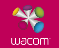
This was on Design Observer yesterday. I think the type is ok but that “Color Thing” is nuts. Is it a bunch of styli coming together?

I’ve been using a Wacom stylus for almost 20 years, and upgrade when necessary. That is, when the old one which was functioning perfectly well with all the functionality I needed is rendered obsolete by operating system changes; it’s part of the feature bloat “conspiracy” to keep milking purchasers by turning them into perpetual clients.
When I had to get the “Intuous” version, it came with a big fat “kiddy” stylus, so I sensed that I was no longer part of the company’s main market. Not really a big piss-off now, just a minor inconvenience, as I move up the demographic age categories and become less and less relevant to this kind of product developer.
So yeah, it’s a pseudo-60s kitsch kiddy popcult kind of logo, so what.
Nah, it’s just ugly?

also discussed over at brandnew:
http://www.underconsideration.com/brandnew/archives/that_wacky_wacom.php
The “Color Thing” looks like an ad for a brushed metal wart remover that comes in “designer” colors. How can a client go for such a thing? I’ve seen better looking nose hair.
ChrisL
PS: the type thing is fine though
Nick, I would’nt mind also if it was any of the 60s kitsch etc kind of logo you describe.
I do mind however, that like the 2012 logo, yet again, WO have fallen considerably short of basic design standards.
A well constructed ’popcult kind of logo’ would have been great.
As ’brandnew’ says, they might even have constructed a logo that demonstrates the unique qualities of the product itself.
But instead they design this.
Pity the poor designer who has to incorporate this logo into their next project.
is this a bit like odvertising. It got people talking, upping the company profile in no time. So maybe not such a bad logo in the mean timeI guess the product is all about fun. The designers are tripping on something. They can remove a few elements and the logo might be kind of normal. Clever or just bad design
odvertising
Is this a new meme?

Oddvertising.
or oddvertising, bizarre adverts in the 80’s that got people talking. Do you remember and ad by outpost.com firing gerbals out of cannons.
http://www.youtube.com/watch?v=4hny1JSsZII
more ones in advertising
http://www.ciadvertising.org/student_account/fall_00/adv382j/christiana/...

... Corel Draw would rule the world!
and what does Corel have to do with it? CorelDraw doesn’t kill good taste - People do.
:-)
Glad you took a shot at that one, Russ. :-)
ChrisL

hee hee
if one of my students had turned that logo in, they’d... never mind. one of my students would never have turned in a logo like that!
It’s...a Spathi Eluder.


Wolff Olins, please take me in. I can design 50 logos per day.

I just visited Wacom.com, lets just say, the logo bouncing around really doesn’t help. I also found it way more difficult, even than before, to find their product list.
You had me for a minute there, chiefdzp.
Maybe I had missed it, it is a great post-2012, double bluff.
Bad logo = free publicity etc etc etc...
...but no they seem serious. see for yourself at www.wacom.com
but wait, maybe this awful logo gets ’repaired and retouched’ by the wonderful product that is a Wacom tablet, over the coming weeks.
Someone let me know I was to bored to get to end to end web animation find out.

think vector purple people eater... yukie

As David (Nickel) says, the logo bouncing around doesn’t help at all. I don’t think it is a logo but more of a mascot (Wolff Olins will have given ’it’ a name of some sort). It seems to appears on every page of the website but isn’t anywhere near the logo.
Anyway, looks like WO have been smart enough to be able to ditch the thing when everyone is sick of it (which shouldn’t be too long now).
The new brand appears to incorprate sound too. Listen to the website for a bit and the four notes/chords cast an Oriental spell that will gently send you off to sleep which is fine unless you have a deadline, in which case why are you reading this?
so, anyways...anyone have one of the new Bamboo tablets? They appear to be selling for $80. Sounds like a great price.
Another Wacom, sockum logo, it just doesn’t git eeny bitter thin that!
ChrisL

Let’s stop talking about it.

It reminds me of that muppet with the honking nose...
or a 3-headed zit
ChrisL
Perfect, Gus!
ChrisL

Yeah, but don’t we all really wish that we got sent the check?

SPATHI ELUDER!!!!!!!!!!!!!! heheheheh I love this logo suddenly.
BTW, there is a port called Ur Quan Masters for OSX. In case you need to waste some time piloting a Mycon Podship, Thraddash Torch or Orz Nemesis. Go, go, go, intruder, bah, intruder, intruder, bah! or the mighty Pkunk Fury. Worm, idiot, loser...
I digress

Oh, that’s a sin-tique!
I’ve seen so much worse.
One thing about graphic design, as I often encounter here at work, EVERYONE is a designer, and EVERYONE is a critic. No matter what you do, some people will love it and some will hate it, and the ones who hate it are usually intensely righteous about thier opinion.

Probably another case of money talking the truth… WO must be doing something ok, reaping it in with s**t like this.
Or maybe we are all out of the loop and this is the way things are going to be from now on…
___
Bert Vanderveen BNO
Oh, please let me stay out of THAT loop forever.
ChrisL

Or this could be a completely different company run by Bud Wolff and Billy Olins that just sounds a lot like the famous one.
you mean, from an evil, parallel universe?
Yes, from... The Twilight Zone.
you know, that’s what i thought, too. like the episode of Star Trek when the graphic designer gets caught in a “beam up” glitch, and is separated into TWO designers: one who uses only black and white, and the other who’s hooked on magenta.

We had a conversation about this one in class the other day. Even design students think that it’s a disaster.

Sweet mother of.... What the hell was that? I don’t normally slaughter logos before I know more about the background. Here I don’t need to. No matter the background. This is just bad design!

The signature is nice, appropriate and an obvious evolution from the previous wordmark. The symbol lacks most everything, but it’s actually difficult to find an application (on the website and packaging at least) that actually uses the symbol locked up with the signature.
It’s easy to blame Wolif Ollins, but few of us actually know what happened behind closed doors. I have been a part of bad client-driven design one too many times. It’s just a fact of life.
Everyone is so quick to through stones.
>Everyone is so quick to through stones.
>I just visited Wacom.com, lets just say, the logo bouncing around really doesn’t help.
A moving target is harder to hit. ;-)
C’mon... a firm with the prestige of W-O isn’t going to be bullied into a logo like this. This was their solution to the assignment. Do you really think Wacom would call a board meeting and announce, “Okay, we found a design firm that will implement our own idea for $XX,XXX. All agreed?”

I just visited Wacom.com, lets just say, the logo bouncing around really doesn’t help.
It makes me wonder if Wolff-Olins might not be a front organisation for an epilepsy research institute. I seem to recall that the first Olympics TV spot triggered a number of epileptic siezures, and the way the Wacom logo moves in and out of focus as it bounces around the screen might be a new trigger test.

*lol*

Just a simple reminder.
Sometimes the designer really has no choice.
They have listened to the customer - and have given the customer what they want/expect. Even if the designer has a clearer understanding of customer from a graphics point of view - bottom line is, you give the customer what they want, you get your check, you let it clear the bank - and then you laugh. For there really isn’t anything else you can do.
Sorry — that’s the real world.
Honkers, Haley, I think you’ve got it!
ChrisL
Sometimes the designer really has no choice.
I don’t believe that is as true at this level of corporate identity — designer prestige and corporation prestige — as it may be on other levels. Few companies the size of Wacom would hire a firm the size of W-O and say, “We already know what we want. Just do it for us.” It’s antithetical to the process.
Chuck - it happens almost everyday. I’m not saying in all cases. Many times a CEO has in their mind exactly what they want — and there just isn’t anyway to change that mind - know what I mean...
We come from the school of 3 choices. We design and turn over the 3 thumbprints. The one they asked for, the throwaway one and the one we are proud we created.
Many of us try to believe it isn’t so... but it is. Especially when the graphic met their expectations. So sorry.
(Pssst, I am speaking mostly of the NYC market - things may be different in nice hometown markets...)
A couple people commented that the type is ok. No, it’s not. It’s predictable, typical graphic designer crap.
Although it’s difficult to judge from the gif, I’d hazard to say that the execution is pretty amateurish. Probably no-one bothered to visually correct the thickness of the horizontal/vertical lines. The curves don’t seem to be particularly considered either, actually appearing to break. And it is certainly inspired to turn the ’w’ to make an ’m’ - not!
And if you look closely, the ’w’ optically feels wider than the ’m’. That sort of stuff happens when you pay no attention to detail.
Bruno
Jackie, I know where you are coming from, but I’m with Chuck on this one.
WO see themselves as the cutting edge of the London branding/rebranding scene.
They don’t listen to anybody. The appalling 2012 logo proves this...
Let’s stop talking about it.
I’m with ya. We’re beating a dead horse.
People, get with the tour.
This is next-level wack-its-ill.
Genius.
...this is the way things are going to be from now on…

If it was an animated .gif, with the those protrusions pulsating and undulating, then it would go far enough over the top to be cool, I think. At least to anyone from the hippy generation. Not that I know anything about drug use in my youth; I’m just guessing.
too bad!
One thing about graphic design, as I often encounter here at work, EVERYONE is a designer, and EVERYONE is a critic.
Everyone is so quick to through stones.
I wholeheartedly agree with these comments, as well as Jackie’s statements. I get a bit disappointed with how quick people seem to tear something to shreds. If you’ve ever had your heart ripped out when a great idea gets killed by a client, you might not be so quick to judge. There’s no arguing with the multi-millionaire, billionaire or CEO who’s fronting the bill when they want a last minute change. I know many of you know EXACTLY what I’m talking about.
But that doesn’t make it good design? ;)
I know many of you know EXACTLY what I’m talking about.
In my experience, clients are usually right, and push creative to do more interesting work than standard “good design”.
good design
Is that award-winning good design, or sales-enhancing good design?
Either is difficult to create, both more so.
Non-award-winning “good design” is pretty-boring, and easily trumped by “bad design” in the sales-enhancing department.
For an example close to us all:


stop the bouncing
Well, if this is the result of being pushed to do more interesting work...... ;)
For an example close to us all:
Ahhhh, yes. A very good point. :)

Wolff Olins has let their Pantone books expire?
Biddy: If you’ve ever had your heart ripped out when a great idea gets killed by a client, you might not be so quick to judge.
Just a quick story for you Biddy - one I think you can empathize with. A dear, departed friend of mine was the art director for trade books at a very well known publishing house - long before there were computers in the bullpen. It was the days when you received lettering from the typographer, that you put together to create a logo type, you sent that off to the photo house for some transfer type of it and demand a C-print. You went out on a photo shoot and spent the wee hours of the morning going through contact sheets before the 9 a.m. publisher’s meeting — having it altogether - as a comp, so the non-design functioning minds could see what the cover of a book may possibly look like.
Well, it had been just such a night, and the next morning, Madame President was having PMS. She was not happy with the design work she saw, and I guess was having a hard time verbalizing it - so she picked up her pen and stabbed his work - not just one time - but 8 holes worth. We had a very long lunch that day — and soon after he left his place of employment.
Again, real world stories for the folks that just haven’t been there - or done that! But Biddy - I know you know that I know that you know exactly what goes on... Nice meeting you fellow graphic arts survivor.
P.S. I would have put this in an I/M to you - but, oops we don’t have that anymore. So I guess others can read this too!
Wow. Now that ripped my heart out. :(
Unfortunately, freak outs of this magnitude still exist today. My main point and (I think it has been others)...you can’t look at a piece of design and EVER know the blood, sweat and tears that went into the design.
Its very easy to judge from the comfort of a chair and after the work has been done. “Blood, sweat and tears” sounds like a cliché...but for those who haven’t done a lot of comps...that term can be quite literal.

Are you against any critique? I’m curious to know if this applies to literature, art, cooking, etc.
I’m just asking. No criticism from me is to be implied. :-)
Sharon

On seeing the end result, I hope they didn’t put too much blood, sweat and tears into the project.
wow.
I don’t know if I would ever even think to play the PMS card to describe a difficult client.
I think we are getting comfused about the difference in concept and the design.
As is the case with the 2012 logo, I don’t think peple are critising the concept here.
I’m certainly not. If WO have done their brand marketing and decided that the best way to represent a graphical hardware company is the sound coming from the trumpet like logo they have designed, who am I/we to argue (you have to visit the wacom website). In fact I think its quite interesting.
What I don’t understand is why, like the 2012 logo, basic design skills are’nt being applied to the creation of the logo.
Would it be that difficult for WO to use skilled type people, as Bruno Maag has outlined above, to create some typography that does’nt already look if it is out of date, yet alone something which will prevail into the next decade. WO, is a company that prides itself on thinking differently, I’m not seeing much difference in the just launched compaq logo - So much for forward thinking ’next level’ typography.
On the same basis would it have been that difficult, if they positively must have a 3d logo, to have drawn it without using basic level illustrator filters. At least think for one moment the uses of the product we are talking about here, if nothing else.
It is will some hesitation that I have posted the 21year old Chermeyeff and Geismar NBC logo, I’m bound to have opened a can of worms. However, if only because of the colourful nature of both logos, I thought about this as being a logo that has stood the test of time. C&G would never have known what the future held in terms of digital broadcasting and yet here it is today, still every bit as relevent and stylish as when it was designed in 1986. Not bad for a simple bit of well crafted 2d artwork.
As a design industry are we creating these 3d logos because that is the best solution or simply because technology allows us to do it?


are we creating these 3d logos because that is the best solution
3d, color, moving.
Everything else is flat, dull, and static, literally and metaphorically.
I love this:
http://www.marksimonson.com/
It’s just that everyone wants a fancy shiny ’web-too-point-oo’ logo these days.
Nick— you don’t believe that, do you?
The only thing different between having a static piece of puke and a moving piece of puke is that you have a greater chance of being hit by the stuff if it is moving.
ChrisL
as opposed to just stepping in it.
I don’t get to see the NBC logo that often in London, but that flat dull and static logo seems to do OK when it is 3d’ed up and zapped accross the screen. It works because good design has been applied to the logo in its most basic form.
I’m just not seeing that in the Wacom logo.
In a way, I’m happy to hear the NBC logo being dragged into this. I don’t know the names or places - and it was so long ago. NBC had a wonderful peacock from the beginning. Then (it was the 70s or 80s - it’s a blur now) then changed it to the giant N. They spent a fortune marketing the giant N. They wanted you to recognize it from another planet.
Long story short - it didn’t go over well - and the peacock, modernized, was brought back.
I do wonder who sat around those creative meetings....
Biddy - Blood, Sweat and Tears was a good group - and brings back good memories... :-) Thank you for being here an understanding — my friend NEVER got over that experience, and now - it’s too late for him. It did teach him not to be abused...
What goes up... must come down... spinning wheel got to go round....
And uh-hum, PMS colors - good ones — also kept many artist up at night trying to pick out the right one — and then wonder why the printer could never match the color... LOL
Jackie T, that NBC “N” logo is a good example for this thread relating to the adoration of the “genius” work that the big identity firms can receive without merit.
It’s an infamous story. NBC paid $600,000 for the highly heralded identity. They got hammered with a cease and desist order, plus had to make a $800,000 equipment donation to the Nebraska public TV station who had already developed the exact same mark — for a whopping fee of $100.
I was going to say that Wolff Olins is safe from this comical mark already being in use. But then again, it may turn out that some six year old kid already holds a claim to it.
Nick— you don’t believe that, do you?
Yes.
The best example of the “new effects trump old quality” principle I’ve come across was a quote from Harold Lloyd, the movie comedian. Sound had just been introduced into movies, and his latest silent masterpiece was being ignored at the box office. His comment was along the lines of, “We spent ages making this film, with well thought-out gags, it’s one of the best things I’ve ever done, but people would rather watch a movie of an egg frying in a pan if they can hear it sizzling”.
I agree with Nick, it makes sense. People like new things. Just like fonts they great one day, overdone and overused another. It doesn’t mean there bad they just don’t stand out anymore. Like it or not it stands out from the crowd
I’d rather look at the lasceaux paintings than view an active, rythmic, hdtv kanye west video. new effects do not trump old quality in my experience. novelty is always attention-grabbing, but that speaks more to our ADD culture than to quality, or flatness, or dullness, or stasis.
when charles marsh said “stasis in the arts is tantamount to death,” he meant intellectual immobility. he didn’t mean that a calder sculpture was inherently superior to a rodin.
Chuck, music videos are old hat—on TV.
But in iTunes or iPod, not so much.
It’s the novelty factor that counts, not whether one thing is newer than another.
I’m not arguing, but trying to understand the implications of your point.
So, the hotmetal type is superior to the handwritten, and the digital type is superior to the metal, and the halographic projection of type will be better than the digital print... each new form rendering its ancestor obsolete (flat, dull, and static).
An interesting conundrum though: torch becomes candle becomes electric light becomes hand cranked flashlight becomes battery flashlight becomes... you know? But what happens when the fad becomes retro, as in the resurgent return of “novel” hand-cranked flashlights, such as are in every store I visit these days? Does the “new” old trump the the “older” new, because of its novelty? I maintain that novelty and quality are vey different things, and further, that quality will survive the battle.
I should say that quality SHOULD survive the battle, or even that quality HOPEFULLY will survive the battle. I’m realistic enough to know that bad things happen to good designs (sometimes).

The instant I saw that logotype, I thought it was in the vein of that 2012 thing. Perhaps the lesson here is that you can’t make every design an instant classic, no matter who you are? Are there any great or profound designs from the same team released between these two logos?
Hideous and amateurish.
“Ill-advised” is a term that comes strongly to mind.
I can only imagine, with no small degree of scorn and horror, what the Wolff Olins marks that were rejected looked like. But I’m sure they were colorful and “forward-thinking”.
In any case, to THESE eyes, the logo is a disaster. Not only is it unappealling on its own, it’s completely UNcommunicative — it doesn’t say ANYthing (sorry- I seem to have lapsed into Salingeresque emphasis) . Regardless of novelty.
I think it does communicate. It says young, fun, lively, musicality or sound, pens. Its a matter of taste, i don’t like it but then maybe i’m not the market. They might be aiming at a very young market. To say it doesn’t comminicate would be wrong.
Nick put it this way: In my experience, clients are usually right, and push creative to do more interesting work than standard “good design”.
this is an important point, and one that deserves repeating. we can trash clients all day, because — let’s face it — it’s nice to have someone to blame. but a client often DOES push us to do better work. the illustrator jim mcmullen and i were discussing this very point years ago when i had just graduated and started doing some high-profile work. he said, “there is nothing like a difficult client to focus your work,” and i’ve carried the thought with me throughout my career. i have to qualify it this way, though: i think the client IS often right, but in many cases doesn’t have any idea why, in much the same way as a hummingbird has the FEELING it oughta fly south in november, without any real understanding of why. it’s the designer’s job to listen, to analyse, (bringing their SKILLS into play) to translate what they’re hearing from the client into good, communicative design. and if, after the client’s prodding, the solution is pathetic, it’s a case of the designer not rising to the challenge, and blaming it on the client is just lame.
to the point of novelty, here’s an interesting quote from stan the man:
“Type design moves at the pace of the most conservative reader. The good type-designer therefore realizes that, for a new fount to be successful, it has to be so good that only very few recognize its novelty.”
First Principles of Typography
Stanley Morison
what a great quote, god is in the details as they say
So, the hotmetal type is superior to the handwritten,
That’s not my point.
Novelty is a separate principle, nothing to do with functionality.
Consider digital type: when it was introduced, its quality was a lot poorer than phototype. It wasn’t really cheaper either, as the capital costs for graphic designers were huge, especially the Laserwriter. The learning curve for going digital was pretty intimidating. So from the point of view of job quality and economics, there was nothing added for me in 1988 by going digital, just a lot of hurdles. But I couldn’t resist the novelty, and could see the writing on the wall.
**
Morison was a book-centric Brit, and his quote dates to the days of hand-lettered headlines. But even then, there were plenty of novel type designs. He pointedly ignored such as Kennerley and Cooper Black, that came outta left field, took the typogrpahic world by storm, becoming mainstays of American commercial culture.
Captured from web.archive.org on 2 Aug 2009. view this capture