
It's grotesk!
Five hours isn't enough time to measure anything or work out the spacing properly. I worked by eye, nothing was measured. Helvetica is pretty easy to draw. Ellipses and sticks. Make the inside ellipse very small, then once you've made a simple l and v it's over. You'll be blatting bugs before breakfast.
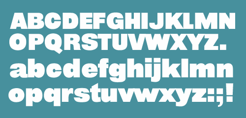
Bug Blatter only looks good with tight spacing to match the interior spaces. I like how c and C come out. z is knackered. There's a lot of cheating going on with stroke width and counter position.
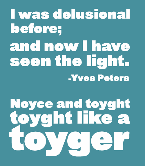
Ray Larabie's type design axiom: "If you work on a font long enough it will turn into Helvetica"
I'm sure somebody has already done this, going by this magazine cover:
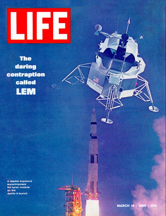
I didn't fake that. Honestly, It's real. Can anyone identify the font used?
I'm too busy with other stuff to draw any more of Bug Blatter. :^) that's good in a way.
No plans to market it or proposition Linotype/Monotype about adding it to Helvetica, but what do people think?
* Would you use it, and what for?
* I figure it would be okay for paperback covers, t-shirts, signage, logos and some kinds of magazine design. It would make good laser-cut perspex letters, 2 inches thick, say.

This looks much better with negative tracking:

All comments welcome!
j a m e s


