
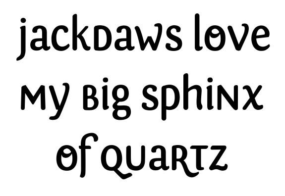
So I started playing around with some letterforms I drew. Initially, my idea was to make a unicase typeface; but since everyone would just point out that there's little need for unicase fonts, I decided to draw both alphabets (that's not the only reason, of course...). However, I did start out with this.
I have lots of problems with many of the characters, most of them I can't quite see how I can solve, so what I'm looking for is anything AT ALL that you'd like to share with me about this (if you like it, if it's any good, if the world needs it – you know what I mean –, if the stroke thickness is all wrong – where and why would be nice... how to solve it would be excellent –, if some character seems out of place, if it reminds you of something, etc.). I mean really anything.
Some things I'd like to add... I drew everything directly on the computer. I know, I know... I shouldn't have and that's probably where most of my mistakes come from, but I'm going all the way with this and you can't stop me! :P
Don't mind the O, I drew that just because I thought the O was too bare in comparison with the other characters. It would be an alternate, as would the R, probably. And I will do the other alphabet, but am planning to maintain the uppercase at the same height as the lowercase, because I really just wanted a way of combining lowercase and uppercase letterforms to make separate words look good... you know... I'd use this typeface to easily create simple logos (or the starting point for logos), for example, or to use as a display face on posters. I kind of always imagine using it on a poster for a music festival, with all the separate names of the bands and stuff, although I can't quite imagine which kind of music festival would look good in this... :P It's just an example.
That said, here's the image. There's a lot more to say (mainly because I'm all over the place with it), but I guess we'll keep in touch. :)
rubenD


