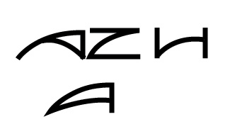
A software company to which I am contracted asked me to redesign their brand in the blink of an eye.(a couple of days) As all my time is inundated by a pile of other "urgent and more important" work to do for this same client and I am not receiving any additional resources (more money nor more time) I will not be able to dedicate the amount of attention to this project that any branding effort truly deserves. However I have never in my career delivered mediocre work and lacking any time at all in which to conceive a brand is still no excuse. I therefore turn to you and to any one who wishes to supply their input. Specifically I am requesting any input on the word mark concept I have started. This image only demonstrates the lettering concept but none of the letters are finalized yet. I like the M and U. I also believe the A once refined will work nicely. The Z, once drawn properly, might also work but I want to draw suggestions on it. As for the T and the H they are my biggest concern as I would like their form to be a bit more harmonies with the other letters.
Please provide impute asap.
Thank you
Thank you to everyone who took the time to comment on the quick concept sketch I placed. Unfortunately it seem that almost no one read what I wrote or that I did not express myself clearly as every one seems to address this as a completed design rather than a quick thumbnail to try to communicate a concept. The X-height and strokes are irrelevant and arbitrary at this point. Also arbitrarily drawn is the crossbar on the A, H and t although I want suggestions on unifying them. The general concept that I like and was trying to communicate was how the bowl curve of the u plays off the M and it’s apex and have these counter echoed by the A. What I do not like is that I have not yet arrived at how to make all the letters compatible. Expressing that the H or z needs work dose not help me as I am very well aware of all that is wrong with those quickly drawn letter forms. My problem is that I do not have the time to dedicate to make the portion of the concept I like work within a hole. This is why I placed the quick sketch here to solicit specific ideas as to how to make all the letters work as a unified hole and still retain the element of the M, U and A playing off each other.
Please provide specific ideas as to how to make the letters work.
Thank you.
| Attachment | Size |
|---|---|
| logo2.gif | 8.91 KB |