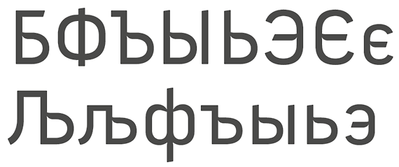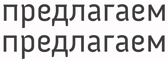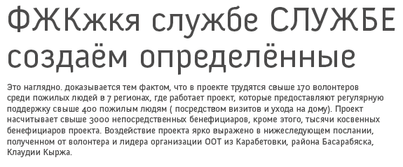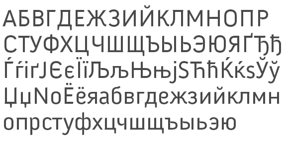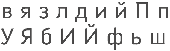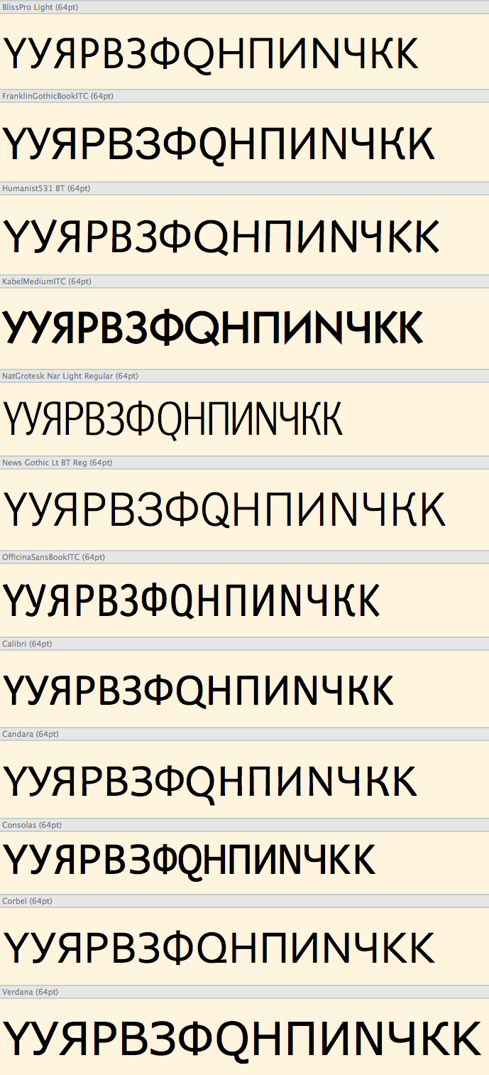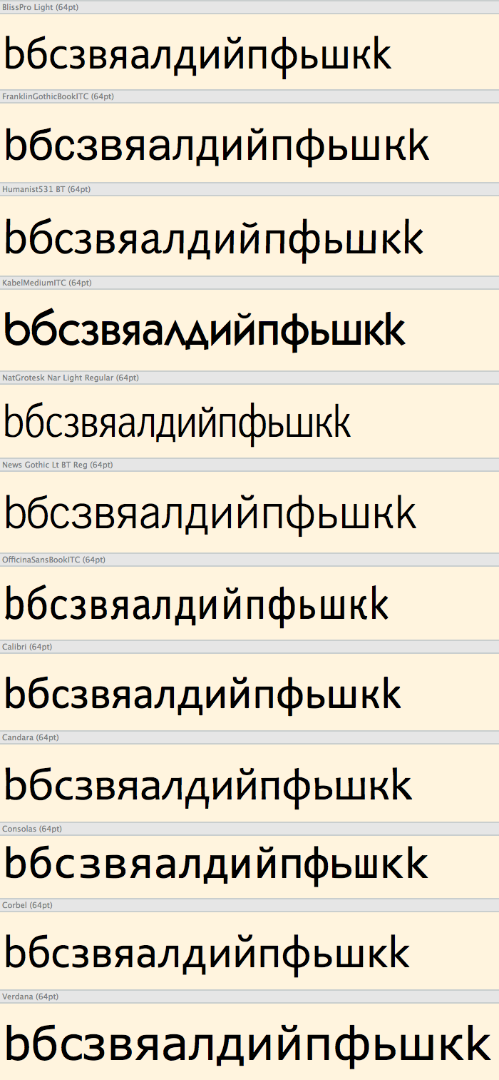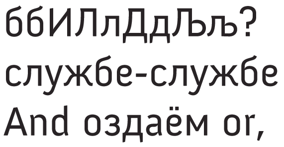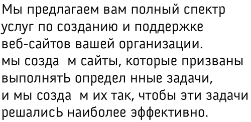
I want to add cyrillic glyphs to a font I made called Anivers. Because cyrillic is not familiar to me I would very much appreciate some input on this. Spacing and kerning still need to be done...
| Attachment | Size |
|---|---|
| Anivers_cyrillic.pdf | 374.55 KB |
| Anivers_cyrillic_2.pdf | 374.6 KB |
| Anivers_cyrillic_3.pdf | 14.24 KB |
| Anivers_cyrillic_4.pdf | 14.32 KB |
| Anivers_cyrillic_5.pdf | 16.91 KB |