Typophile

A communitarian fitness center logo

alainch

Hi,

I’m working on a logo for a communitarian fitness center and I would like to have your opinion. For those which do not speak French, the center’s name mean "Legs in the air".

The center is opened to everyone, men and women, 16 years old and more.

It is exercise on apparatuses as in a gym.

Thanks for your opinions.
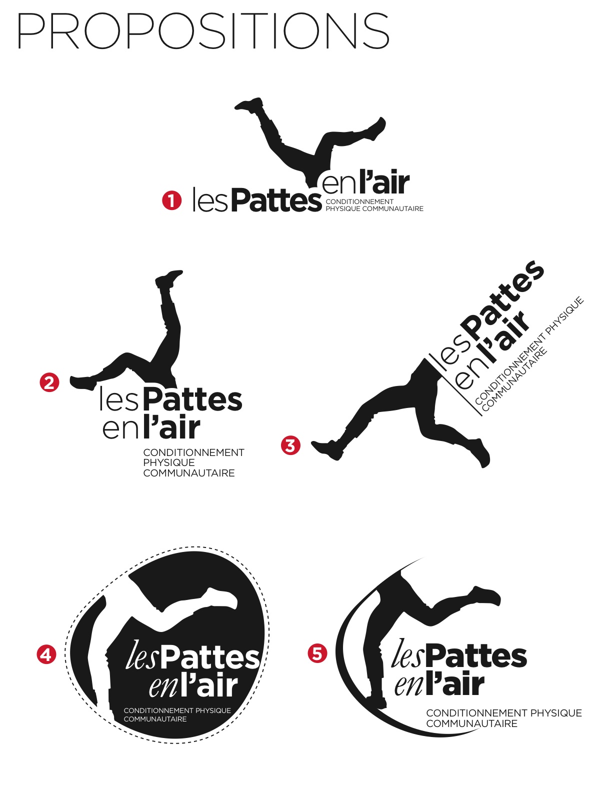
That’s not a logo, it’s an advertisement. How is it supposed to work printed on a membership card, business card, or stitched onto a polo shirt? Or even just printed small on a busy page?

The tag line needs to come out of the logo—otherwise there’s just too much type. If the client absolutely demands it stay, then you’re going to have to make a typographic logo—there’s just too much type to have it battling with dancing legs.

I like it. #3 seems to work the best as it's not quite as busy as the rest, plus seems to offer itself to be tweaked into multiple configurations more easily.

I think the legs in the air are dynamic, but I feel that it is a bit literal. The name is Legs in the air. And the image is legs in the air. What could you do that adds another dimention of interest to it or more information than just an illustration of what the words say? What if it conveyed more motion, showed team work, strength / empowerment developing over time, flexibility or ...?

I agree with what James is saying about the configuration, as this looks more like an ad or illustration. When you see a bunch of logos together, say, on the back of a charity event T-Shirt or at the bottom of a poster, certain ones work because of their shape and proportions. For instance, if you sized down #1 or #2 to be on another application or with other logos, you would not be able to read the tag line at all. It can be a crazy shape, but generally if it fits inside some invisible boundaries, it will work on other applications such as business cards etc. better.

I hope this is helpful.

Hi i hope there are 5 logos are displayed in your post. i last two is professional and looks nice to use it. if possible give some good attractive logo for it.

------------------------------------------------------------------------------------------
Melgia Glory
customised Logo, windows xp vista icons

I totally agree with James and Gordon, what you need is just a typographic logo. You already have such a stunning typographic composition that you can use for the logo. Such as in version 2, apart from the legs illustration. The taglines placement should be flexible. But, you need to create a guidelines how to place the taglines, like the sizes comparison between the logo and the taglines, the line breaking in the taglines and the amount of spaces in between. You could show them examples of the composition of the logo and the taglines, but remind them that it is depends on the applications.

The illustrations should be use as the brand elements only not part of the logo. In this way, you could use the illustrations applied into different applications in more elaborate way, not just restricted with certain composition.

Just keep it clean and simple for the logo. I am sure you will create a stunning visual identity.

Thanks to all of you...

- - -

alainch

Captured from web.archive.org on 16 Oct 2013. view this capture