
Logo for a custom jeweler. I arrived at two versions based upon the initial logo.
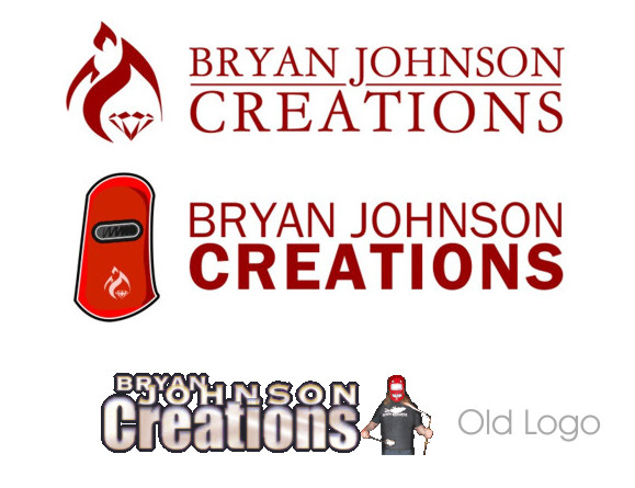
Logo for a custom jeweler. I arrived at two versions based upon the initial logo.

#1 - I like it. Very classy, but the fire adds some edge. Make sure you align things optically, not geometrically - The ’C’ in CREATIONS should stick out a bit to the left of the ’B’. I’d tighten up the tracking in everything just a bit. I’m also worried that the diamond will get lost at small sizes, so you may have to play around with the scaling of the flames vs. the stone.
#2 - Not really a logo. Think of how this would be reproduced in a one colour setting (such as a photocopy or fax). I think it’s too cartoony as well, but depending on who the target market and what kind of price this jewellery has, it might be appropriate.
Old logo - This guy might not know how to market himself properly... hopefully you can help him.
- Lex

I think that #1 has very good potential to become a very nice logo. The major problem that I see with it is the difference between the fire and the the diamond. You’ll have to make them more even so they don’t look like two images glued together but as one image. A symbol of the whole logo. Fire stylization is very very likeable and nice...
Build on that. Make the diamond a bit bigger and bolder to complement the fire and you’ll be closer to what you’re looking for. Maybe the diamond should be the source of the fire? Or maybe vice a versa. Don’t get distracted by the real fact...

If I saw these without the explanation, I don’t think I would get to jeweller, while fire and heat might be required to create jewellery they are not what most would think of, I would look at the product rather than the process to influence/dominate the mark. Obviously it is not necessary (or even possible) for a logo to represent everything about the person/organisation it is supposed to represent.
Tim

I have to agree with Tim.
Here were some other versions of the diamond and fire I played with before coming up with the current one in the logo. Alot of them seem to me to resemble the heart of Jesus on fire imagery in Catholicism.

Scale-wise, I like the top left version the best. However, I think the flames can interact with the diamond a little better (i.e. I don’t like the white outline on the left side of the diamond).
- Lex
So something more like this with the flames around it rather then behind it?


I think the left one is better for me, no 1 is on the right track
I’d go with the second one because the first one has those subtle lines that first of all need lots of refinements and second of all don’t really add anything to the symbol.
I’d choose the second one. Maybe even discarding the bottom part of the flame under the diamond. And refine the left most curve of the flame. Because it’s oddly shaped.
So I redrew the mark, and am pretty satisfied with it now, so on to the Typography. I originally thought about a more formal serif look, but I tried a less formal sans look as well. Along with a few placement variations, I am concern however about the mark replacing the O in Creations and not reproducing well at smaller sizes.

I prefer option 3 (Gill Sans with the rule). You may want to try Kabel with a rule as well. I don’t think that 4, 7, or 8 work very well.
- Lex
I agree with Lex regarding 4,7 and 8. But contrary to his preference I’d go with #2 without the rule. The only problem that #2 has is the join between J and A. I’d lift J to baseline and sort that out.
If you plan to go with the rule try placing the symbol so the top part of the diamond will align with the rule.
You’re getting there. I hope you’re also satisfied with your results so far...
The only problem that #2 has is the join between J and A
Maybe that’s why I didn’t like it.
I agree that the diamond should be aligned with the space between the two lines (or the rule). The point that sticks out to the right should be centred in the space.
- Lex

I actually like No 5 for some reason but the bottom of J doesn’t look too comfortable.
How about these revisions? I lined up the top of the diamond with the baseline of Bryan Johnson. Artficially shortened the J in number 1, increased the leading in 2, made the horizontal stroke lighter in 3, and moved some things around in the bottom two.

I lined up the top of the diamond with the baseline of Bryan Johnson.
No you didn’t... they are visually still not aligned. Maybe I should point out to visually align those not geometrically. At least you didn’t align #1, #2 and #3.
But I’d go with #1. Seems strong and clean. But align it. :)
I agree with Robert, and I would add that you should move the diamond just a little closer to the type.
Do you have a pdf of this? It would be good to be able to see this as a vector rather than a low-res raster. I think you can attach pdfs to your original post if you edit it.
- Lex
pdf PDF Link
Oh yes. The PDF reveals that flame curves need major improvements to make them smooth and the way they should be.
Captured from web.archive.org on 14 Apr 2008. view this capture