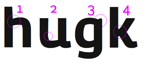
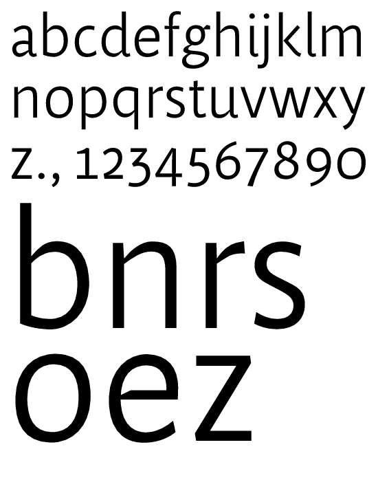
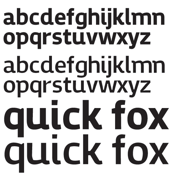
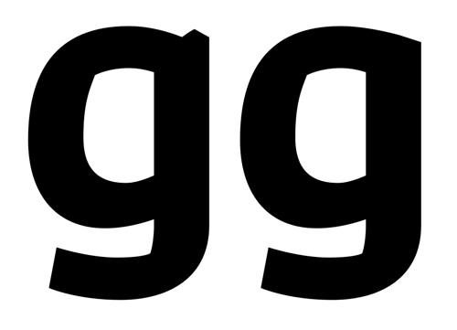
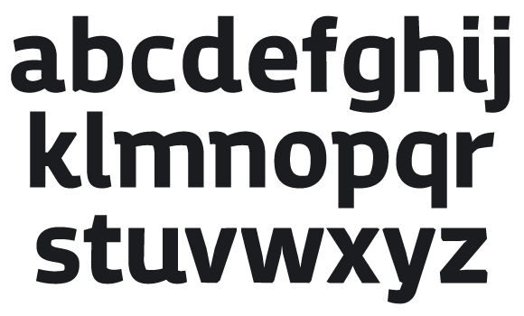
This is a design I've been working on for the last two weeks. I think it's my third more serious attempt at designing a typeface. It's still in the early stages. I have drawn first versions of the lowercase characters. There is no kerning yet, I kerned some pairs a bit by hand when I set the specimen.
I would like to have some crits at this point. The 's', 'v', 'w', 'y' and 'z' are the characters that trouble me the most, I have difficulties with getting those to fit well with the style of the design. But all tips are welcome. :)
Check the PDF for larger size.
| Attachment | Size |
|---|---|
| rough-cut-jelmargeertsma.pdf | 521.59 KB |
| rough-cut-2.pdf | 538.07 KB |
| rough-cut-3.pdf | 237.78 KB |
| rough-cut-4.pdf | 431.3 KB |
| proof-b-g.pdf | 36.76 KB |
| rough-cut-5.pdf | 46.11 KB |
| rough-cut-6.pdf | 45.96 KB |
| rough-cut-7.pdf | 42.72 KB |
| rough-cut-8.pdf | 42.32 KB |
| ultrablack.pdf | 259.63 KB |
| weights.pdf | 70.02 KB |
| weights2.pdf | 73.05 KB |
| regular-spacing.pdf | 49.69 KB |