
Would love to hear some comments on this font design in the early stage!
Is it something you would like to se developed? Love it, hate it or indifferent? Any comments so far? (I only have a few characters so far so bare with me)
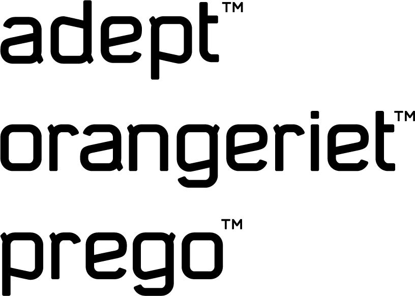
Would love to hear some comments on this font design in the early stage!
Is it something you would like to se developed? Love it, hate it or indifferent? Any comments so far? (I only have a few characters so far so bare with me)

Although I do love the general feel of the letterforms, I think the little stems are totally unnecessary and would look much better without them. Really nice feel though, would look great as an information graphics typeface.

I think the stems give this typeface feel a little more strength, it'd be much more passive without them. However I do agree that they feel a bit 'tacked-on'. Perhaps if they were larger and blended with the letterforms a little better.
At the moment they remind me of the tag hanging out the back collar of a t-shirt!

Move on to researching what is available for modifications to individual characters from other fonts.

I like the stems, but I think they should be the same width as the rest of the strokes, and closer to a 45-degree angle.
I'd like to see the s, and you might like to try an eyeglass g.
-matt

First impression when I saw the images: "Oh my... this is really nice!" So the font itself is very very nice and has a strong character to it. I'd definitely keep those "ears" but I'd make them part of each letter because right now they do look like they've been glued on them. The width is different, they don't have a natural flow with strokes...
But all in all, this would make a very strong face. I'd also add a more text face to this family. This one is more or less just display font. But I can see its use in strong and powerful industry identity system.
VERY NICE.

Ah, this looks nice. It has a very nice angular/modular look to it. But in a way that it's not over the top, like some of the other typefaces that are somewhat in this genre.
I agree about the terminals though, they need to become more part of the characters themselves. I think the flat endings of those parts should be more 45 degrees.
It is obvious that this is a display face, but I would like to see short snippets of text set in this, just a couple of sentences.
Keep it up!
Thanks a lot for all your feedback so far.
I'm getting from the comments I definetly have to look at the terminals (I haven't yet so again bare with me).
However I've drawn some more characters to the typeface. Any comments?
The ones on the left has slightly longer ascenders and descenders than the on on the right which is also increased a little from the last version due to problems with the f (any suggestions on another way to solve the f and keep the ascenders and descenders short like in the first draft?)
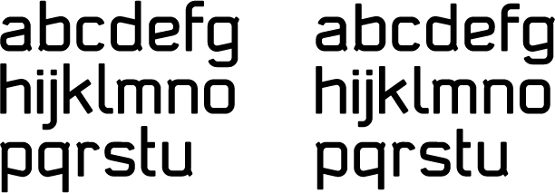
Here is the original version (top) and the longer ascenders/descenders version
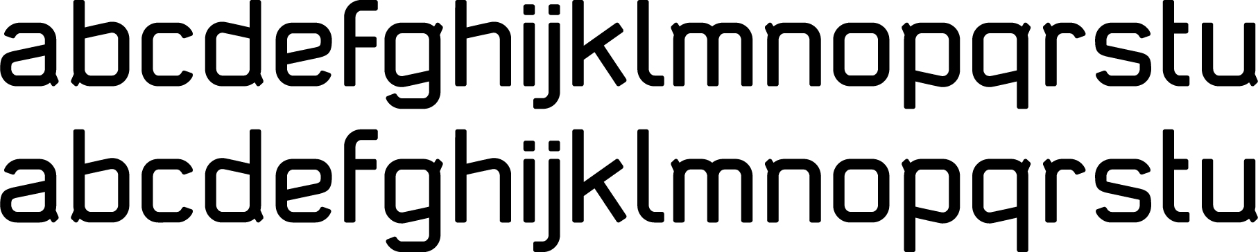
What about the u and the l?

I like the one with the shorter asc/descenders better. I do see that the 'f' might get in problems then, but I think it doesn't look too bad with the crossbar on the x-hight, eventhough the space between the crossbar and the top of the 'f' gets quite small. I say this because I'm not sure I like the crossbar in the middle of the letter, instead of on the x-hight. It's not ugly, but it does look kinda weird. ;)
Keep the crossbar of the f on the x height. Change the top curve to be angled. Maybe a bit longer than the cross bar.
Regarding u. Keep the last one with terminal. Regarding the l ditto.
But your t could also have angled bottom.
And please make the version with shorter ascenders. goes better with the rest of style.
Thanks a lot litera. Will work more on it tomorrow and post new versions;o)
Adjustments to the f, l and t made (will do the j as well later).
Right, wrong or...?
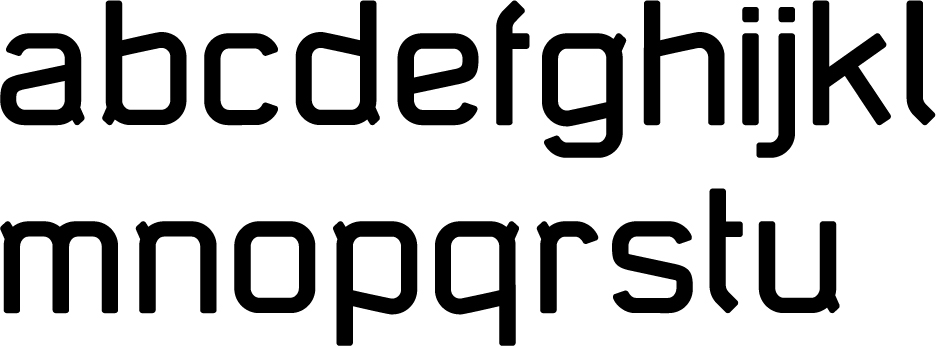
The problematic terminal.
Which? There is the problem with character spacing if it becomes to big. That's why I designed it small at the start. Now I'm seriously unsure what to do. Any sugestions?
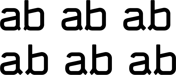
I would go for either the style of bottom left or top right (are those practially the same? oh well). The other ones have angles that look off from the rest of the strokes.
Man I definitely like your f and l now. You'll have to adjust the bottom of your t, but I guess you made them look part of the complete family. Maybe you should try something similar with your j.
Also adjust the bottom end of your l, because it looks lighter than the rest of the stem.
But regarding your terminals... I can see why you made them thinner at first... Because they add too much to the style. If I were you I'd keep the bolder ones that you proposed and make the ones that are a combination of the 1 line middle and bottom line right with not right angled termination. that will make them subtle but still part of the letter. YOu could also do a bit of a stroke variation like in the 2 line middle... If you know what I mean.
great work so far mate.
top middle is probably the closest to the original "glued" ones that just add a bit of life to the letters. All the rest are too strong and outstanding to me. Overpowered.

In the latest post, I think the bottom left is best. I might move the tail joint down a little bit so you can shorten them up a little too. BTW, it's ok (and probably advisable) if the tail overshoots the baseline a little bit.
The terminal angle in all the other versions (save the top right/bottom left) are all too sheer (vertical) for my taste.
Randy

I hope you don't mind a quick paint-over instead of words... I'd suggest something like this:

Hi Kevin and welcome to the thread. I don't mind a paintover at all. Thanks!
I like it but I think I should try making them slightly longer. But this is definetly down the right track.
Thanks again!
Kevin's manipulation is rather good. But I agree with Endre they should be just a bit longer. Well. That bit is a very small bit anyway.
The angle I was referring to in my last post is pretty close to what Kevin did in his edit. I guess they could be a couple of units longer indeed.
Glad I could help. It seems most people were thinking the same thing.
I think you should keep the j exactly as it is. As a descender, its kinship with g is preferable to any potential consistency with f, l, t.
I know little about type design but I prefer the shorter ascenders and descenders. Have you thought about rounding the terminals once they are a little longer. They remind me of little devil ears at the moment, very nice. I might also do alternatives with the terminals up or down on the characters just to give versatility. You might get a word with a lot of only up or down terminals and it might get too much.

Do you need them? I am not sure they add anything. To me they feel tacked on. An afterthought. I would make them strong & so they related to the main strokes or loose them. Also if you do keep them what about cutting into the join? Look at News Gothic.
I imagine this might sound harsh. If so, that is not my intent.

Hi Endre,
I'm another one who don't like the terminals. Btw, why not think in do those corners with the terminals just a bit more squared - and kill the terminals? I think it could contribute a lot with the clean look of your typeface... ;-)
Hmmm... Interesting guys. It seems we are divided in two groups here: Terminals or no terminals. I am not sure and definetly have to do some more fiddling with the terminals before I totally discard them. Cutting into the join is one of the things I'll try and Eben; nothing is too harsh in my threads. I like it when nothing is put between the thought and what's written and think that's the only way to really communicate. So let me have it in the future!;-)
By the way: Anderson, some really nice work on your flickr page.
Anderson, some really nice work on your flickr page
yes.
:-)
I look at your typeface for a while and I think the problem is not the terminal. I like terminal on some typeface. Also, you're not force to use it at each letter. You can decide to use it on the a but not on the b, on the d and on the p but not on the q, may be on the r and so on. The problem, to my point of view, is how the terminals are. You choose to use them at an angle of about 45 degree, have you try to draw them align on the alignment line at 90 degree? Or use the same angle of the top of the b or the a bowl. Of course it's only some suggestions. Keep going - BTW I like terminals.
André

I saw the first version and immediately wanted the terminals to be more like little trapeziums... idea very quickly below:
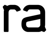
So they end the same width as originally, but fatter near the letter.
Captured from commoncrawl.org on 26 Apr 2015. original URL