
Hi,
I'm trying to find out what typeface is being used for the roman alphabet "YOU ARE HERE" on these contemporary maps from Tokyo's Yamanote Line stations (run by JR/Japan Rail).
Any help would be appreciated.

Hi,
I'm trying to find out what typeface is being used for the roman alphabet "YOU ARE HERE" on these contemporary maps from Tokyo's Yamanote Line stations (run by JR/Japan Rail).
Any help would be appreciated.

Eurostile, no?
As in, Eurostile Demi, I believe.
Thanks malbright!
It looks pretty close, although there seems to be a small difference in the lowercase y:


I don't know the right words to describe it, but that sort of step at the junction of the two strokes.
It's close enough for me, more for the record really.
Ever the cheapskate, probably my real question is can anyone suggest a free alternative?
Cheers,
nikki

JR Tokyo Sta. is Helvetica.
You asked for YOU ARE HERE, which is Eurostile.
F

A free alternative for Helvetica is Arial.
Ah, sorry! Assumed they would be the same - my mistake.
Thanks for the help everyone.

Strictly speaking, it is probably latin characters of ShinGo (means “New Sans Serif” in Japanese), a Japanese popular modern sans serif font.
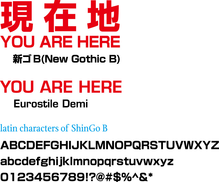
Of course, the latin characters of ShinGo is based on Eurostile but rounder than Eurostile.
BTW “YOU ARE HERE” set in ShinGo is condensed around 94%.
- Akira
Ooh, funky lowercase "g".
ありがとうございました!
I'm definitely lusting after that now!
Usually I'd be in the funky g camp but that slight rounding of the uppercase "o" is gorgeous!
どういたしまして。(You’re welcome.)
- Akira
g
Captured from web.archive.org on 14 Apr 2015. view this capture