
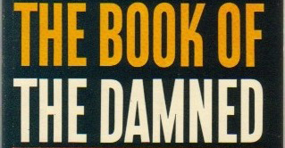
I love that K!
Anyone have any idea what this might be?
I love that K!
Anyone have any idea what this might be?

Not quite that one, but the K is similar : http://www.myfonts.com/fonts/chank/nicotine/

How old is this book?
Hmmm, I don't really know.
It was first published in 1919 but this is an obvious reissue sometime later.
Here's the full cover:
http://manybooks.net/original_covers/f/fortc/fortc2247222472-8.jpg
The logo in the upper left feels sixties to me but I could be dumb.

Ace paperback from late 1950s.
I hope that means we're getting closer...I really like this one.

It looks Czech influenced.
ChrisL
It might be an old Ludlow face "Gothic Condensed" or Extra Condensed.
ChrisL

Funny you see it as Czech influenced, Chris.
In this German Fontblog thread (about the recently replaced logo of Haus der Kulturen der Welt, designed by Cornel Windlin/Neville Brody), HD Schellnack characterizes a similar ‘K’ with ‘bent leg’ as having a ‘Russian touch’.
I would grant that the Czechs had a very strong Russian influence, particulary during the era of the Soviet Union. I think the Czechs were far more likely to be open to experimentation in letterforms and gutsy about implementing them. Veronika Burian gave an inspiring presentation at TypeCon '07 showing some very innovative examples of Czech work.
http://flickr.com/photos/ebensorkin/1225352194/in/photostream/
ChrisL
Captured from commoncrawl.org on 19 Apr 2015. original URL
