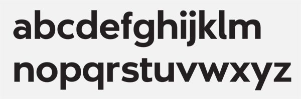
Hi all. As I mentioned in a post in the General Discussions section, I've designed an upper case typeface as the first project of Kris Sowersby's pilot Typeface Design paper at Massey University. This was a 5 week project so it's not perfect, and we were required to only design glyphs A though Z and concern ourselves only with metrics to space the letters between HHxHHOOxOO, no kerning (big can of worms apparently!).
The second project is to design a lower case typeface, either based on our upper case or something entirely different. I want to base mine on my upper case, and am keen for some ideas from you guys on where I could go with it, example typefaces and the like. Any feedback on my upper case would be great too – I'm all for making more improvements.
For context: I really love Futura, but lately I have been getting used to softer typefaces with a similar feel like Myriad and even Avenir. So, with this project my aim was to create a 'softer Futura' in a way. I decided to create a heavy/bold weight with tight spacing to be used for headlines/display.
Thanks in advance!
| Attachment | Size |
|---|---|
| hand_in_specimen.pdf | 32.79 KB |