Typophile

Please critique my logo

dendicott

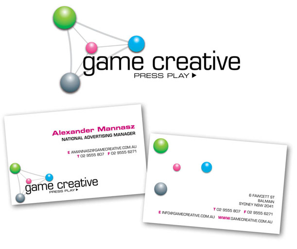
Rough design for a in-(video) game advertising company.

Based on the universal play symbol (triangle) and DNA

Can’t decide on a typeface towork with the logo - currently eurostyle but very open to suggestion.

Look forward to any and all comments.

Thanks as always

Chemical, biological, but never thought of something like advertisment.
And the colors, 3-D Effects are looking to cheap in my opinion.
I would try something else.

Type –
if you want to go the “squarish geometric” direction have a look at Klavika (process type foundry), FF Max (fontfont), Etelka (Stormtype).

i think the chemical compound look comes from the connecting rods between the balls. like a high school chemistry model.
i think the image works a lot better in its usage on the back, w/o the lines. if you wanted a small change, i would suggest moving them around a little so they aren’t so balanced. i know that loses the “play” reference, but it’s more dynamic. you might establish the triangle another way...

Hi
Yes. I love the idea of a circle... it also could be interesting if you could add a cube or a triangle or an oval. Games are all dimensional... and it comes in all shapes and sizes. Colors are ok. maybe try tertiary colors instead of primary or mustard, lilac or olive combo.. layout is clean. How about embossing.../or a cut out?
Maybe have the type in the middle and have the shapes over the information like a juggler? as another alternative?

AD-Shamiko

I like it without the lines connecting the balls. The lines hold those elements static whereas the lack of them has movement. I don’t like the blurred drop shadow but it makes me think light shadows for the balls would be cool. Love the “press play” under the name. I don’t think the T F E and WWW in pink is needed.

Captured from web.archive.org on 4 May 2008. view this capture