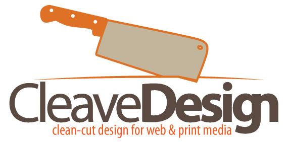
Although the connotations are a bit strange to me (the name), I feel like you could do something much more memorable / original with your look than big type + a weapon... knife... thingy?
Few things... in my modest opinion and experience:
1. Looking at your mark, I would lose the blade knife thing, and stick with the diminishing line and the cleave mark through it... having the knife seems redundant and a bit blunt for any viewer with some intelligence... also really focuses too much on the negative connotation in my opinion.
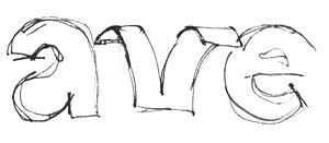
2. I would lose the combination "g + n" in Design – or is there meaning there? Was the "n" cleaved? (cloven?), if you are aiming for something like that, perhaps a pure type solution could be found that does it in a more intelligent way, and would also make the mark unecessary?
Good luck! bm