
Would one of you tyophiliacs be able to ID the type used for the Masthead in Gourmet Magazine?
http://www.epicurious.com/gourmet/
| Attachment | Size |
|---|---|
| GourmetMagazineMasthead.jpg | 30.01 KB |
Would one of you tyophiliacs be able to ID the type used for the Masthead in Gourmet Magazine?
http://www.epicurious.com/gourmet/
| Attachment | Size |
|---|---|
| GourmetMagazineMasthead.jpg | 30.01 KB |

Have you tried the Script Font Identification Guide by Mike Yanega?
I have, actually. It's a great tool (thanks to Mike)--but some of the samples are so low resolution its hard to really tell.

I think it could be a custom work. There are some strange overlaps at the m...
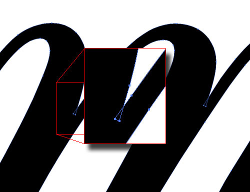

Marten,
Your effort and diagram really impresses me (as does your icon)!
I was wondering, for the benefit of those of us ignorant in such matters, but who are very eager to learn, would you mind elaborating on your finding? What exactly do you mean, and how did you figure it out?
If it's too time-consuming, no worries. It's just a skill that I for one would like to start developing.
Cheers.
I'm really no expert, Malbright! I'm just very much in love with type and are trying to learn more about it every day and must say that this site is one of the best places to do that...
I'll let you in on a little font-ID secret: One way to find out what fonts are in use is to find a PDF containing it, or information about it. In this case I found a PDF on the Gourmet-Works site containing the logo. After opening it in Acrobat and realizing that the logo was outlined and there were no font information to be found I opened it in Illustrator to study the curves. There I saw the strange overlap in the the lc m. I don't really know for sure that this is custom but based my guess on this little detail. I haven't seen this kind of curve joint in a character before...
There is no doubt that is has been customized. What I would like to know, is if anyone knows what it was based on or modified from.
Captured from web.archive.org on 10 Oct 2013. view this capture
